How might we make a cover screen say more —clearer feedback, more function, and no more complexity?
- Company
- HTC
- Role
- UI Designer
- Platform
- Mobile
- Period
- 2015
Overview
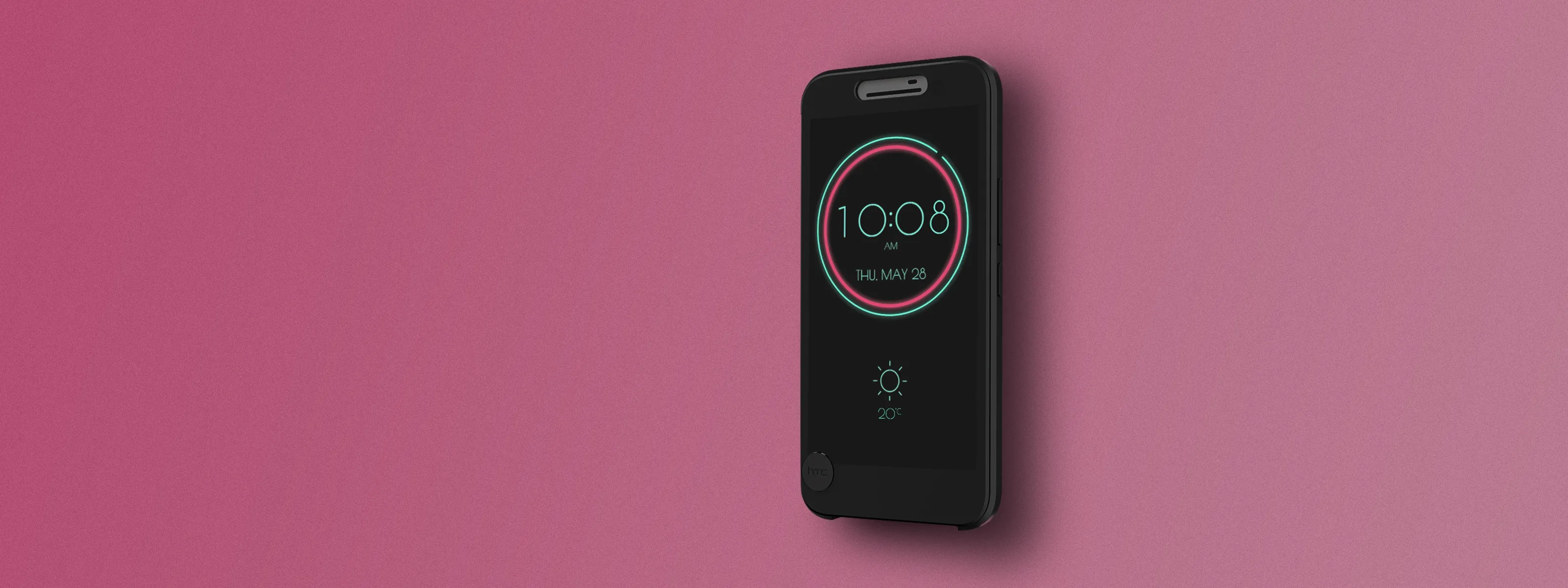
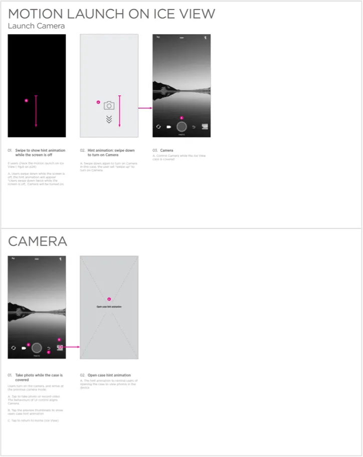

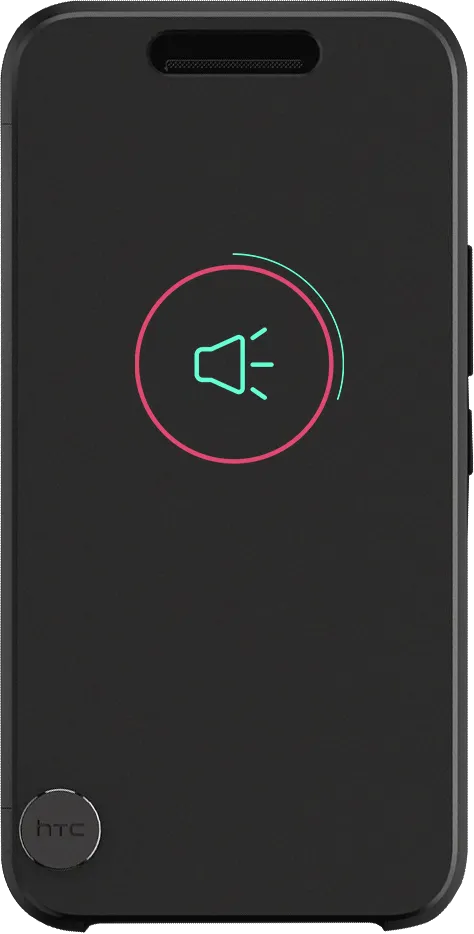
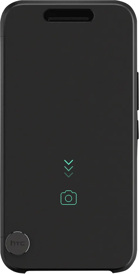
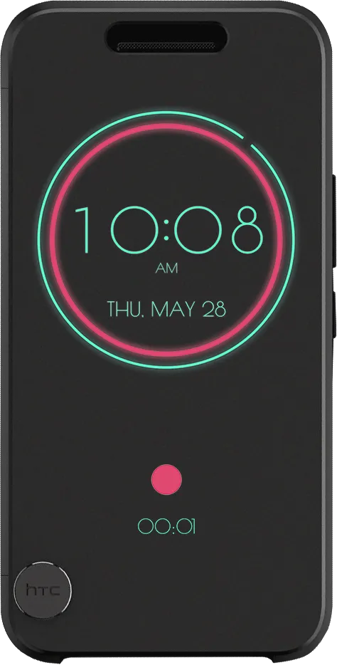
Ice View is the successor to Dot View: a smooth, borderless, almost-opaque cover you can read through. Notifications, calls, music, and — the one Dot View could never do — open the camera and take a photo with the case shut.
I led it from the early visual concept through to launch, directing two UI designers. We ran the ideation, picked a direction, and the result was patented (TW D182760). I also did the motion design: the animation prototype that verified the whole operating sequence, and every animation that shipped.
The goal
What the previous product could not doDot View had 48 points to say everything with. That ceiling is what kept the advanced functions out — and the one that mattered most was that you could not take a photo. Opening the case did not fix it either; it was still awkward.
So Ice View is not a restyle. Changing the front surface from a dot matrix to a translucent pane is what buys the resolution, and the resolution is what buys the functions.
The material
Protection and legibility pull opposite waysThe material cushions the phone and lets content through, and its hard problem is that it is blurry by nature. Transparency that protects well reads badly; transparency that reads well protects less.
We spent a long time with the CMF designer tuning the material properties, looking for the point where the aesthetics and the hardware performance both survive. This is the part of the project that no amount of interface design could have solved on its own.
Legibility
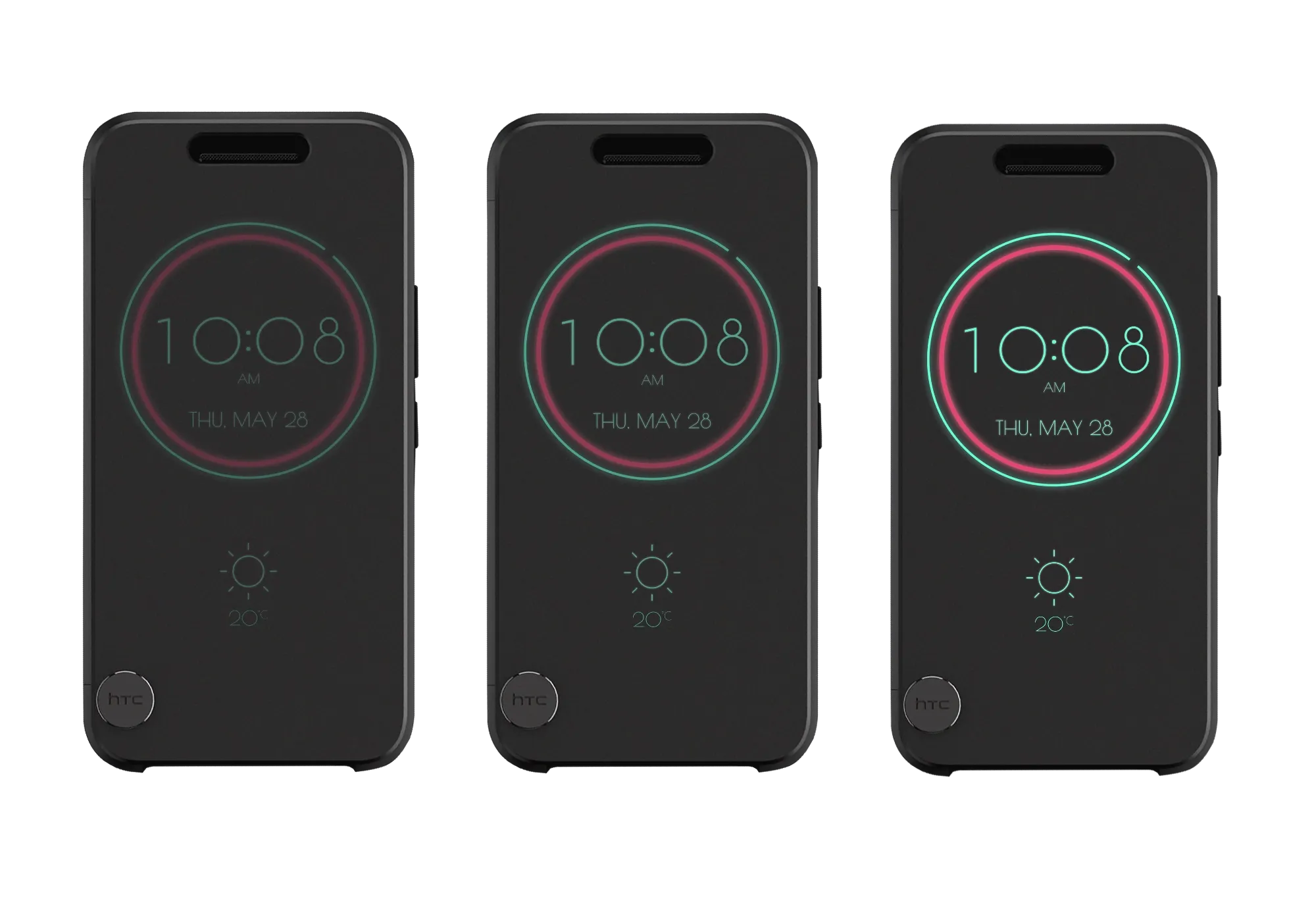

Chosen by wavelength, not by tasteReducing the material’s transparency improved legibility and still was not good enough. So we stopped treating it as an opacity problem and started treating it as a wavelength one — which is how the palette ended up neon on white, and mostly red and green.
The reference is traffic sign theory: red and green carry furthest through a degraded viewing condition, which is exactly what a blurred translucent pane is. Picking an interface palette from penetration rather than from brand or fashion is the single decision this project turns on — everything legible on the finished cover is downstream of it.
The flows
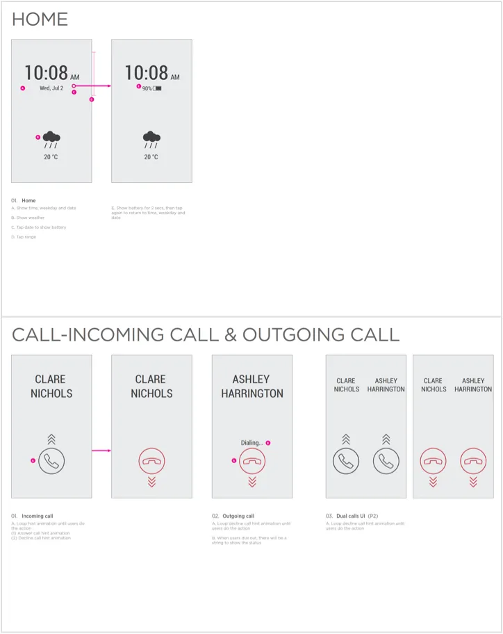
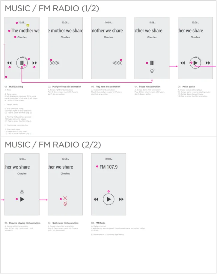
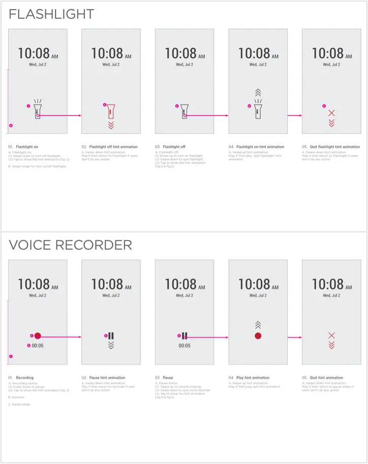
What the cover can do, in orderEight flows for the closed state, worked through before any of it was drawn at final quality.
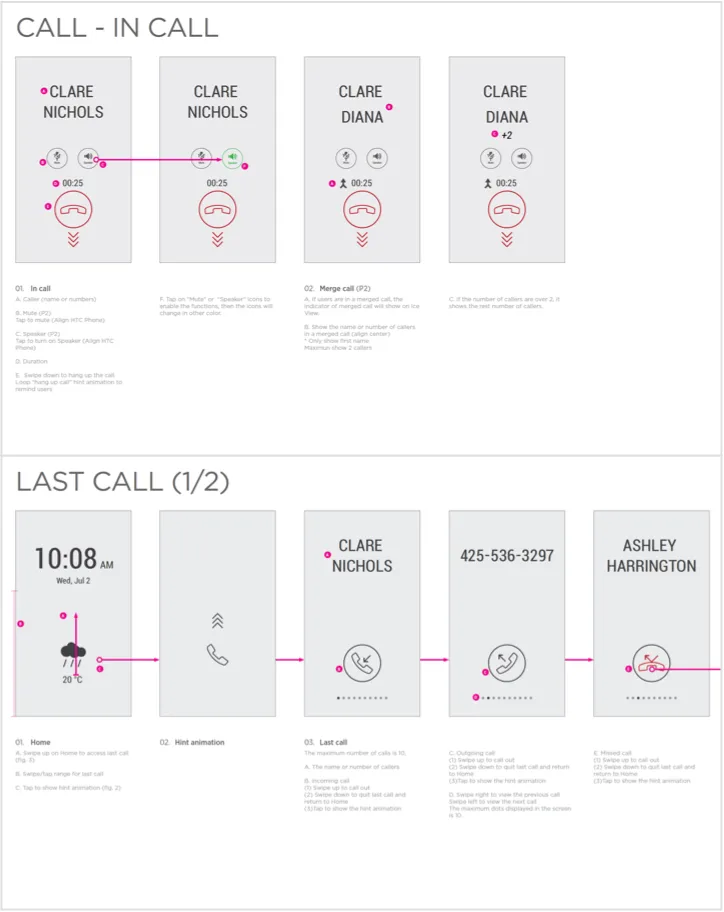
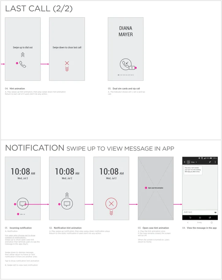
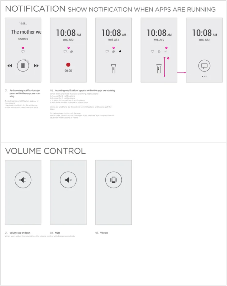
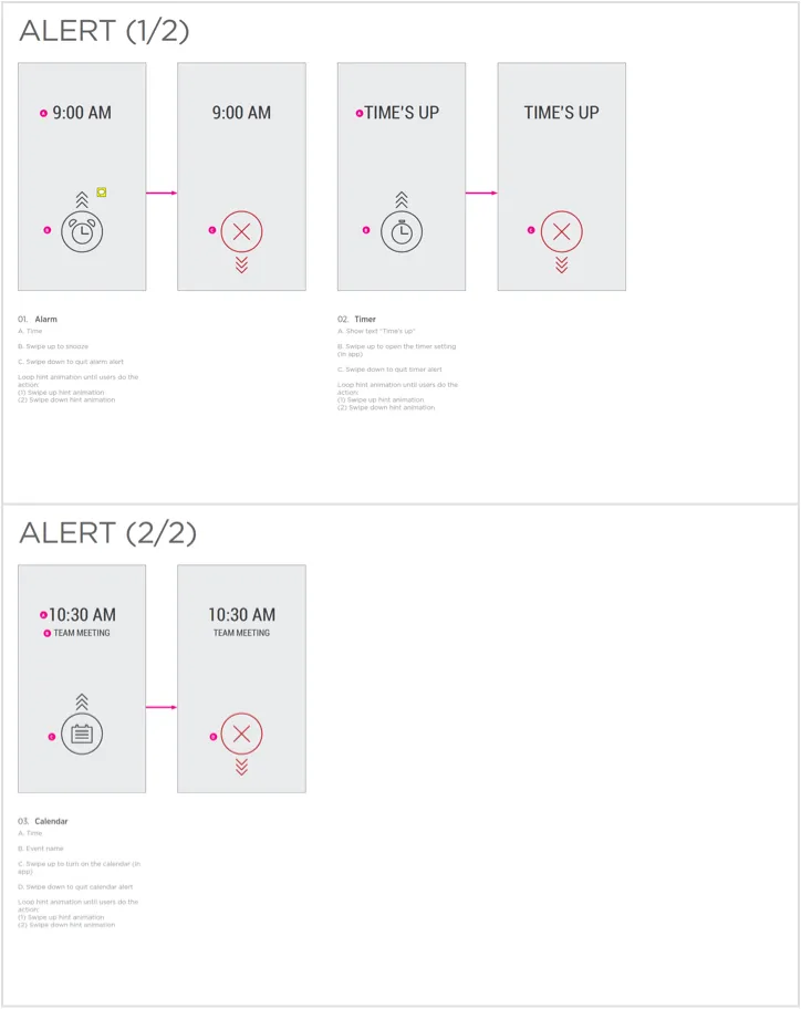
Motion design
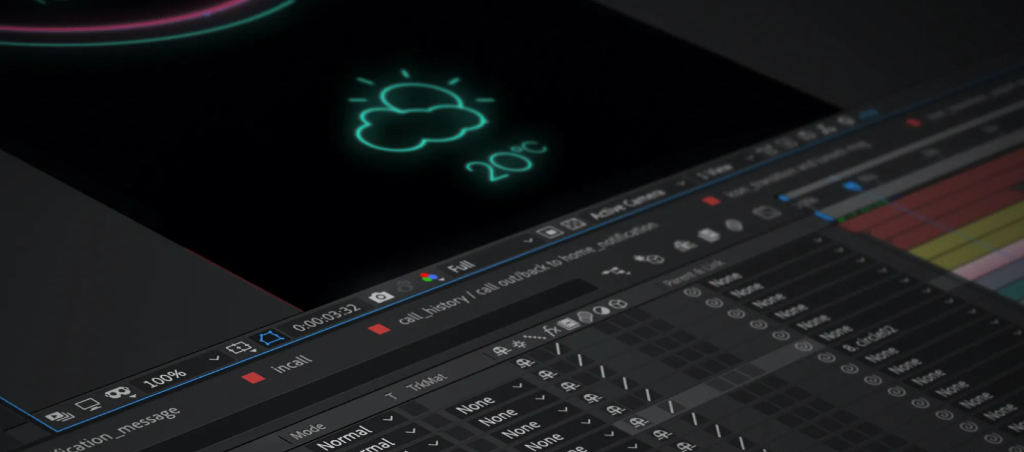




Deformation, pointing at where the event isThe motion principle is smooth deformation used to mark the place on the screen where something just happened. On a surface this diffuse, position is easier to read than detail, so the animation carries the pointing that sharp typography would otherwise do.
The animation prototype was reviewed against the physical mockup rather than on a monitor, because fluency and legibility through the real material are not things a screen can tell you.
Memory
Why full-HD animation was the hard askThe translucent surface is full screen, so there is far more to draw than Dot View ever had. But when the cover closes the system goes to standby, and the memory available is at its smallest exactly when the most is being asked of it.
That constraint shaped the motion more than any aesthetic preference did. Every animation had to be worth what it cost to run in that state.
Essential functions






Weather, and the screens behind itEleven weather states, drawn to stay readable through the cover at the size the cover allows.





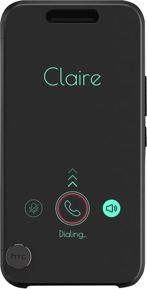
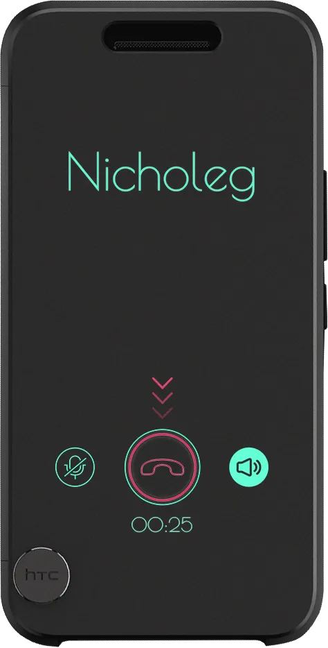
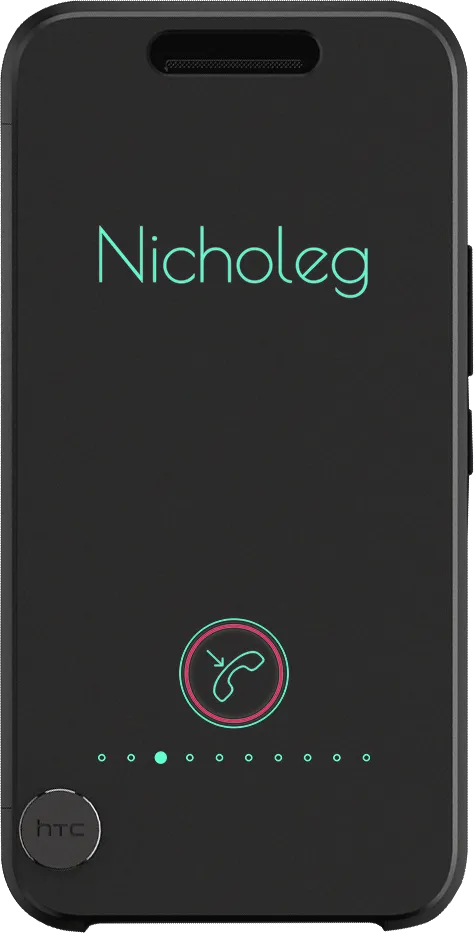
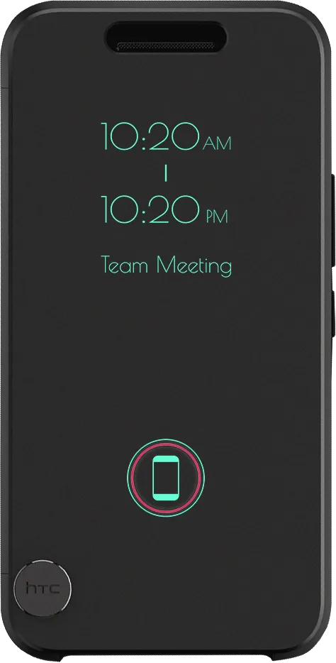
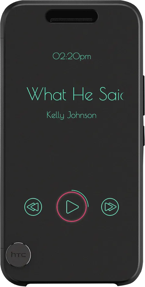
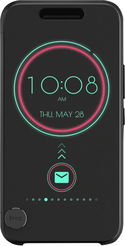
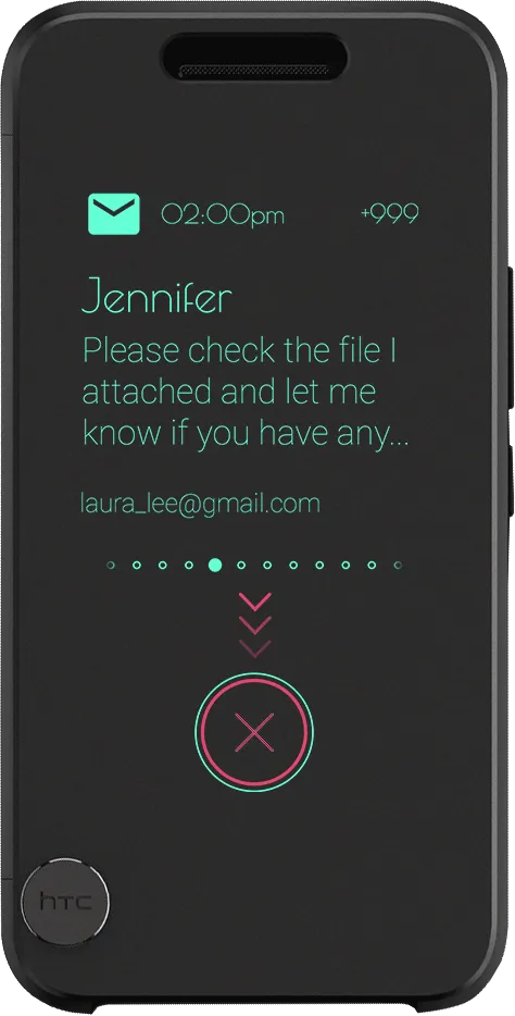
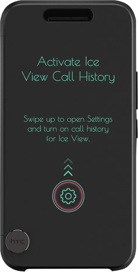
Outcome
Ice View shipped to a genuinely mixed reception. Read as an upgrade to Dot View it was well received; read as a case, the complaints were about the hardware and about customisation, and both are fair.
much higher resolution and have a greater variety of colors
Confirms the premise: the pane is what buys resolution and colour range, and the camera-through-the-case function that Dot View could not do.
needs theme options like dot view
We wanted this too and designed several theme mock-ups. Each theme costs a lot to implement against the hardware limits, and engineering could not fit it into the first launch.
I only wish I could change the colour scheme or font
Same answer, and the more pointed version of it — a palette chosen by wavelength is hard to let users override without losing the legibility it was chosen for.