How might we reshape HTC’s brand image with a fixed budget?
- Company
- HTC
- Role
- Principal Designer
- Platform
- Web, film, event
- Period
- 2017–2019
Overview
An integrated campaign across several U series phones from the HTC U Ultra onward — key visual, animation, photography, commercial film, website, launch event. The aim was to shift how people saw the company, not to advertise one handset.
I worked in the integrated team from 2017 to 2019 as principal designer. Beyond the design itself that meant working with clients, finding new collaborators, and taking commercials to final with the vendors. A team this small only functions if people switch roles quickly, so the job description was less useful than the willingness to pick up whatever the week needed.
The goal
What was actually weakYears of limited resources had left the marketing effort with a structural weak spot: no integrated strategy, so nothing carried a message far. Individually competent pieces that did not add up.
That is the honest framing, and it sets the target. When the budget cannot buy reach, the only multiplier left is coherence — every surface saying the same thing so a viewer meeting three of them meets one campaign rather than three departments.
Key visual
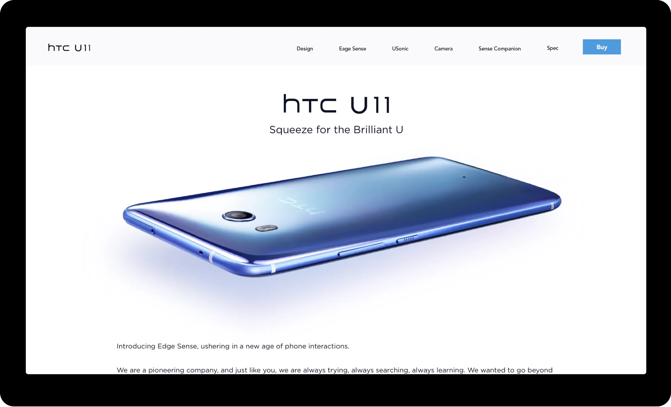
The decision everything else inheritsThe key visual has to catch the spirit of the product, because it decides the direction of the whole campaign story. Get it wrong and every film, page and display after it is spent arguing with it.
The project opened with intensive ideation and a mood board, to fix one vision before anything expensive was committed. On a constrained budget that sequencing is not process for its own sake — it is the only affordable way to be wrong.
Website
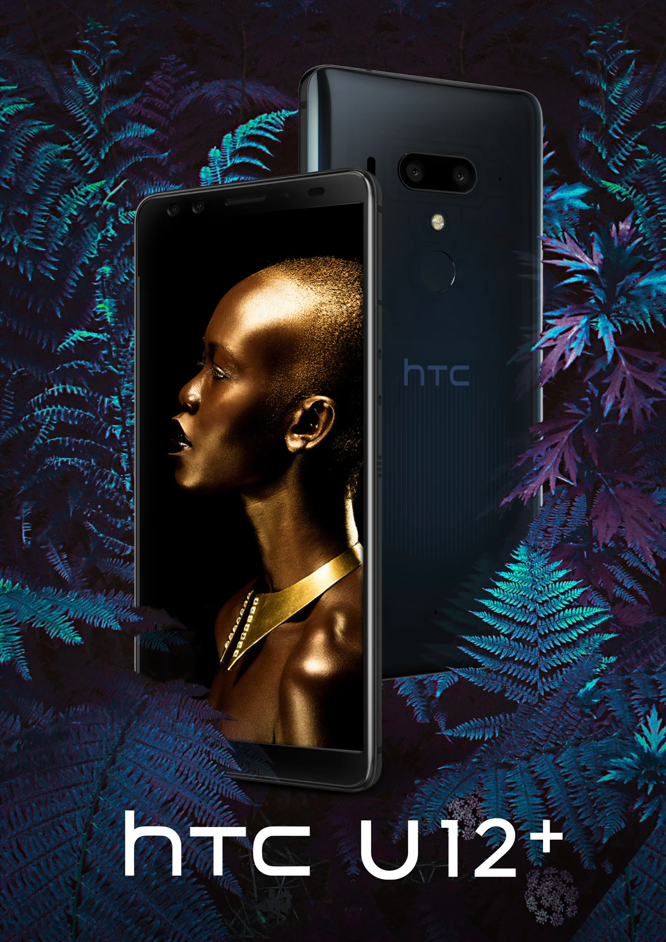
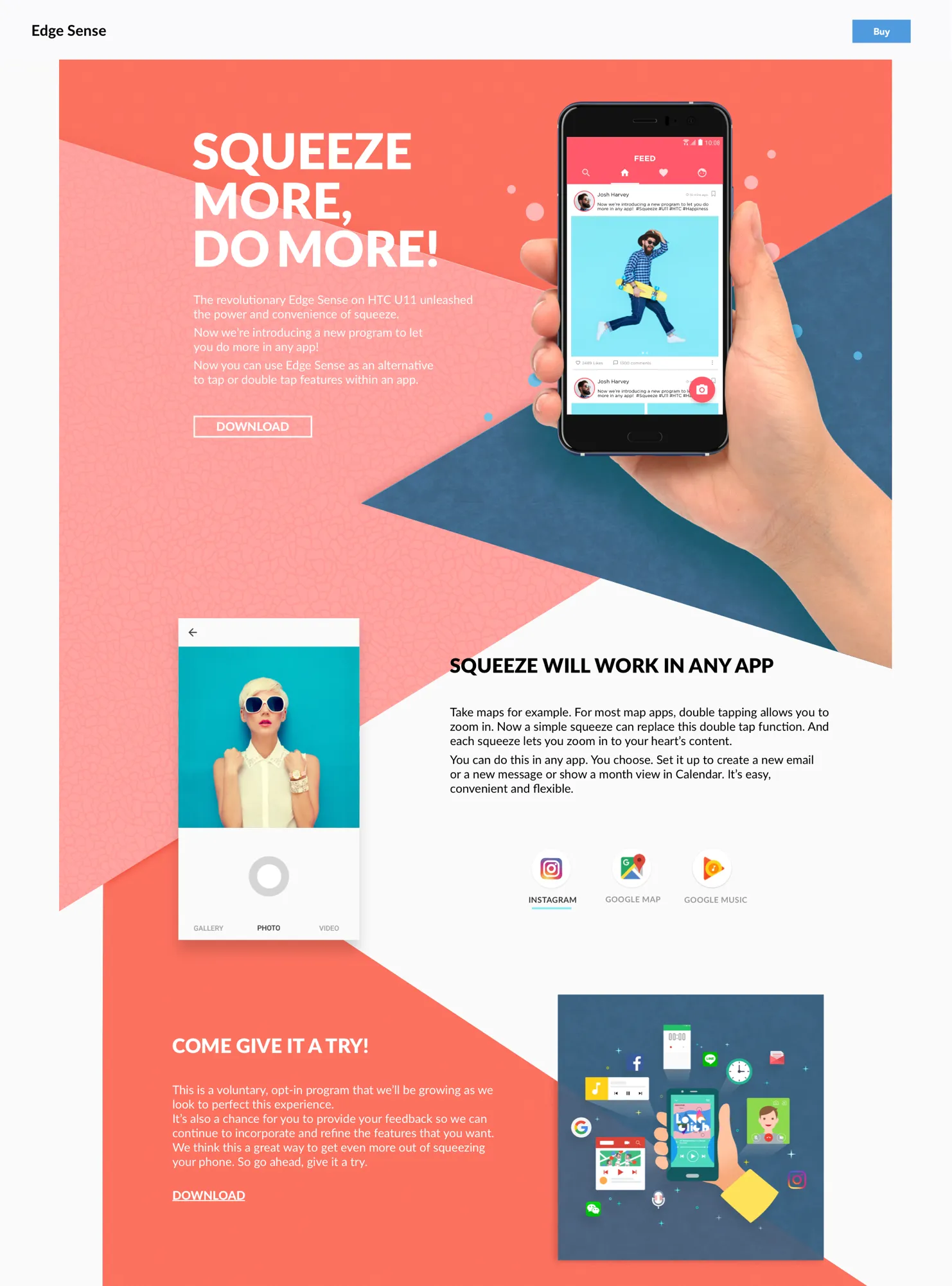
Inside a framework we did not setThe product detail page is where the selling points and the specifications have to land for someone deciding. We structured it by prioritising features to the marketing team’s direction, then adjusted so the aesthetics served that order rather than competed with it.
The development team had already laid out the framework, so this was not a free design: the work was finding the best resolution available inside a structure that was fixed. An add-on site introduced Edge Sense separately, where a feature needed more explaining than a spec row can carry.



U11 EYEs
One shoot, cut for two surfacesThree camera features, shot once and cut twice: a branded edit for social, and a silent loop for the product page. The same idea has to survive both, which is what an integrated campaign actually costs.
The social cut carries the product and the logo and runs with sound, because it is competing in a feed. The product-page loop drops all of that and shows the interface doing the thing, because someone already reading a spec sheet does not need to be sold the brand again — they need to see the feature work.
Motion and video
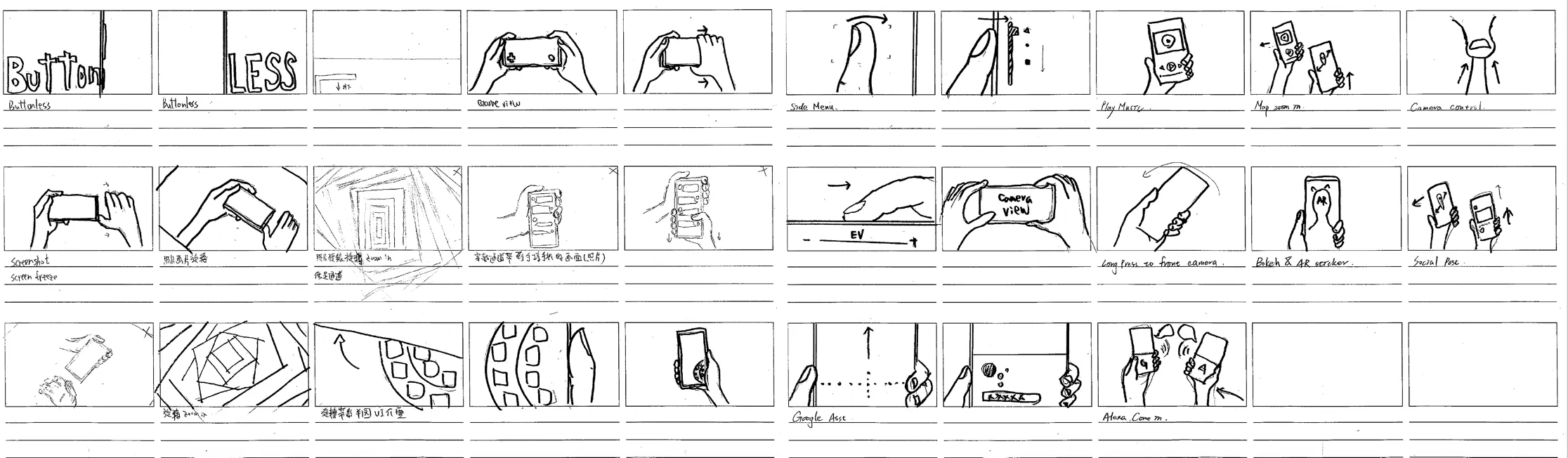
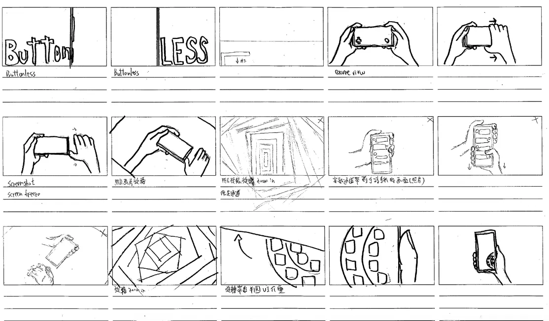
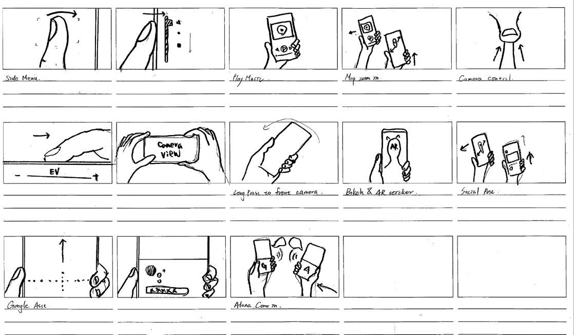
Idea, storyboard, motion board, animationIdeas, storyboards, motion boards, animation, and the vendor conversations that turn those into a finished film — showing the product’s features and its story through the work rather than around it.
Commercial film
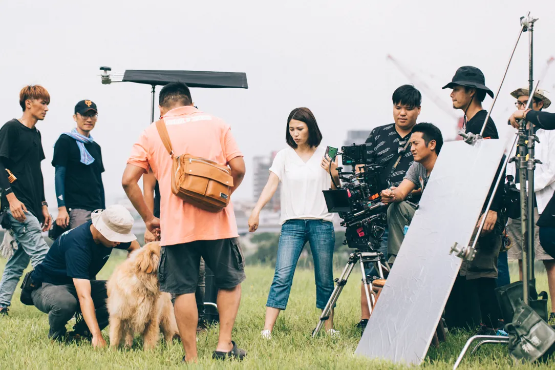
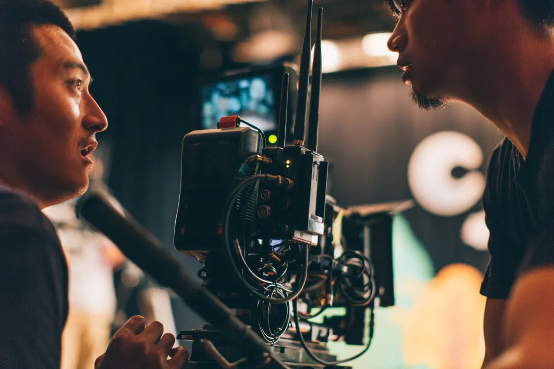
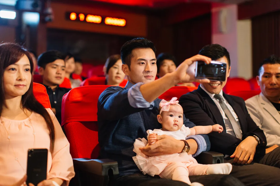
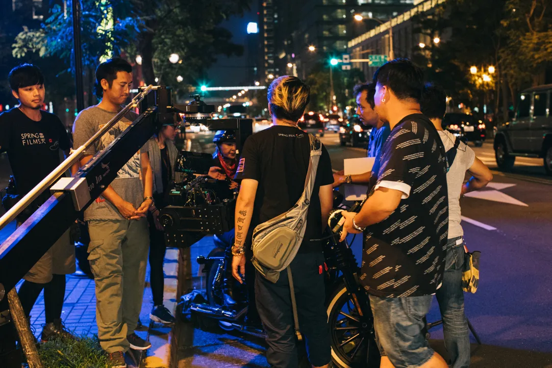
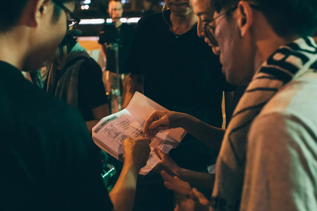
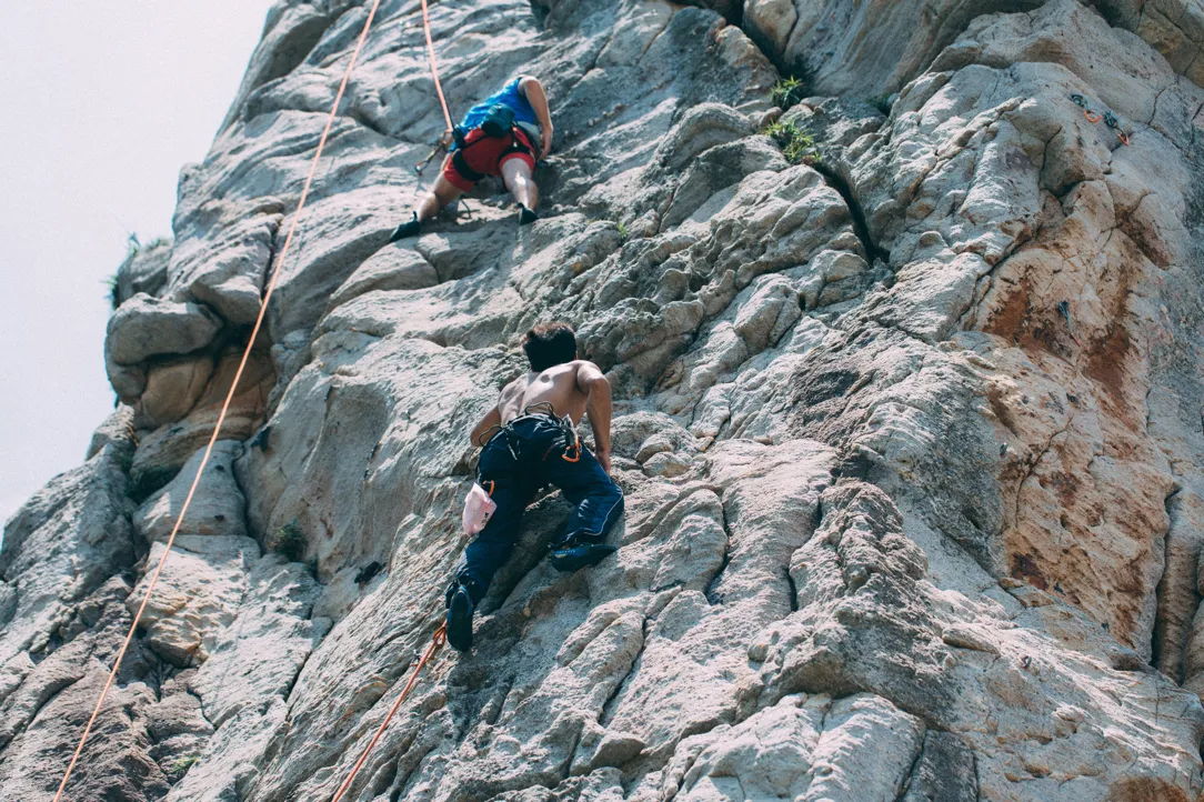
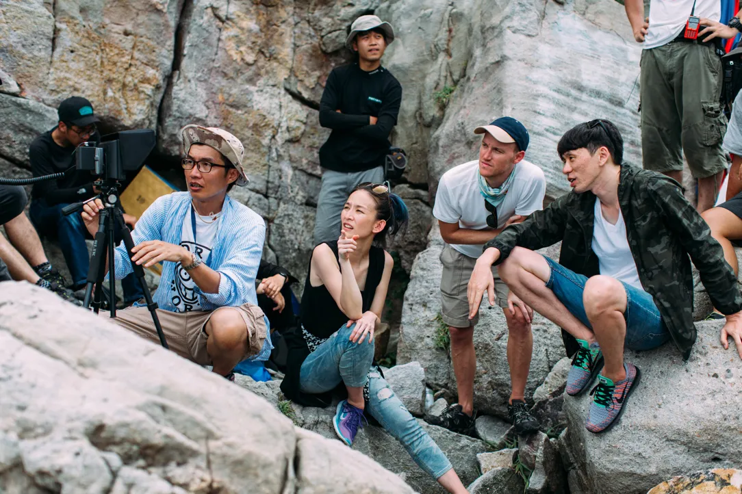
Four chapters, one campaignStoryboard from us, production with the house, and quality held across all four. Chapters let a campaign say four things without becoming four campaigns — each stands alone and they share a grammar.

Event
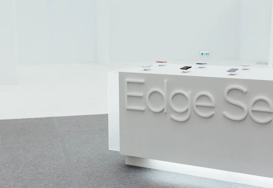
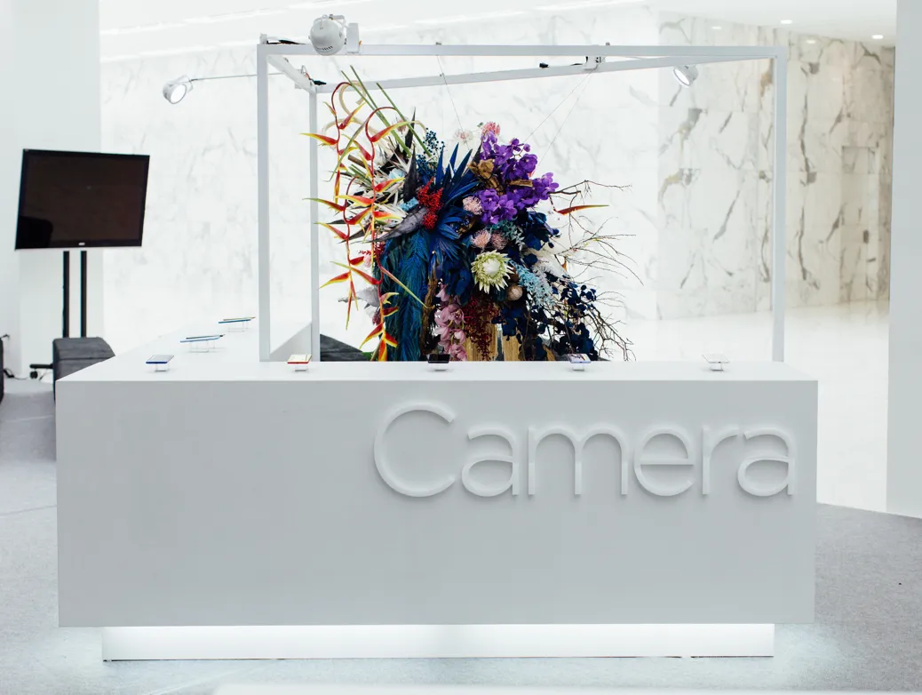
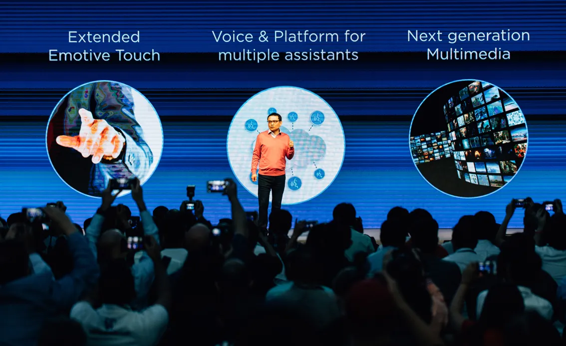
The announcement, builtDisplay design and setup for the phone announcement, worked out with the team that builds it. A launch stage is the one surface where the campaign has to survive being a physical object at the size of a room.
Photography
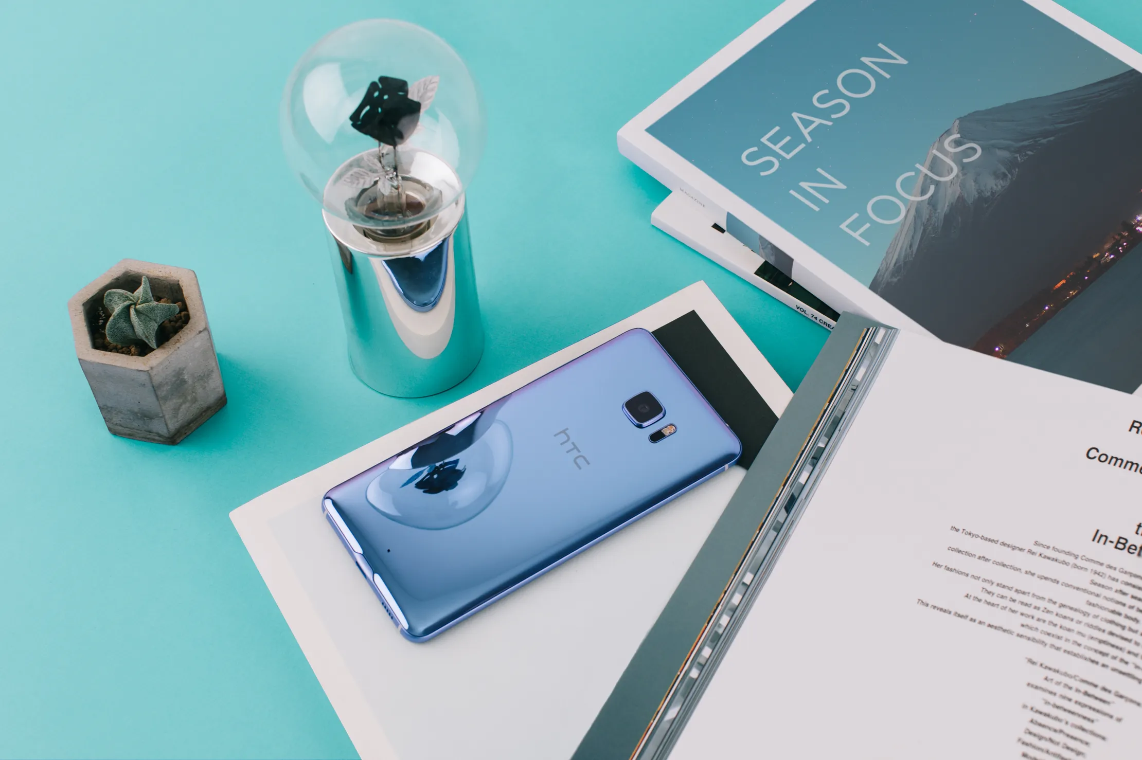
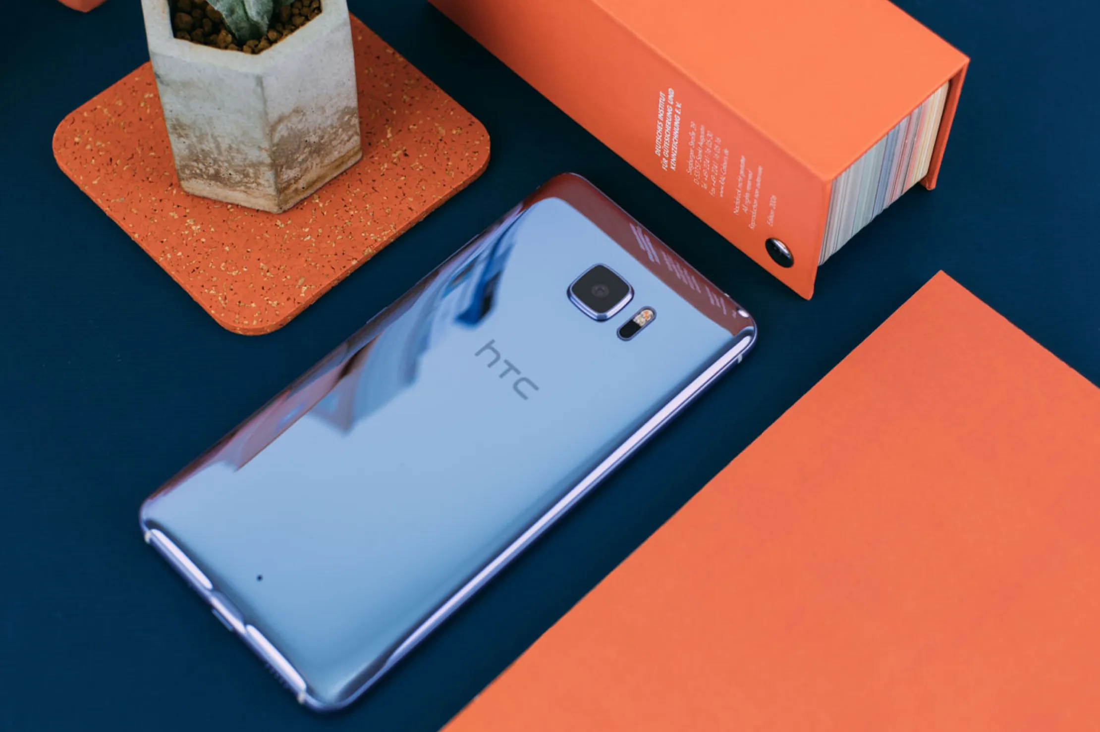
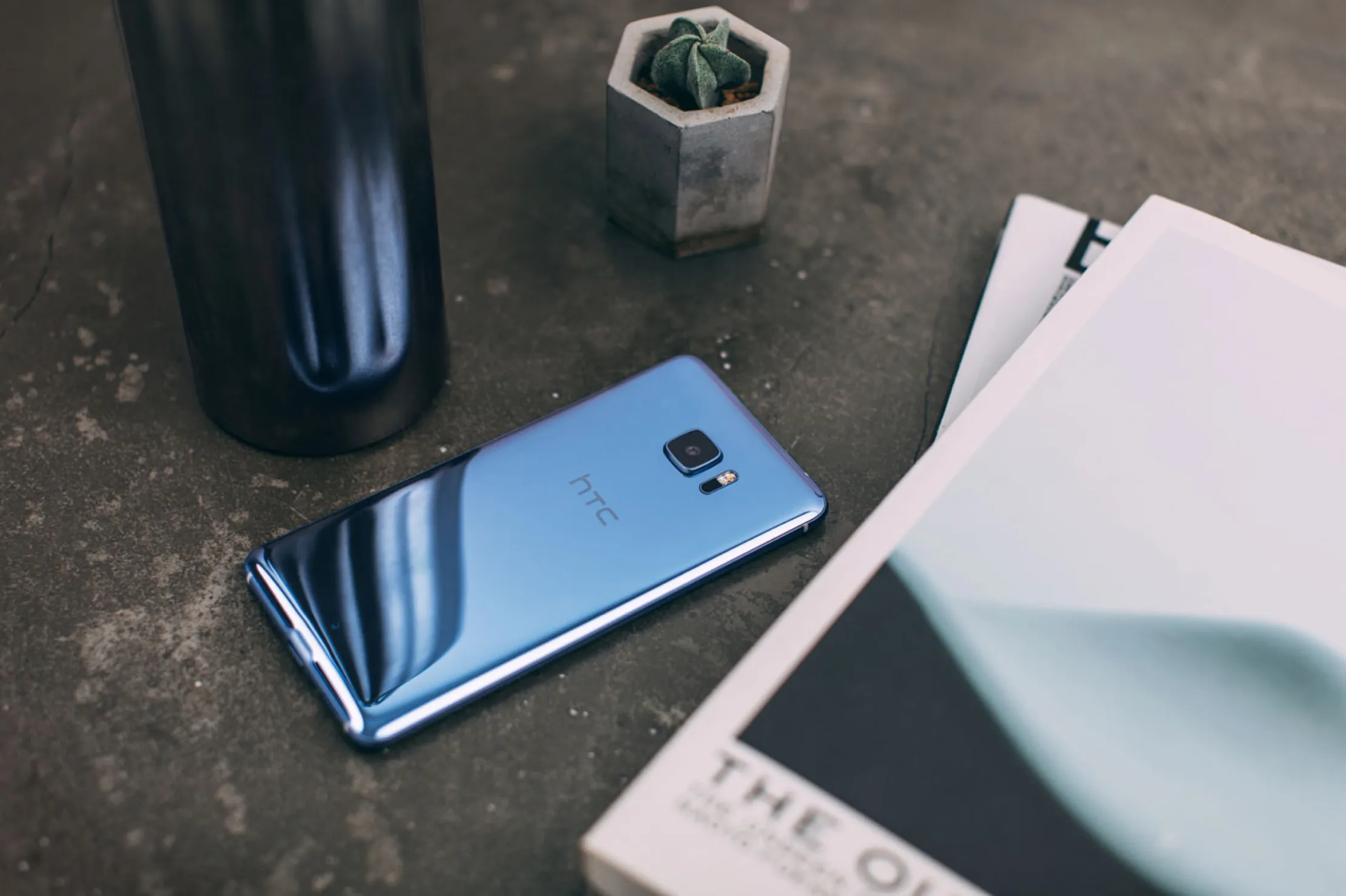
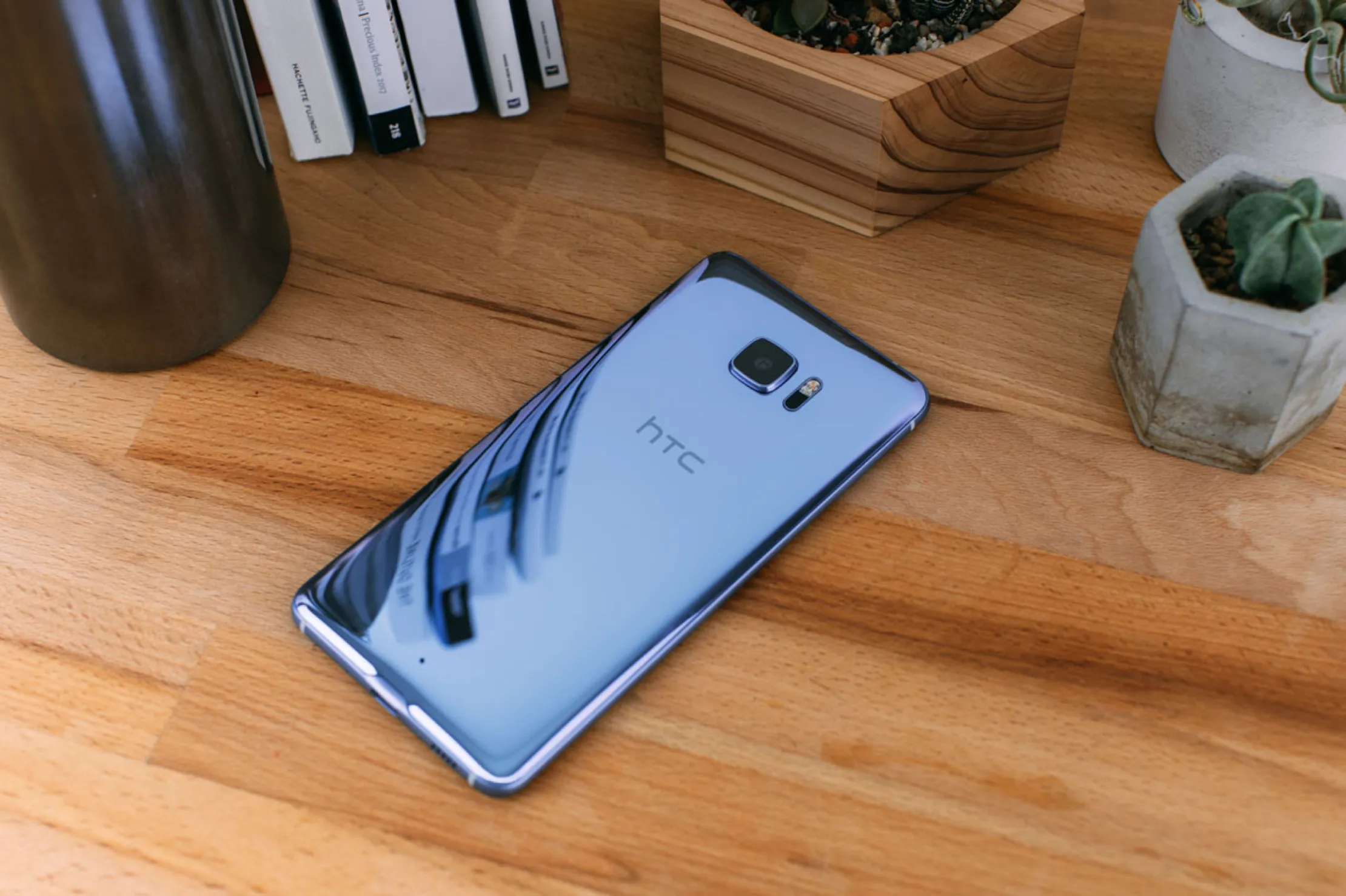

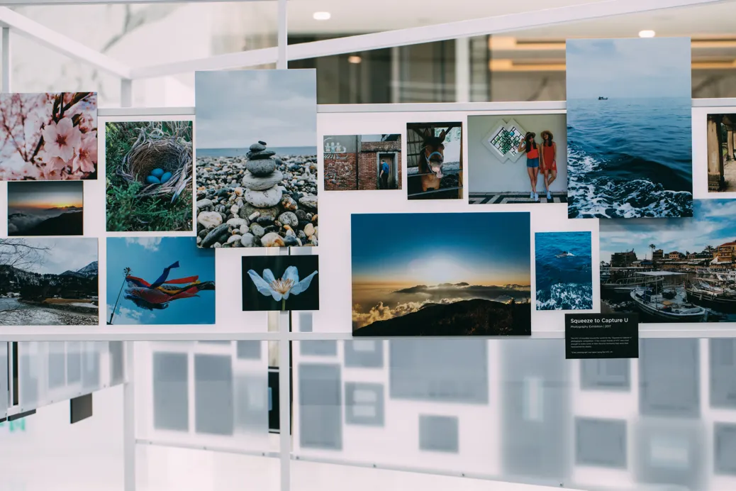
Shot for social, to put the product’s advantage in front of people where they already were. The spaceman series was made for the U11+.