
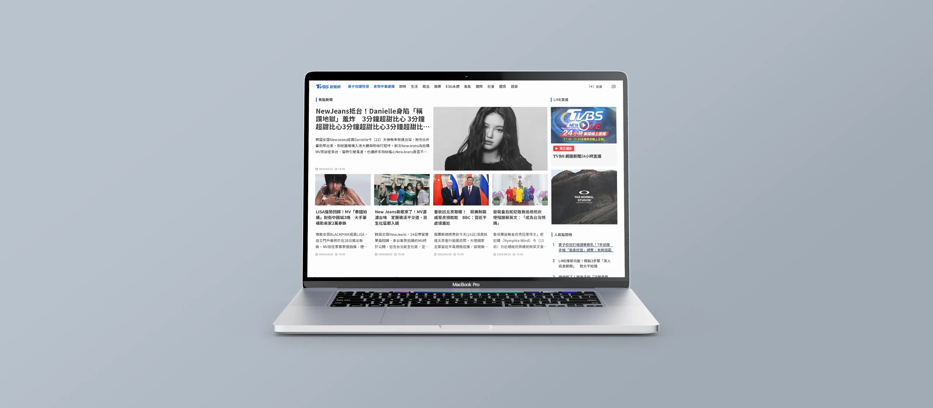
How might we rebuild a legacy news site so readers keep reading?
- Company
- TVBS Media Inc.
- Role
- Product Design Lead — sole designer
- Platform
- Web, mobile-first
- Period
- 2024
Overview
TVBS News is one of Taiwan’s largest news platforms. Years of ad-first operation and a focus on breaking updates had left it with a fragmented reading flow, an unclear hierarchy, and editorial tooling too rigid to fix either.
I led a mobile-first redesign as the sole designer. The core team was six: myself, a PM, two engineers, my design manager and the department head. Beyond it I worked with the online news desk — an editor and the editorial director — plus the sales department and a third-party ad vendor. The brief was not a visual refresh: it was to restore reading flow and give editors a modular system they could actually operate.
Objectives
Agreed with editorial & business- Reduce cognitive interruptionDense mid-article ad placement was breaking the narrative.
- Strengthen information hierarchyReaders could not scan or locate the key idea quickly.
- Increase session depthGive readers a relevant reason to continue after the article ends.
- Support editorial scalabilityReusable modules instead of one-off layout adjustments.
Target metrics
The problem
Reading flow had broken down. Ads placed mid-article interrupted the narrative and readers left early. Three systemic factors kept it that way.
- Outdated information hierarchyReaders could not scan the page or locate the key idea, which made staying engaged harder than leaving.
- No guided continuationRecommendations after each article were generic and unrelated to what the reader had just finished, so they left rather than continued.
- Limited CMS flexibility — underlying causeEditors had no tools to structure stories consistently, so layout and hierarchy problems reappeared with every story.
Research
GA4 + 1:1 interviewsBehavioural analysis
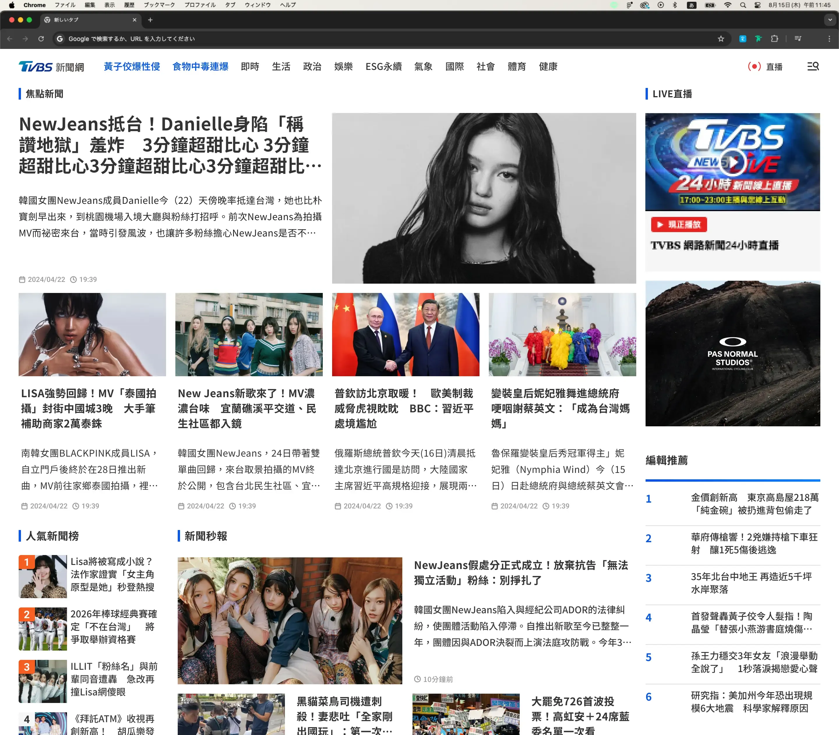
GA4 behavioural data and scroll-depth metrics showed drop-offs clustering at the exact points where ads interrupted the reading flow. 2023 data also showed mobile carrying roughly six times the pageviews of desktop while session depth was higher on desktop — a strong signal of friction specific to mobile reading. That set the mobile-first direction.
What readers said
I couldn’t tell where this article fits in the full story. I need more context.
Timeline module showing how an event evolves.
There’s just too much going on. My eyes don’t know where to focus.
Reworked spacing, grouping and layout rhythm.
I stopped using the app because the ads were too annoying.
Modular ad blocks with minimal content interruption.
I finish reading and just leave. The suggestions below don’t seem related.
Related content module and the Shuffle Next control.
I scroll down and immediately see the comments and ads — it’s too noisy.
Reorganised the comment section and changed its default behaviour.
I’m not sure why these stories are being shown to me.
Clearer visual grouping and theme indicators to signal relevance.
Outdated articles and inconsistent layouts — the tooling shows.
CMS proposals: layout preview, media flow, structure guidelines.
Three reading orientations
- Who
- Office workers, freelancers, mobile readers
- Behaviour
- Skims headlines and key points; reads on commutes; values efficiency
- Friction
- Distracted by intrusive ads; hard to focus on core content
- Opportunity
- Lower ad density; better mobile scannability
- Who
- Students, knowledge workers, researchers
- Behaviour
- Explores related content; wants structure and background
- Friction
- No event chronology; unclear topic relationships
- Opportunity
- Timeline modules; contextual next-to-read paths
- Who
- Arrives from Facebook, LINE and messaging apps
- Behaviour
- Clicks in, leaves quickly, does not explore
- Friction
- No continuation path; insufficient cues to explore
- Opportunity
- Guided recommendations; lightweight exploration
Where each one breaks downJourney matrix — 5 stages
| Stage | A — Busy Skimmer | B — Context Seeker | C — Passive Reader |
|---|---|---|---|
| Entry | Push notification or headline scan | Homepage or bookmarks | Social or messaging link |
| Scanning | Skims for the main point and key visuals | Reads in depth, checks related sources | Scrolls fast, reads headline and lead only |
| Context | Skips supporting sections | Wants timeline, background, sources | Does not seek more |
| End of page | Stops at the conclusion or is blocked by ads | Expects related articles or follow-up | Sees comment and ad clutter, exits |
| Friction | Ad interruption; dense sections; key points hard to spot | No visual timeline; poor grouping; overwhelming structure | No guided path; content feels irrelevant |
Alignment
Editorial · Business · EngineeringThe constraint was never design quality. It was revenue. Every ad slot I wanted to move was someone’s number.
I ran alignment sessions with editorial and ad sales to map which placements were non-negotiable and which layout areas were open. That produced explicit boundaries to iterate inside — rather than proposing work that would be rejected later on commercial grounds.
The roadmap that came out of it balanced user value, operational stability for the editorial team, and technical readiness — against release timing and resource constraints.
Usage data that settled the arguments
Rather than removing low-performing UI on instinct, I pulled click share from H2 2024 and let the numbers set the direction. Every contested element sat under 1.3% — and four of the five under 1.1%.
My direction was consolidation, not removal. Navigation moved into a hamburger menu — its own click share is only 0.06%, but I kept it as an access path for the readers who still use it. Sharing was merged into a single button.
The breaking-news ticker had already been repurposed as an ad slot, and interviews showed three of four participants skipped it entirely. That told me the module had lost its original information value, so the right move was to realign it with stakeholders rather than quietly delete it.
For text size I proposed aligning article typography with the device’s native text-size setting, working with engineering — older readers already adjust it at system level. If it holds up, it replaces the in-UI toggle; I planned to validate that through post-release feedback.
What we built
2 of 11 concepts, first releaseI presented all eleven concepts to usability participants to rate for usefulness against their own reading habits — eight ranked in their top five. I then ran a prioritisation workshop with the editorial lead, PM and engineers, scoring each on feasibility, editorial workflow impact and implementation cost. Two were selected for initial development — high user impact, low editorial complexity.
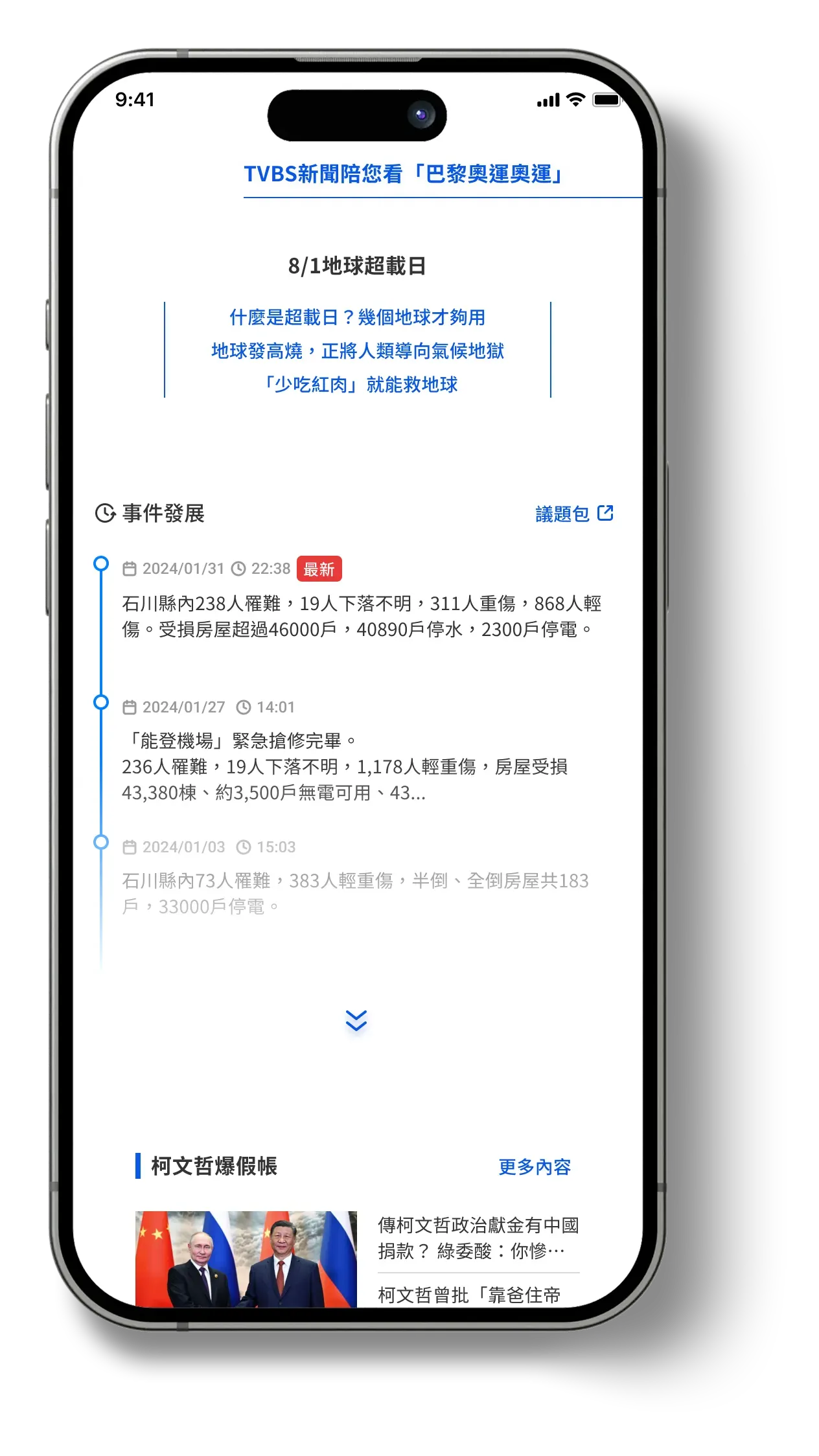
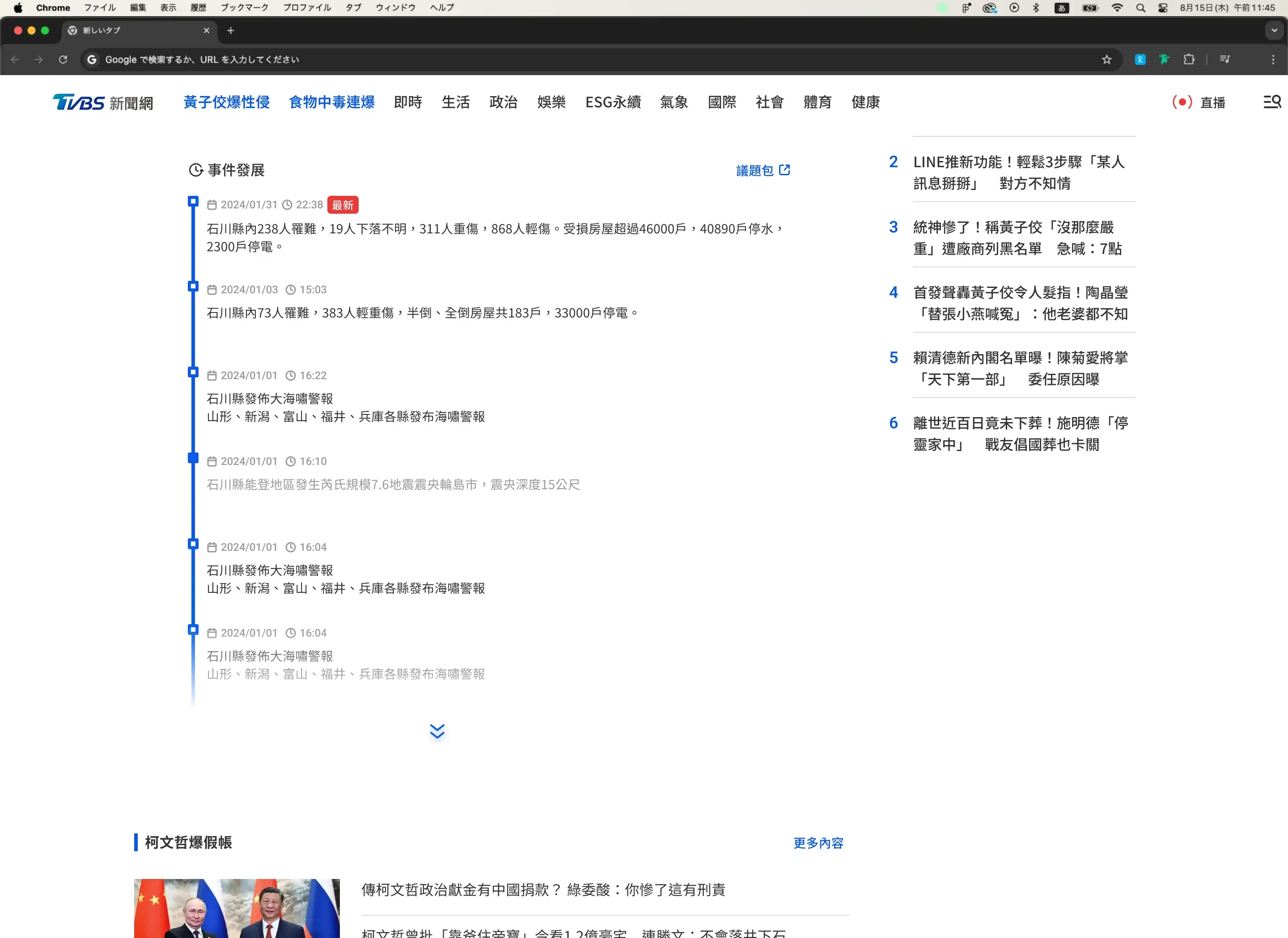
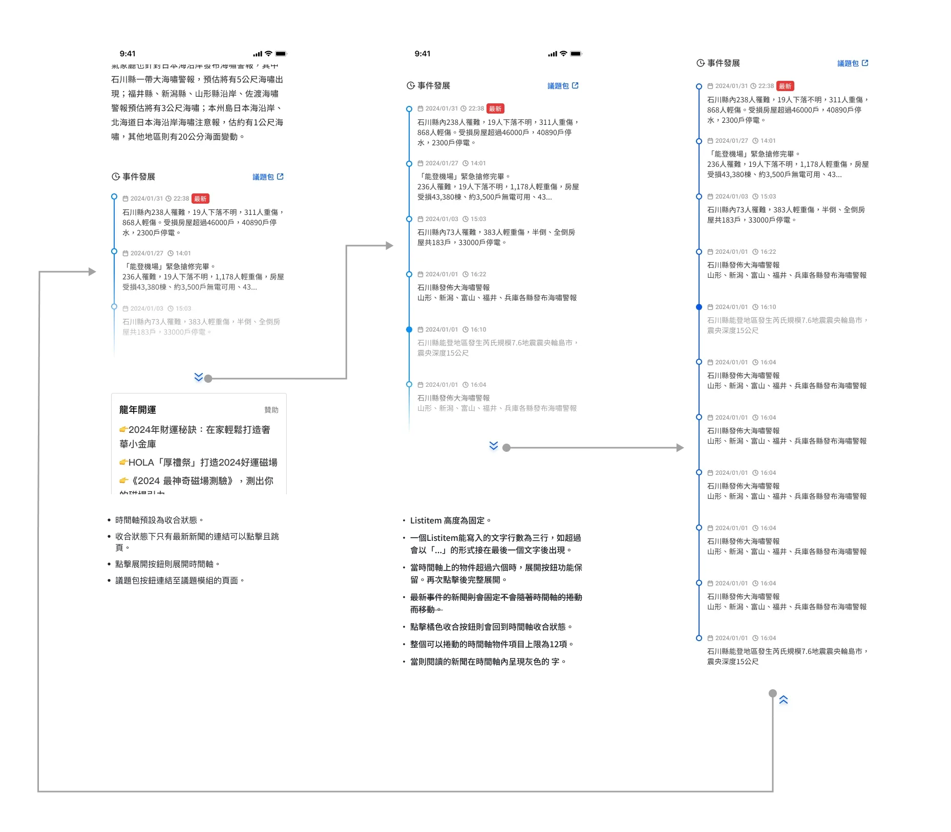
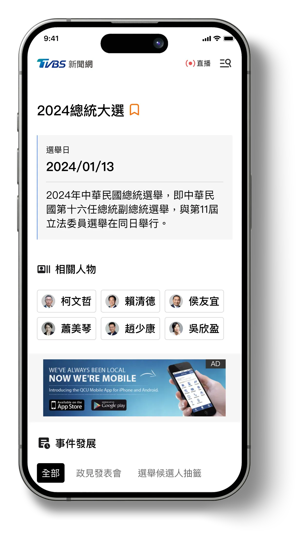
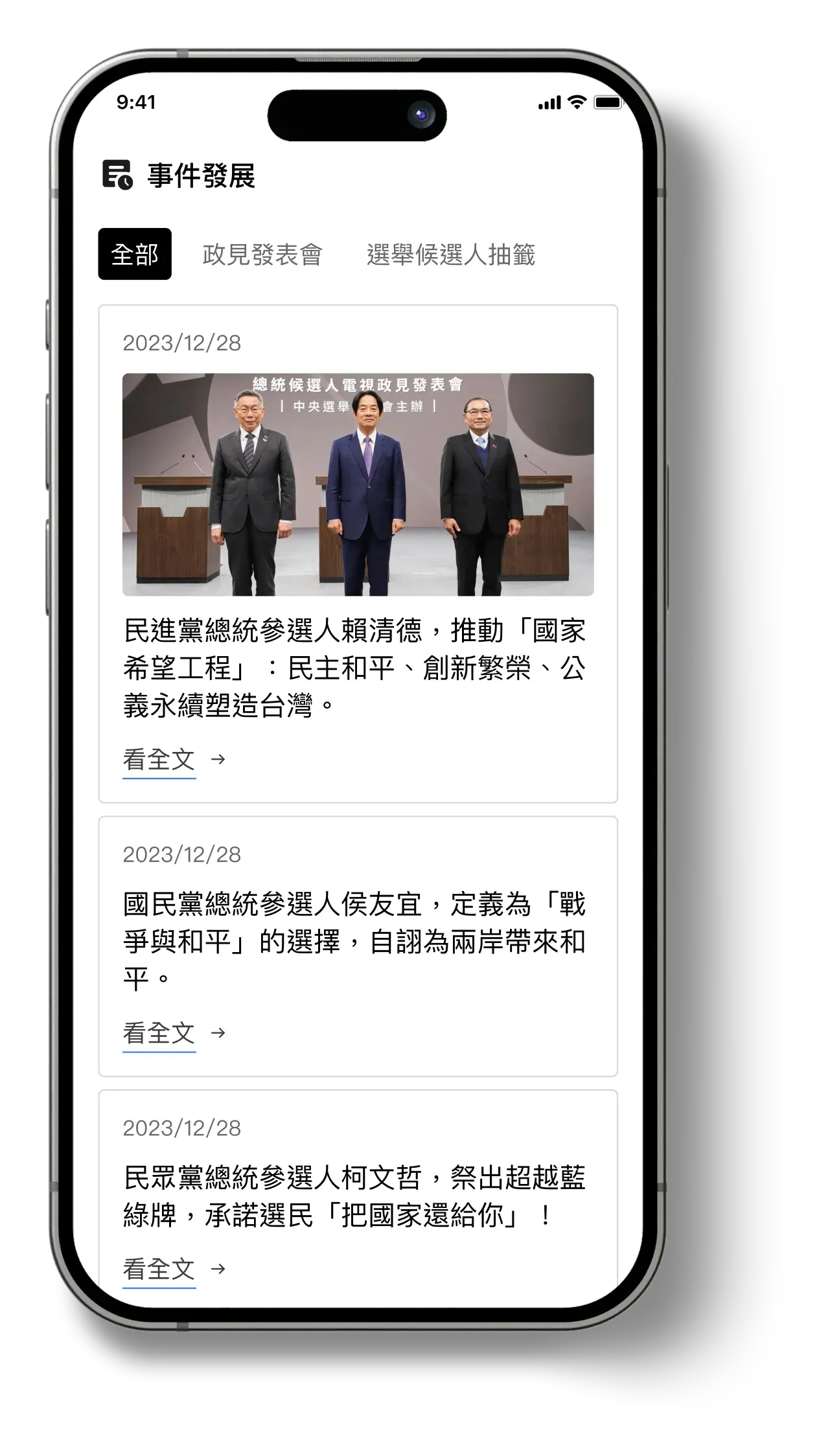
The chronology of a running story belongs inside the article, not in the reader’s head.
Readers opened several articles and reconstructed the order of events themselves. Fixing that could not cost the newsroom anything each time a story updated.
- Design
- Placed at the end of the article — the point where a reader pauses and is most open to wider context
- Collapsed by default, so it never interrupts the read
- Expandable list of related updates
- CMS tagging lets editors add, reorder and remove items directly
- Outcome
- Context at a glance, raising the likelihood of continued reading inside the same story cluster.
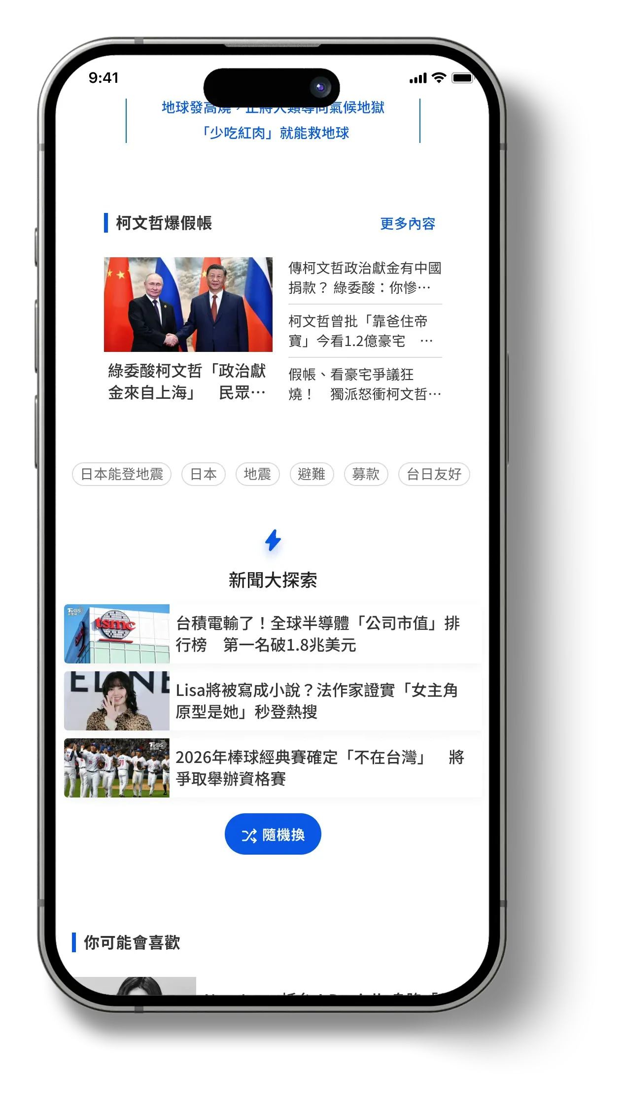
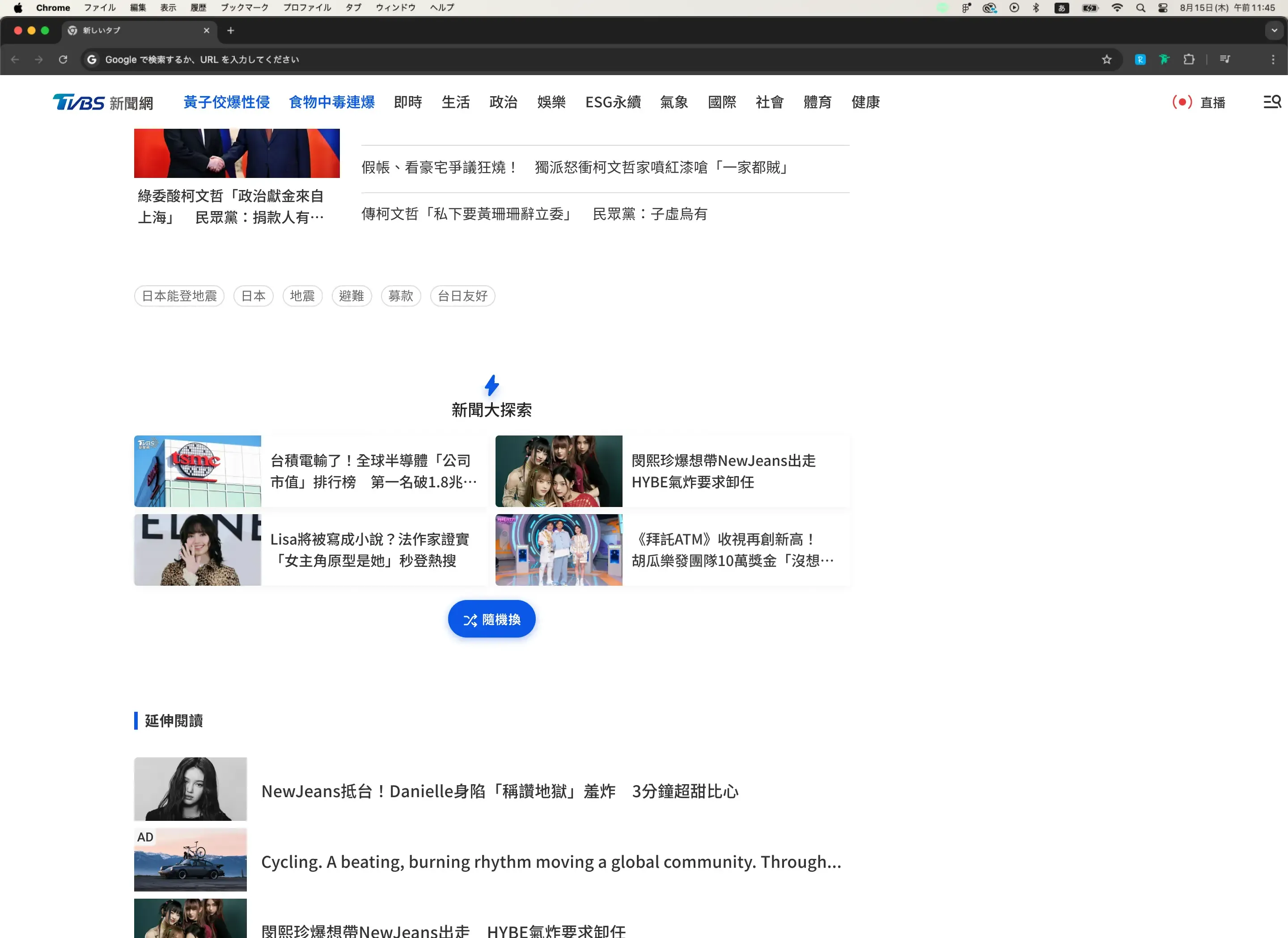
With no recommendation engine to trust, the design handed the choice back to the reader.
Generic post-article recommendations gave readers no reason to stay, and algorithmic relevance could not be guaranteed on the existing CMS — so I designed for agency over precision, and let readers shuffle until something lands.
- Design
- Each tap surfaces three fresh stories
- Mixes trending, recent and under-explored
- No profile or history required
- Outcome
- Discovery extends past habitual reading patterns, increasing the likelihood of a longer session.
- Measurement
- Shuffle tap rate and re-tap rate
- Article transition rate via Shuffle
- Pageviews per session
Core surfaces
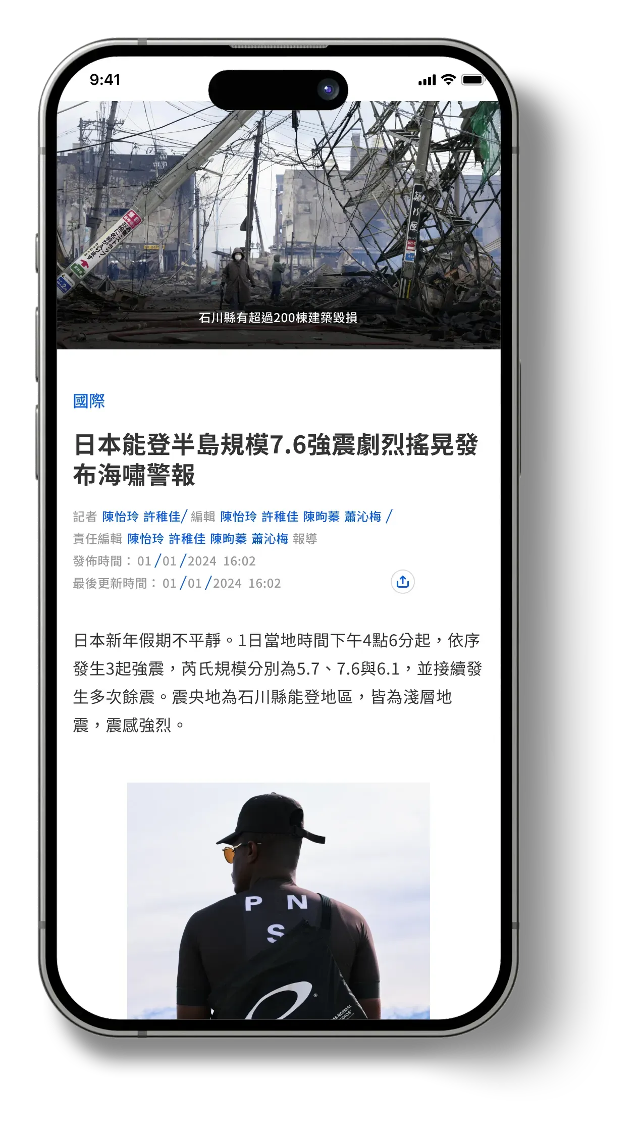
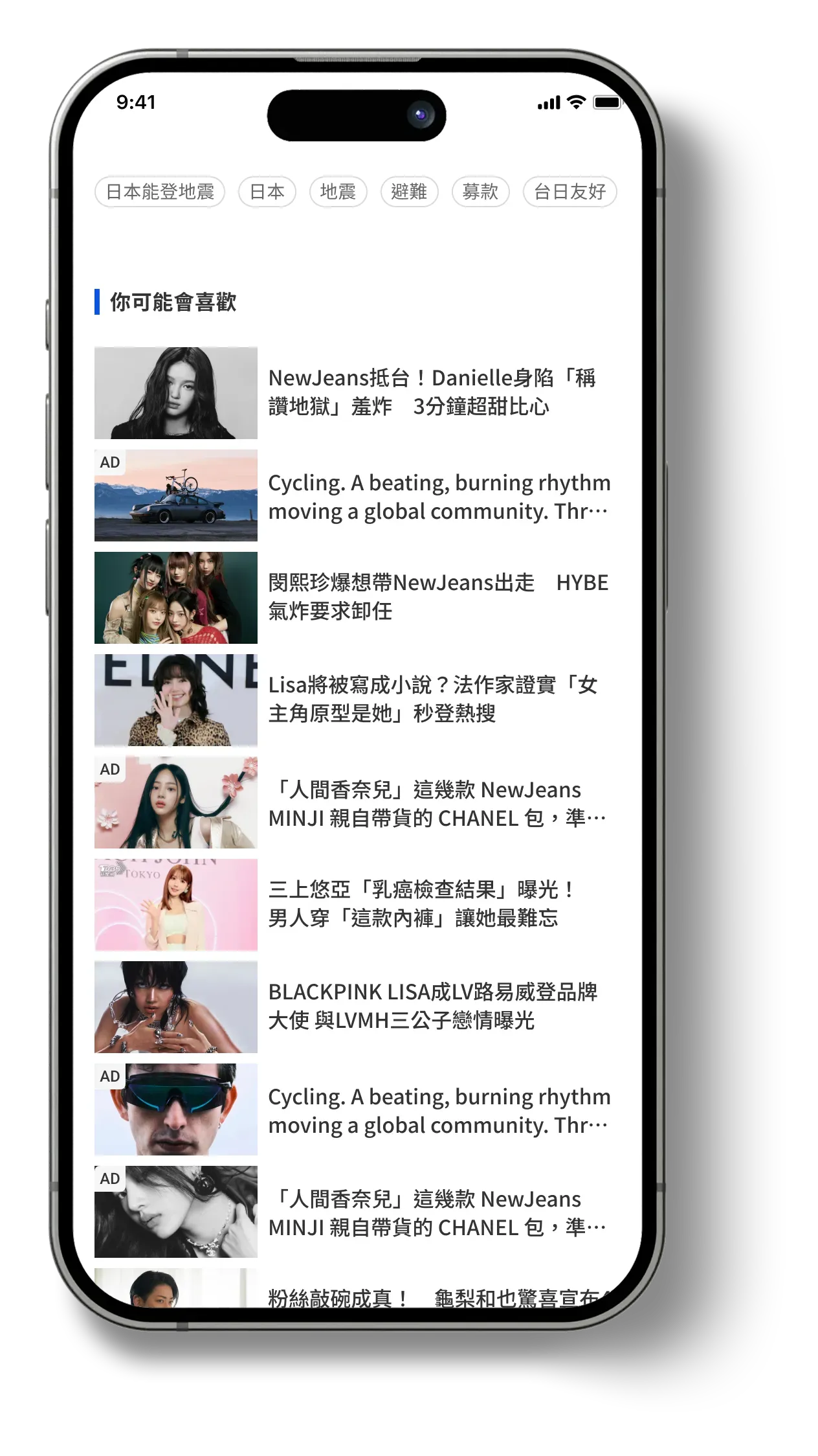
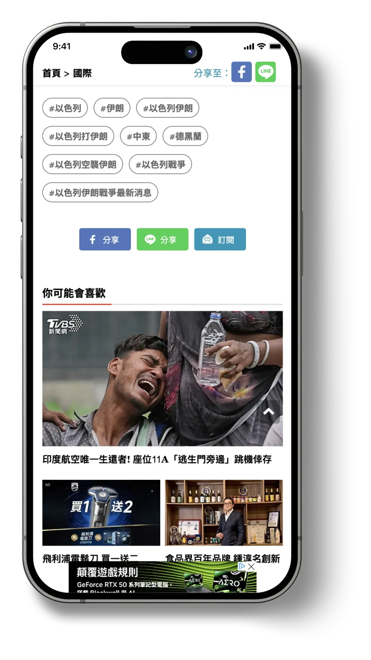
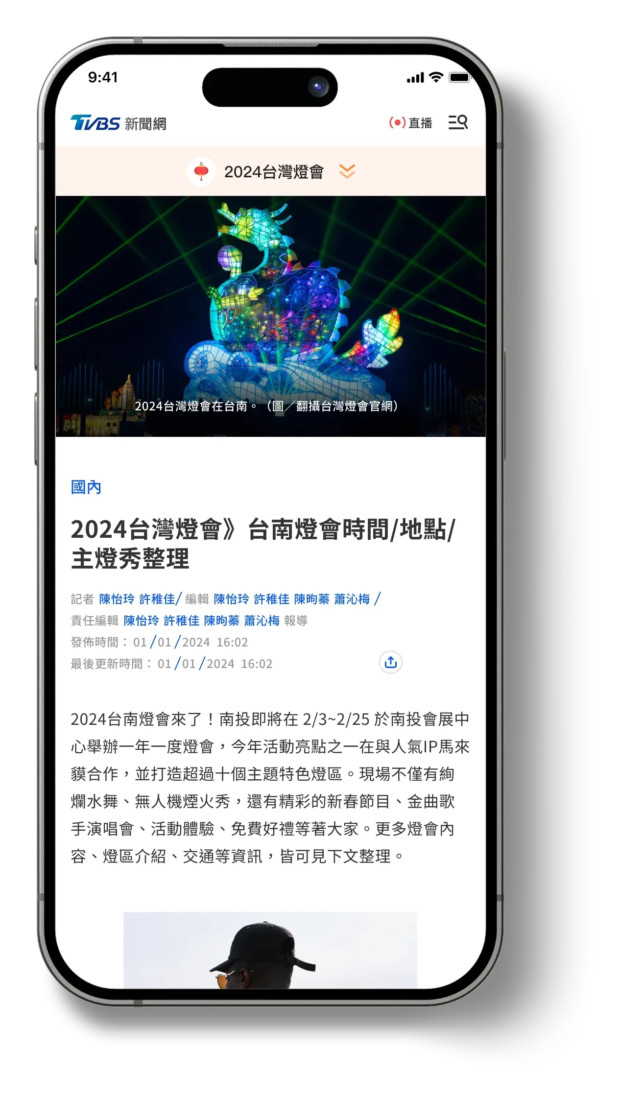
Concepts 10 & 11, plus supporting systemA larger, quieter article — reached by taking chrome away, not by adding space.
Preserve the premium sky banner, anchor the article with a large magazine-style image, and strip what the page had accumulated around it.
- Removed or nested
- Duplicate share buttons, font-size controls, and the 24-category nav — consolidated into a single hamburger menu.
- Reformatted
- Ad units restructured as list-style items, low-engagement tags grouped horizontally to reclaim vertical space.
- Outcome
- A larger, quieter content area with readability as the organising principle rather than ad inventory.





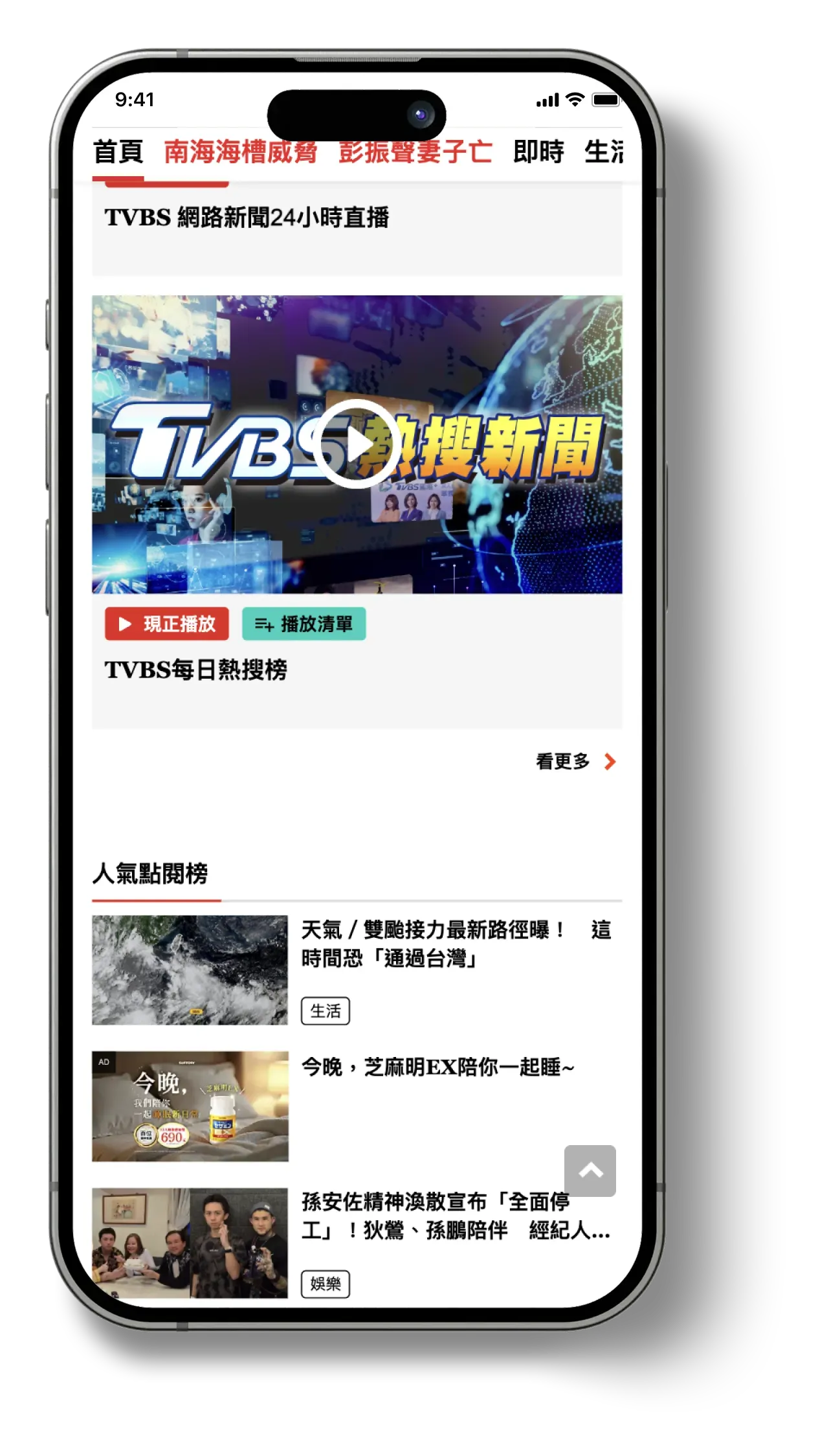
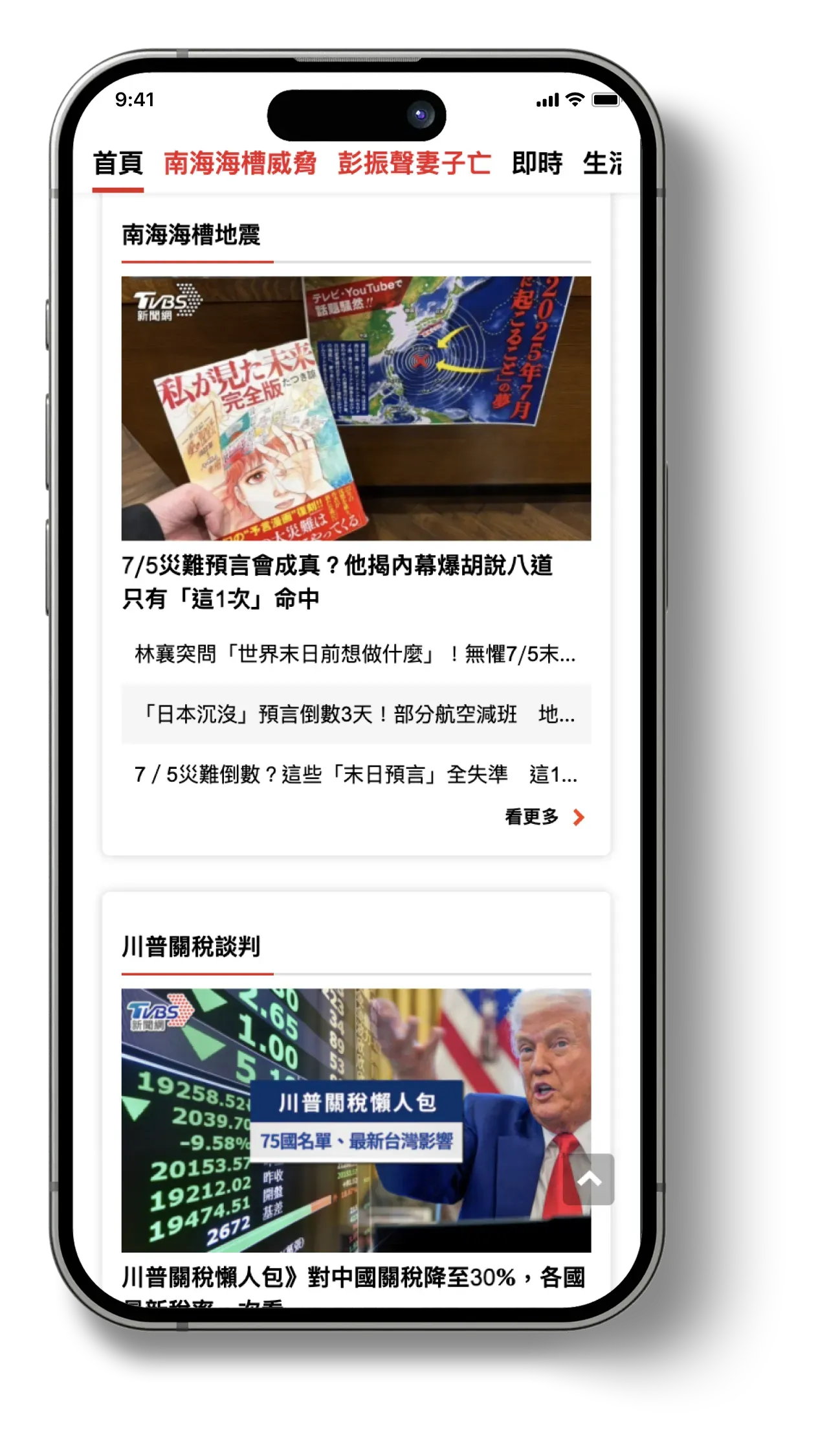
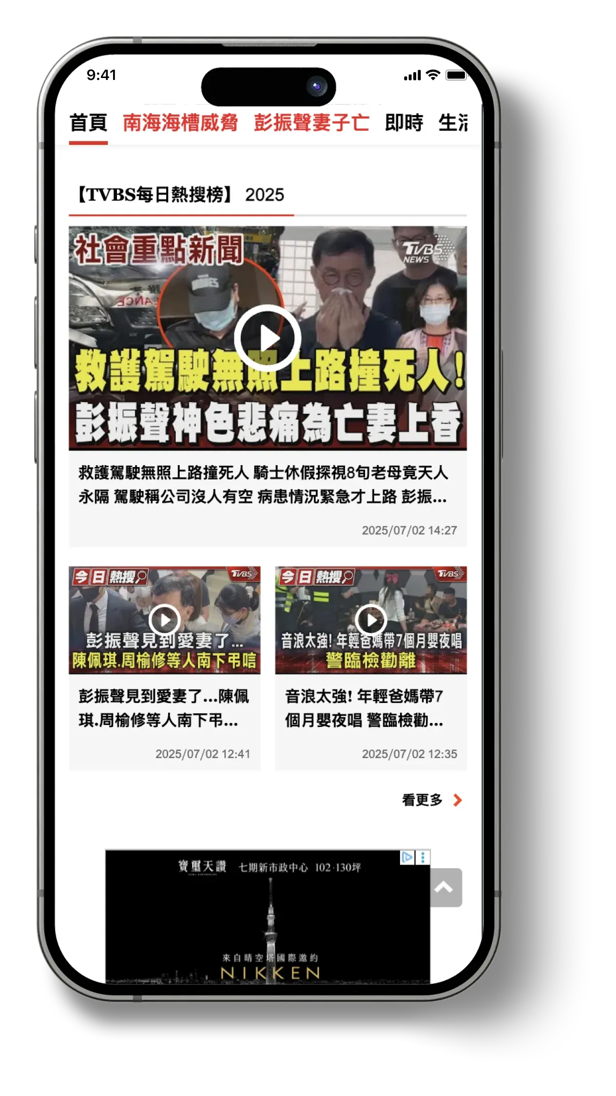
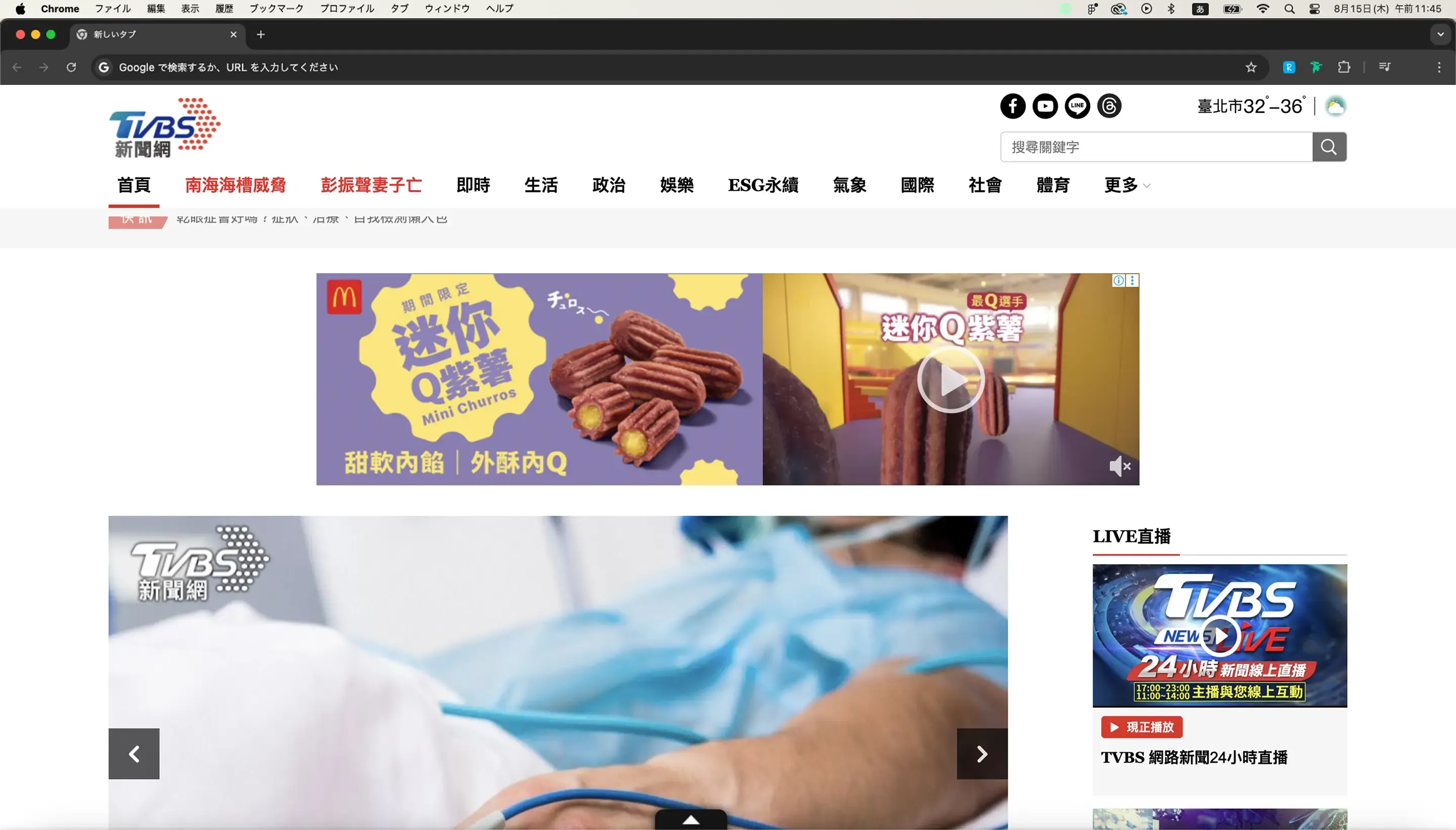
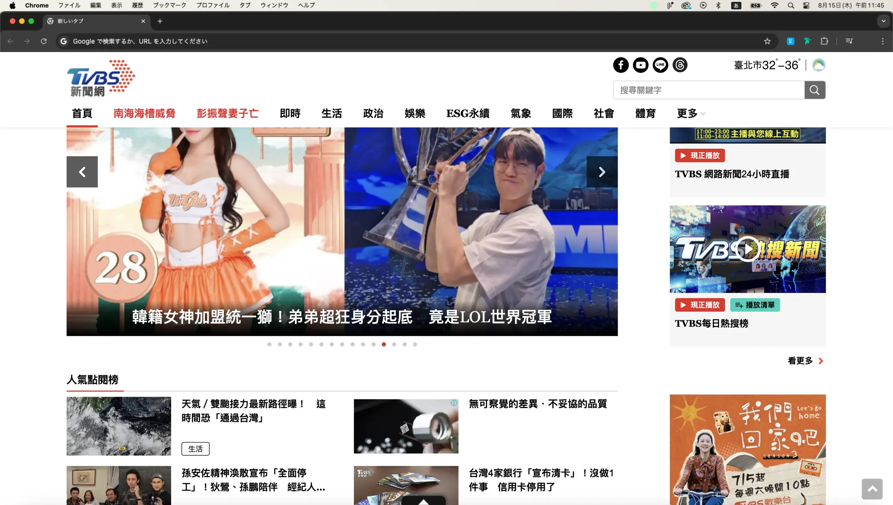
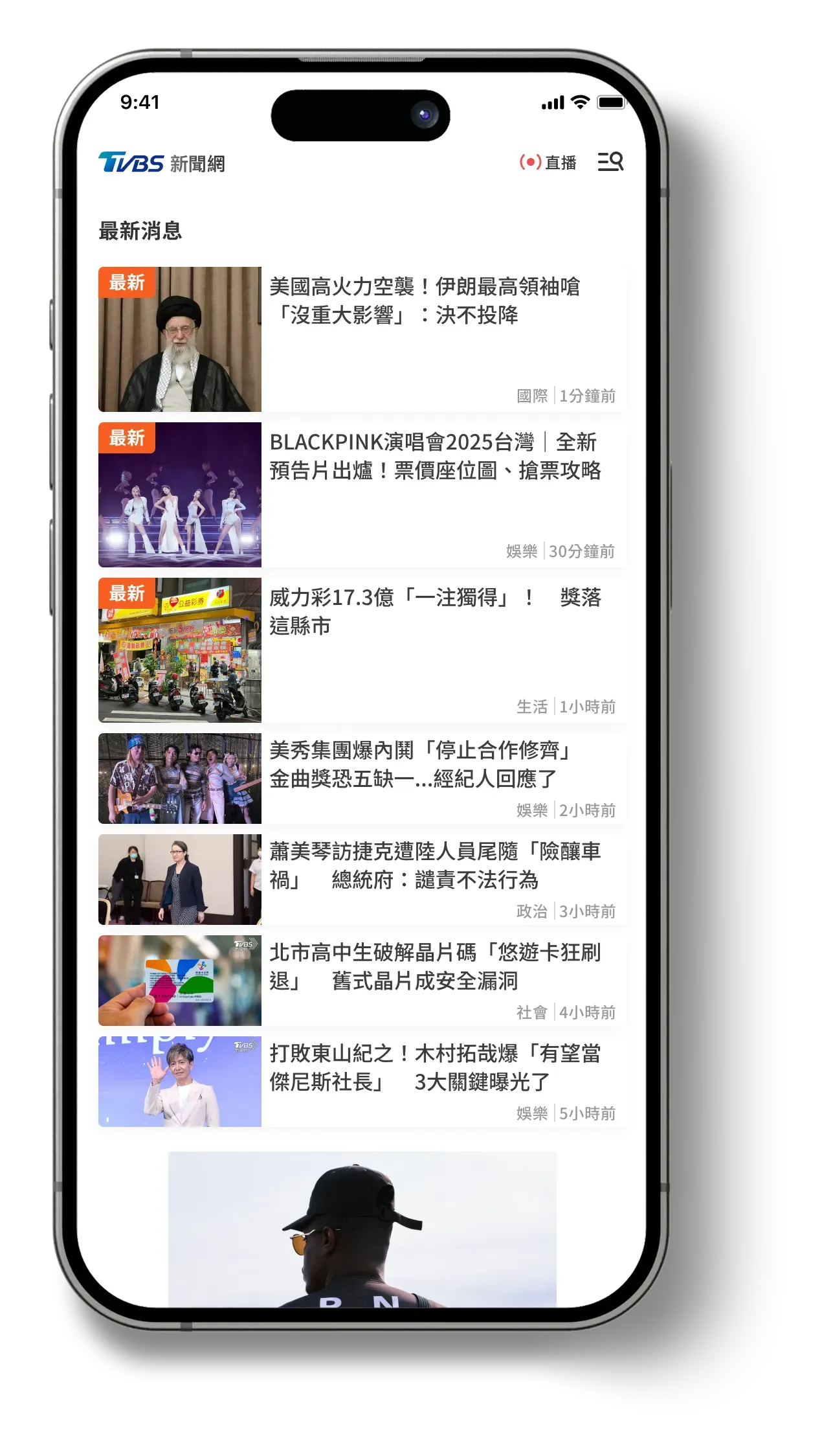
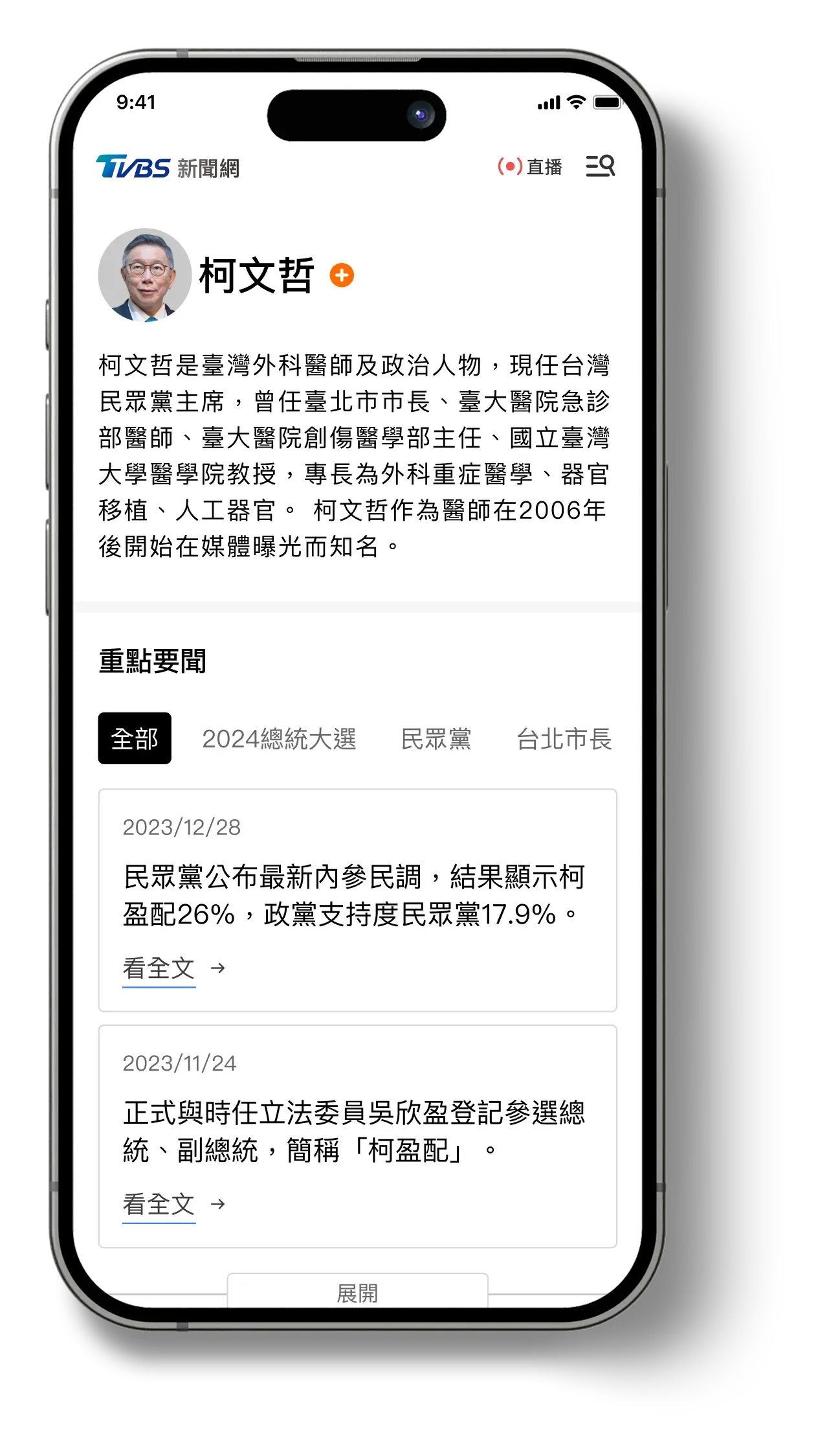
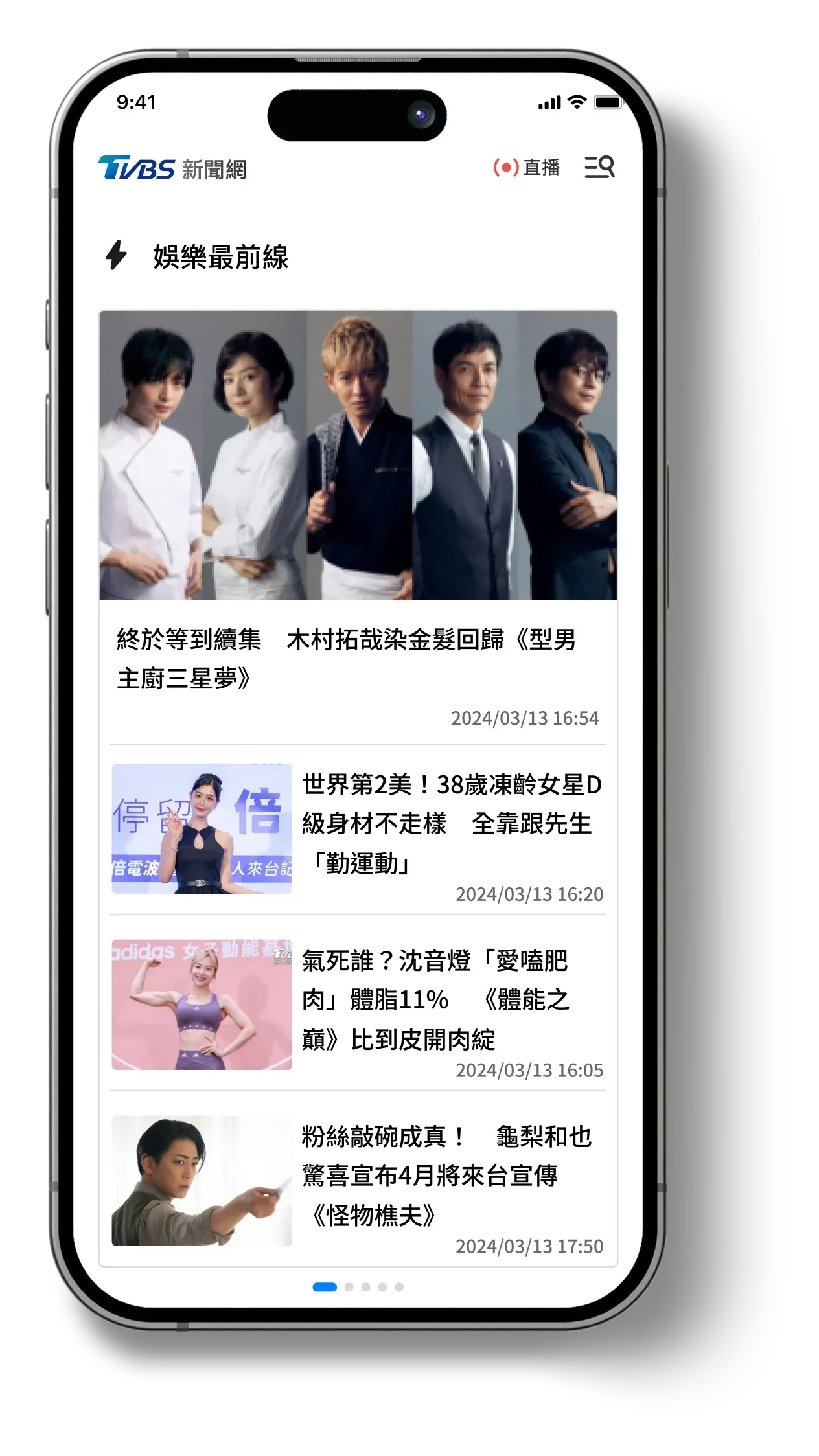
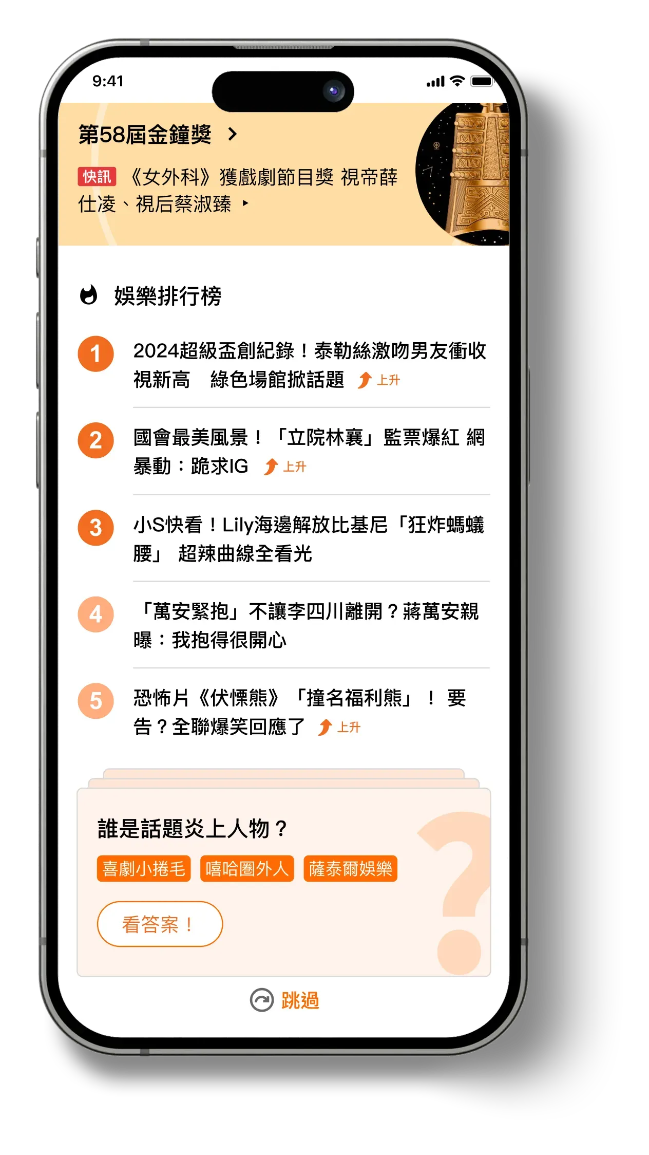
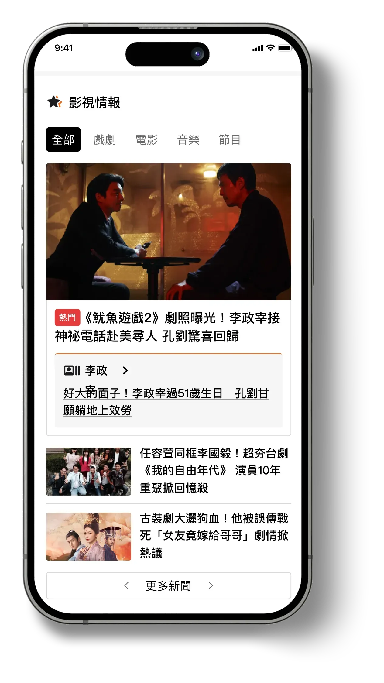
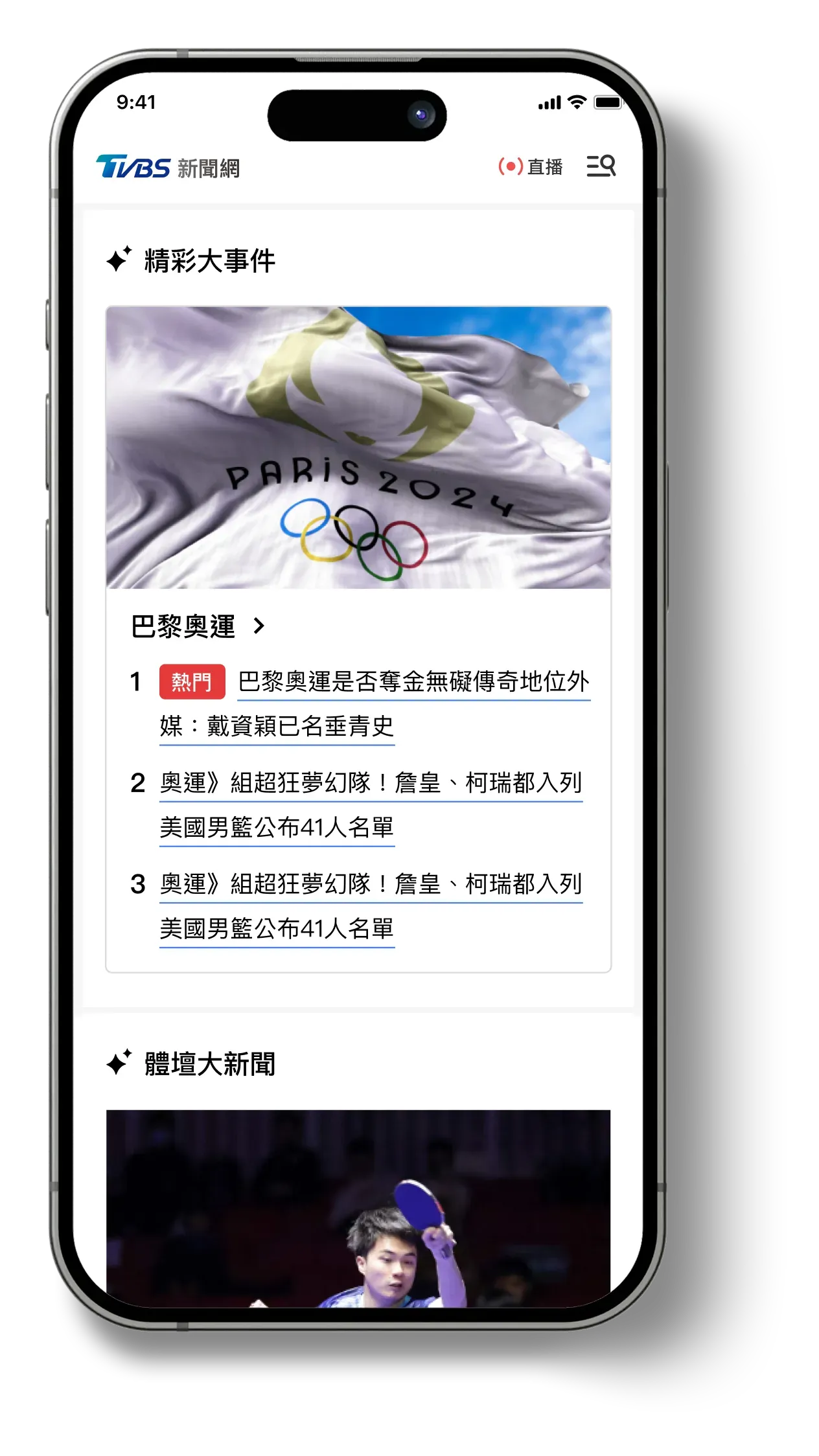
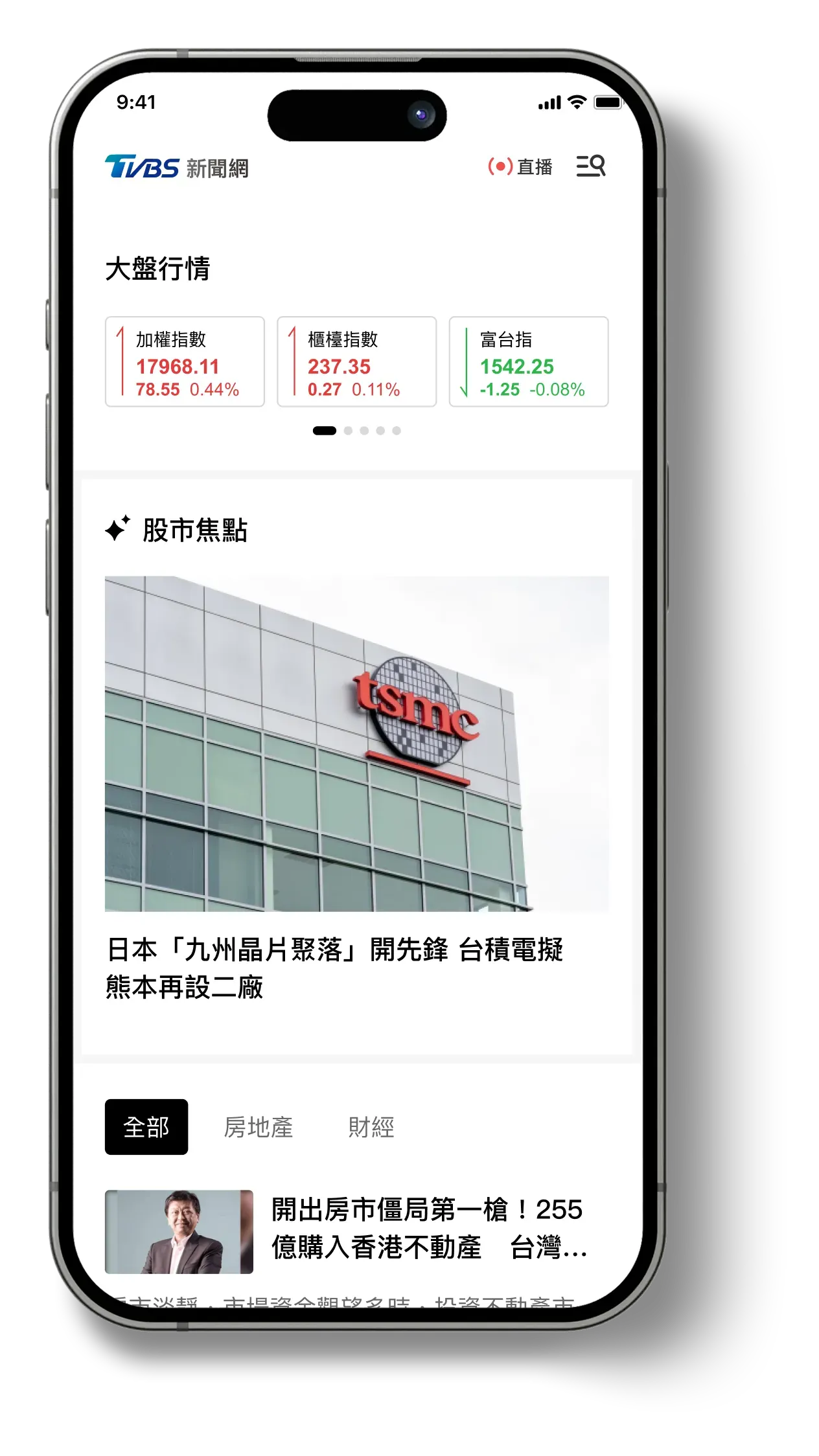
The homepage was treated as a brand surface, not as a list.
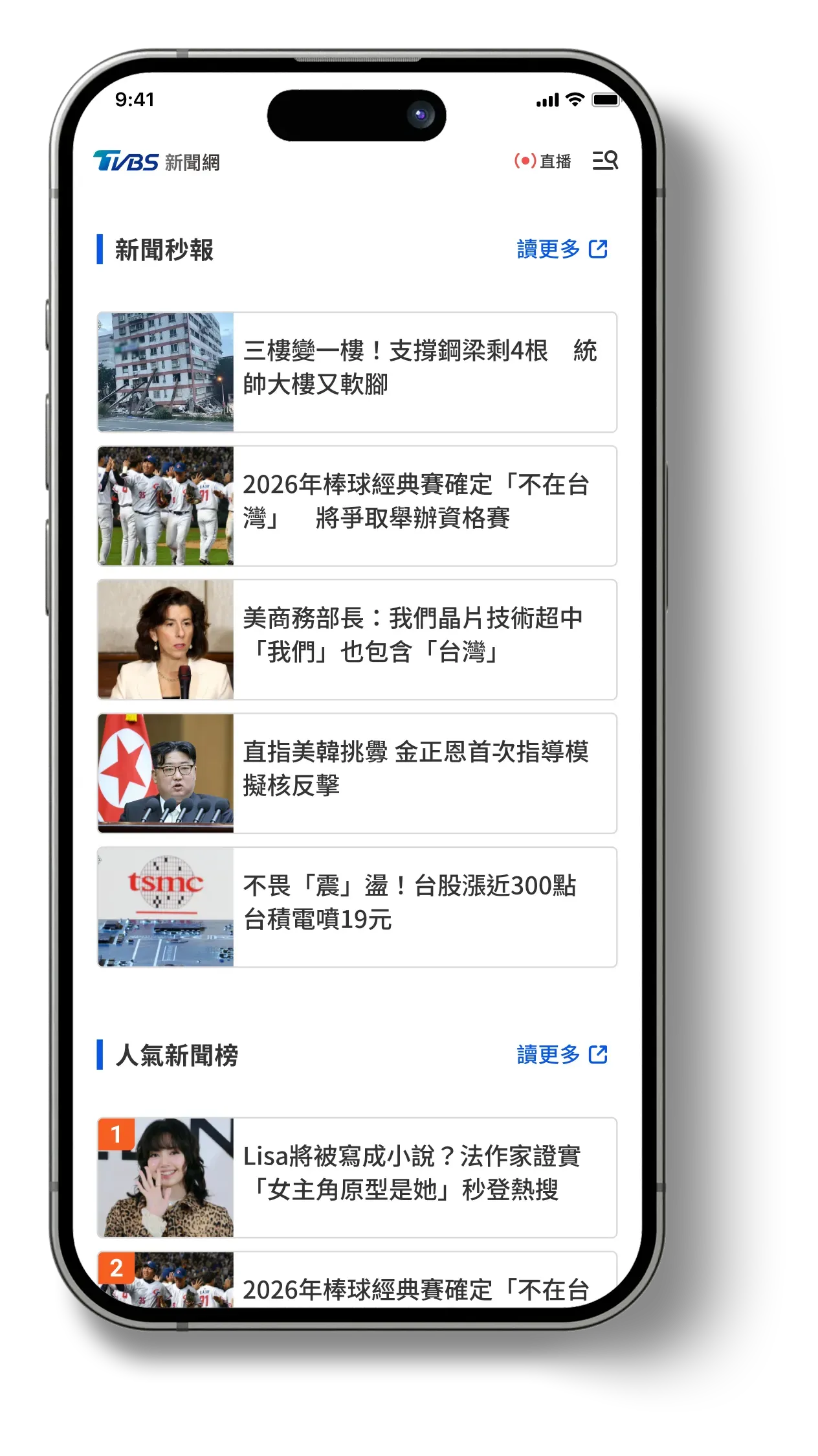
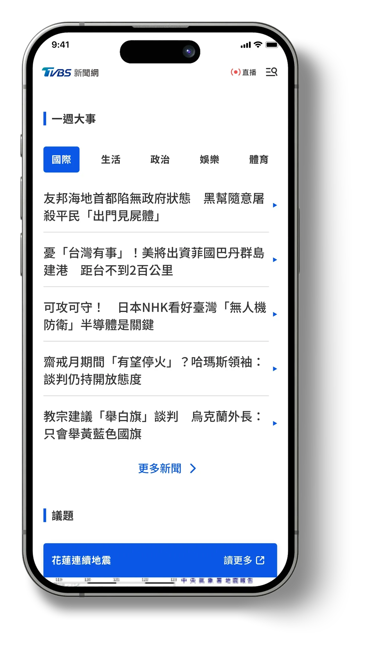
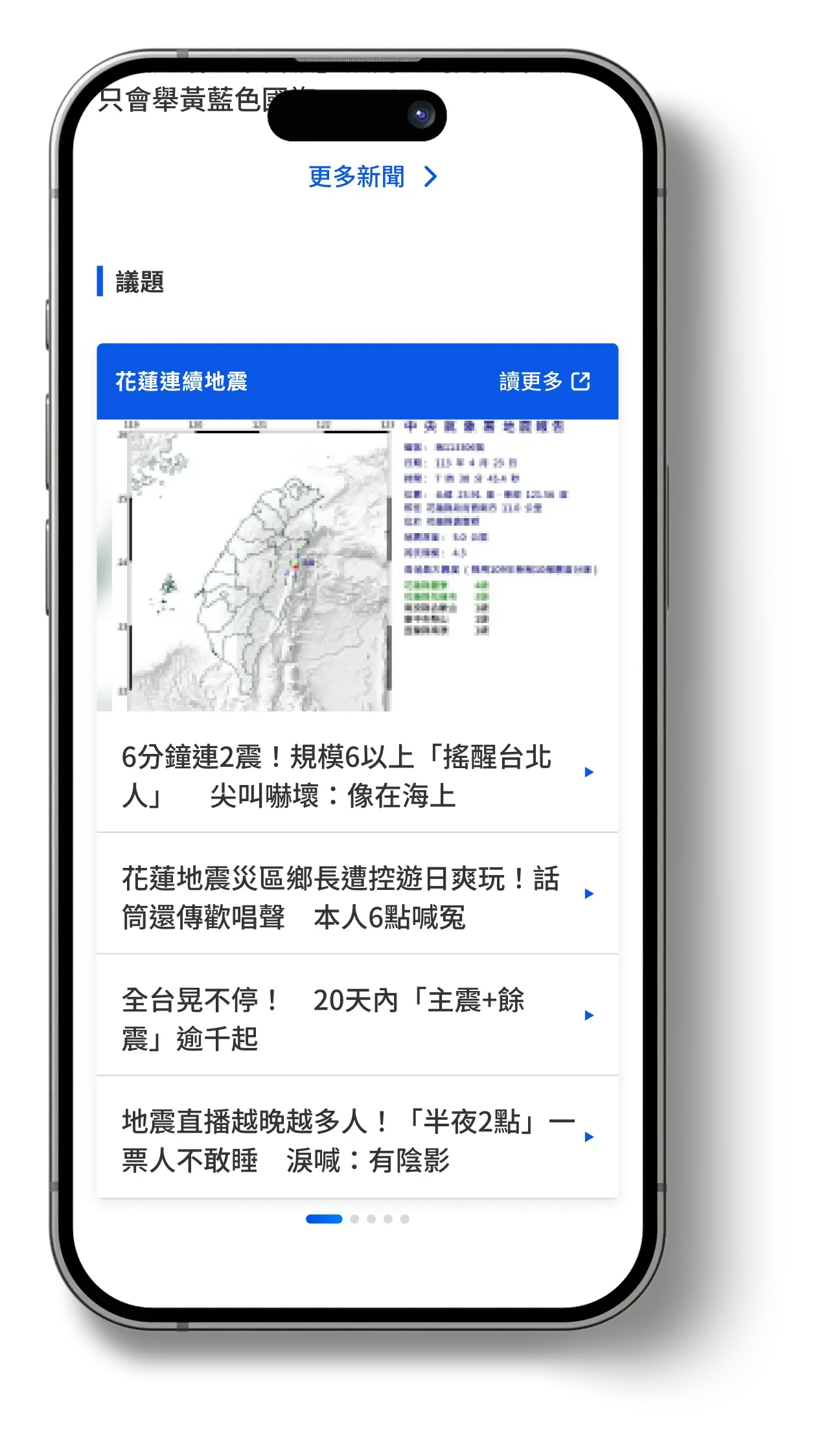
Homepage traffic is lower than article traffic, but it shapes perception and referral paths — which makes it the wrong page to optimise for throughput alone.
- Structure
- Multi-story carousel, a Week in Review summary, and an Upcoming Events block, organised by recency and importance.
- Extensibility
- Blocks designed for future personalisation, with flexible ad space reserved where revenue weight is lower.
- Outcome
- Brand expression and information access held in balance, with generous spacing to reduce visual fatigue.



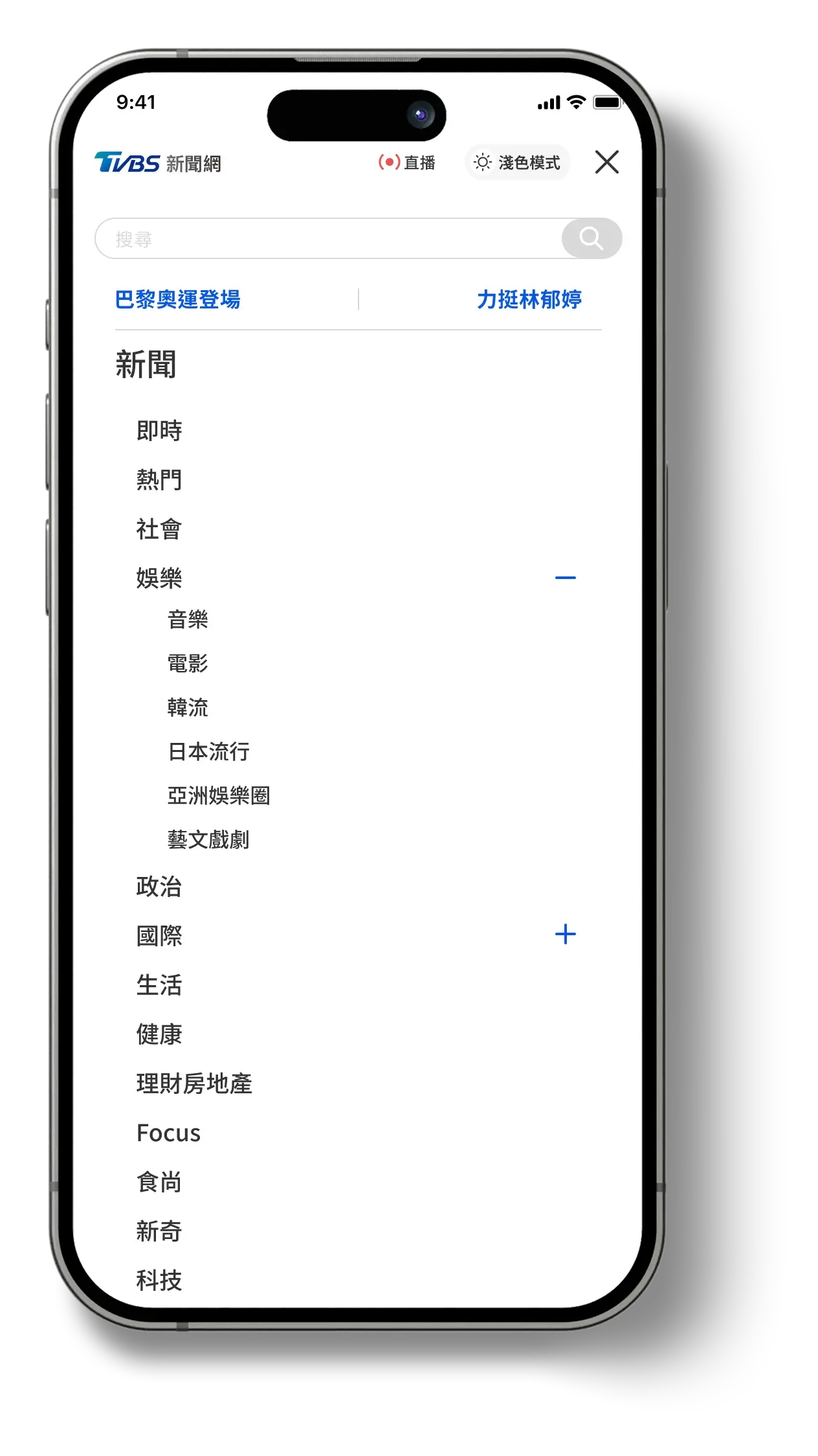
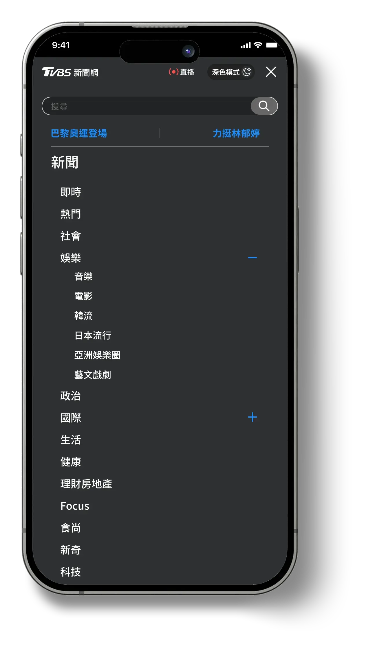
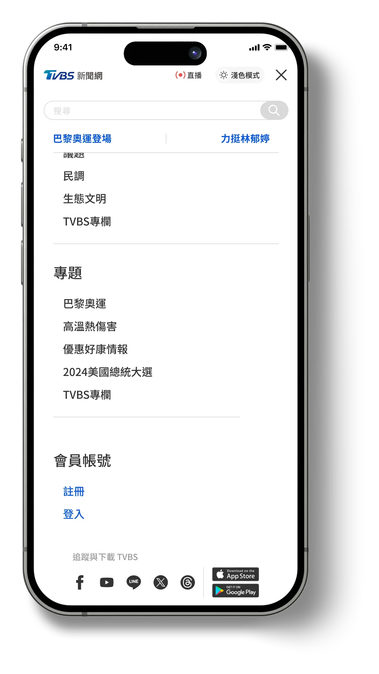
Consolidate the navigation first, then build the components that keep it consolidated.
The site is content-heavy and ad-dense, and the editorial team is the one who has to live in it — so the job was to minimise their overhead while protecting brand value.
- Menu
- Scattered navigation consolidated into one scalable structure — search, issue packages, full categories, account, newsletter, theme toggle.
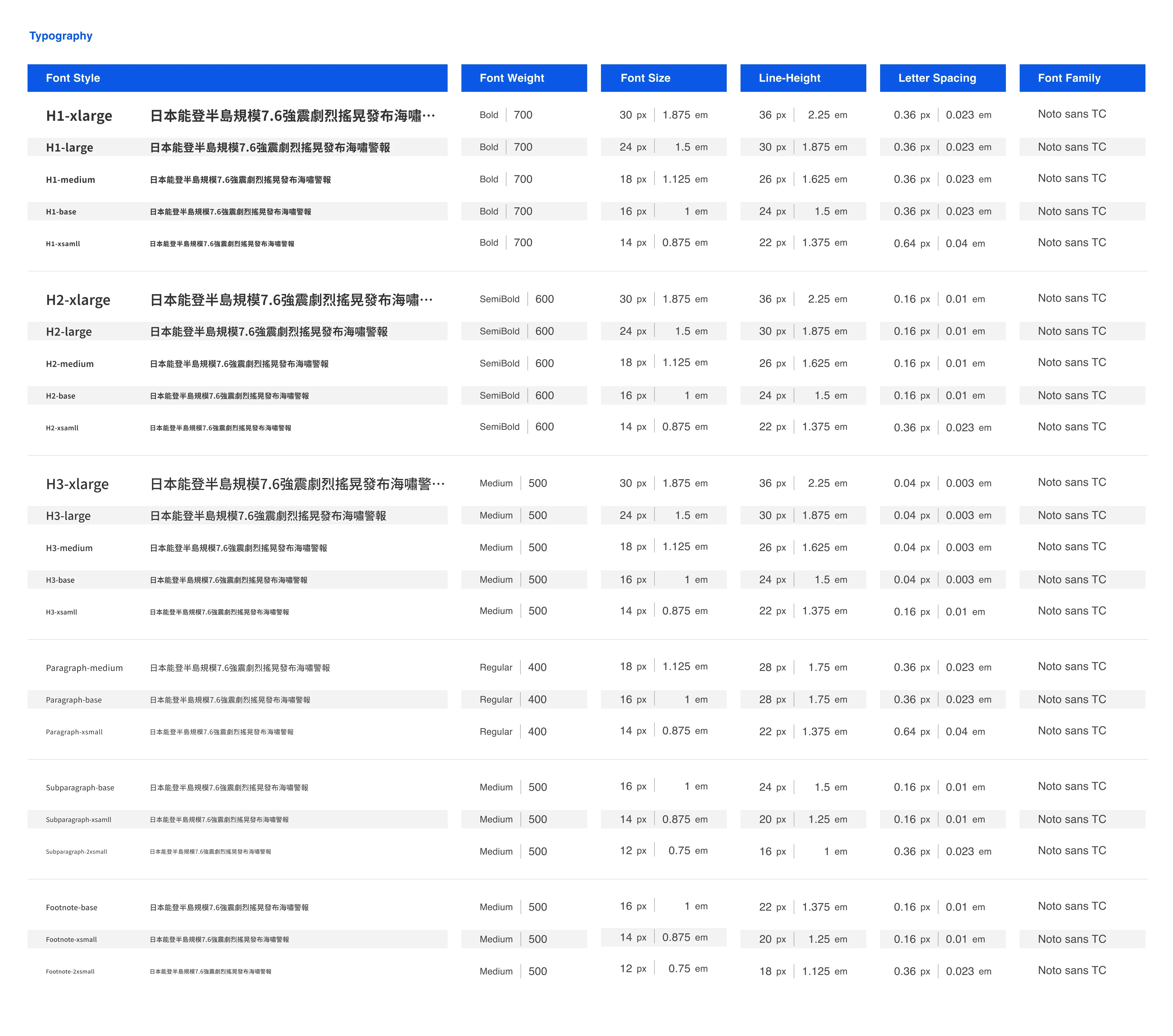
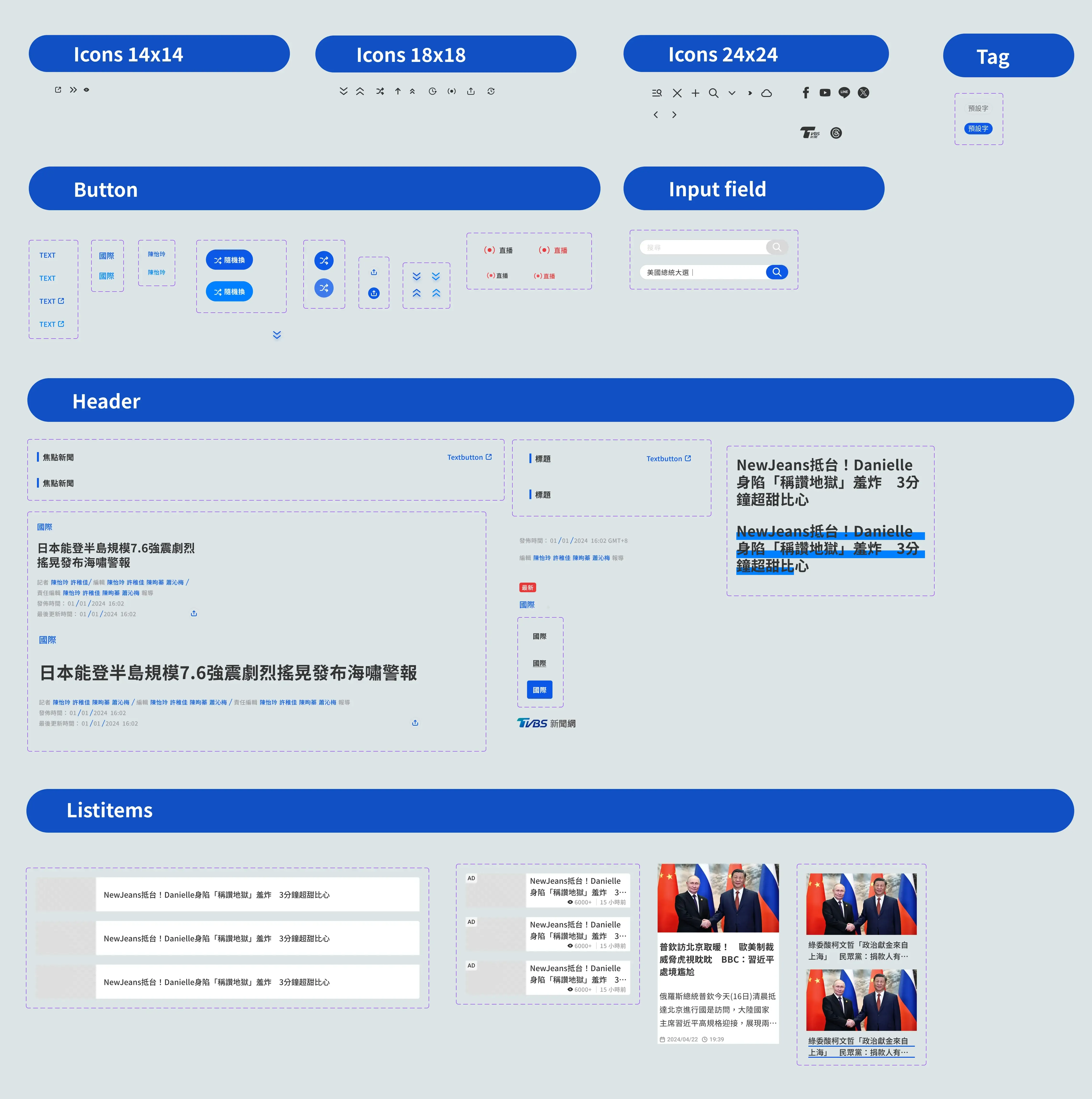
- System
- Typography, colour tokens and a component library anchored in TVBS blue, built so editors could vary layout without breaking consistency.
- Anticipates
- Nested submenus as the editorial team expands its content offering.
Palette
- Blue 100
- #60AAF2
- Blue 200
- #3D9AF6
- Blue 300
- #1B8DFF
- Blue 400
- #0080FF
- Blue 600
- #0B57E6
- Blue 700
- #215AC4
- Orange 300
- #F28155
- Orange 400
- #FF6D33
- Orange 500
- #F65E22
- Orange 600
- #FF4800
Icon
- indicator-secondary
- Grey 400
- indicator-primary
- Grey 200
- primary
- Grey 800
- secondary
- Blue 600
- logo
- Blue 600
- live broadcast
- Red 400
Text & action
- text-primary
- Blue 600
- text-primary-hover
- Blue 400
- action-primary
- Blue 600
- action-primary-hover
- Blue 400
- action-surface-primary-hover
- Blue 600
- action-primary-inverse
- White
- action-primary-inverse-hover
- Blue 300
- disable
- Grey 200
- action-secondary
- Orange 500
- action-secondary-hover
- Orange 400
- action-surface-tertiary
- Grey 100
- action-surface-quaternary
- Grey 900
- action-surface-quaternary-hover
- Blue 600
Surface & stroke
- surface-label-latest
- Red 400
- surface-label-section
- Blue 600
- surface-label-ranking
- Orange 500
- surface-label-ranking-inverse
- Grey 100
- surface-primary
- White
- surface-primary95
- White 95
- surface-secondary
- Grey 100
- divider
- Grey 200
- stroke-primary
- Grey 200
- stroke-secondary
- Blue 600
- stroke-secondary-hover
- Blue 300
- surface-pills-hover
- Blue 600
- bg-thumbnail
- Grey 200
- bg
- White
- bg-system
- White
Typography
- title-primary
- Grey 800
- title-secondary
- Grey 600
- title-tertiary
- Blue 600
- body-primary
- Grey 800
- body-secondary
- Grey 600
- body-tertiary
- Blue 600
- footnote-primary
- Grey 600
- footnote-secondary
- Grey 400
- placeholder
- Grey 200
- disable
- Grey 400
- hover
- Blue 400
- bread
- Blue 600
- footer
- Grey 400
Colour tokens as documented in the design system — 47 semantic tokens over a 10-step palette
Explored
Validated, phased for later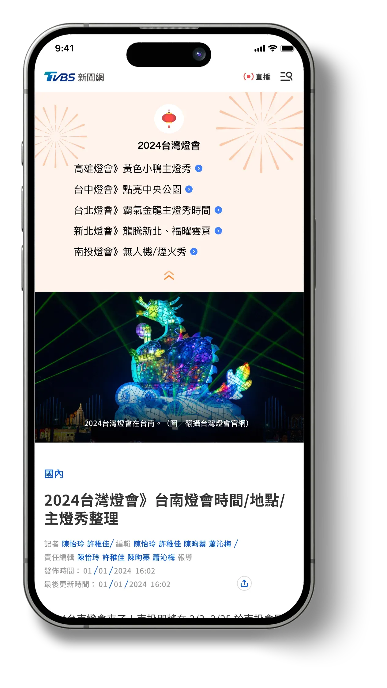




Outcome
The redesign had not launched before I left TVBS. The proposals were aligned with stakeholder KPIs and business goals; what follows is what was validated and handed over, not performance claims I cannot make.
What I took from it
- Constraints are the briefAd revenue was not an obstacle to design around — mapping it explicitly was what made the redesign implementable.
- Design for the system you actually haveShuffle Next exists because the CMS could not support real personalisation. Designing for reader agency was the honest answer, not a compromise.
- Legacy organisations move on evidenceClick-share data settled arguments that opinion could not.