

How might we improve the experience for SME insurers by simplifying and digitising core workflows?
- Company
- OneDegree Global
- Role
- Senior Product Designer
- Platform
- Web, SaaS
- Period
- 2021
Overview
IXT is an enterprise SaaS platform that helps SME insurers digitise insurance operations — underwriting, policy administration, claims. After the 2.0 release I drove ongoing UI, interaction and motion work for the parts where a wrong number costs real money.
I translated agreed UX definitions into production-ready screens, states and specifications, working alongside a dedicated UX designer rather than owning the flows myself — and applied a UX mindset to the execution: hierarchy, task flow, and where a user could plausibly get it wrong.
Goal
Agreed with product & businessLet SME insurers roll out new insurance products faster, in Asian markets where financial regulation is unusually strict.
The platform’s promise was speed at scale. That put the design problem in a specific place: not making insurance beautiful, but making a regulated, calculation-heavy process survivable for the people who run it every day.
The problem
SME insurers face high operational friction and real adoption barriers when they digitise core workflows. The tooling is not the hard part — the cost of switching is.
Scope
Product · Policy · ApplicationFive modules, three prioritised — chosen where business requirements and the daily operator’s needs overlapped most.
I worked with product managers to clarify the proposition and direction, ran competitor comparisons, and sat in on expert interviews with actuaries and insurance product managers. Clarifying the business requirement was the first priority and the one most likely to be wrong: insurance rules are not guessable from the outside.
The challenge
Insurance products carry complex premium and policy-period logic, and several products together produce interlocking rules. The constraint was to deliver clarity inside the existing framework, without growing the design system to fit.
Every new pattern is a cost paid twice — once in design, once in engineering. So the question on each screen was whether an existing component could carry it.
Process
Definition · UI · States · Prototype · Reuse- Align on workflow and rule definitionsConfirmed decision points and exceptions with PMs and UX early, where rework is cheap.
- Translate flows into production-ready UIStructured dense forms and tables with clearer hierarchy, grouping and progressive disclosure.
- Define UI states, validations and edge casesWith engineering: validations, warnings, confirmations, loading, empty, error. Calculation steps had to be explainable, not just correct.
- Use prototypes to reduce ambiguityLightweight prototypes and motion studies for the things a static screen cannot settle — table interactions and step-based flows.
- Scale with reusable patternsDocumented typography, spacing and component usage so delivery stayed consistent without the system expanding.
The frame
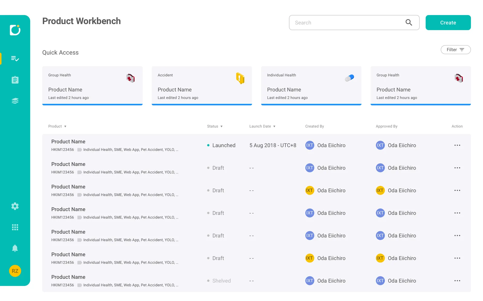
What every module inheritsEvery module had to open on the same frame, so a reader arrives already knowing where to look.
Workbench pages are long and information-dense. Staying oriented is not a courtesy here — a reader who loses their place has to rebuild it before they can do anything else.
- Canvas
- Left navigation and a central content canvas with generous spacing.
- Context header
- Entity identity and status stay visible throughout — policy or product ID, current status, key timestamps.
- Sections
- Card-based blocks break dense content into scannable units, with tables only where a list actually needs comparing.
A review state has to say read-only, not merely be read-only.
After editing, the work gets checked, shared and confirmed. A screen that is safe but does not look safe still gets handled as though a keystroke could change something.
- Reading order
- Information presented as structured blocks to be read top to bottom, rather than as a form standing still.
- Telling
- Disabled fields and read-only styling carry the state, so nothing depends on the user remembering which mode they opened.
- Grouping
- Content grouped by hierarchy, so key facts can be verified without scrolling through raw form fields.
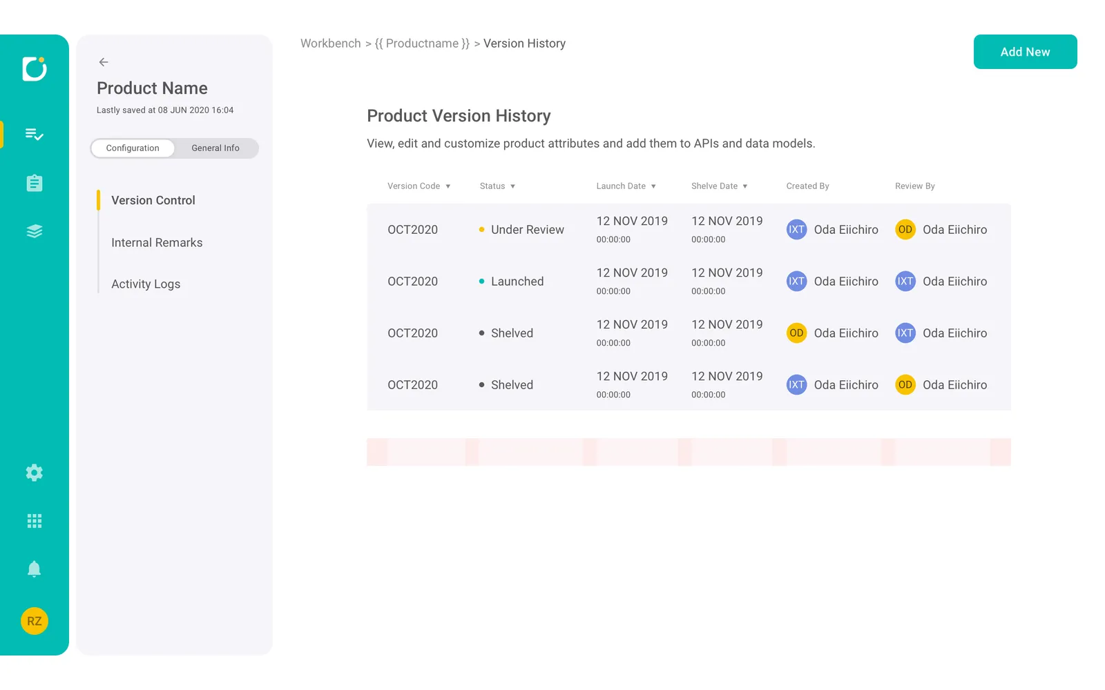
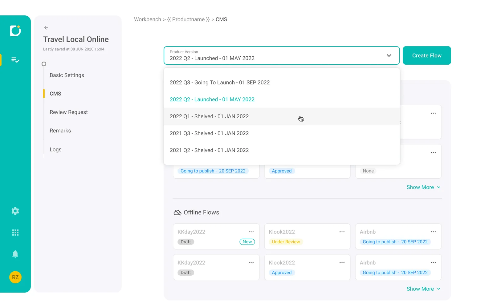
Navigation had to answer two questions at once — where am I, and am I editing the live version?
Decision-heavy work means jumping across areas constantly, and a product is not one thing but a run of versions. Neither question should cost a detour to answer.
- Rail and list
- A fixed icon rail for global areas and an inner section list for the current workspace, collapsible when dense content needs the room.
- Predictability
- Consistent labelling and hierarchy, including expandable groups, so a user can predict where a setting lives.
- Version state
- Going to launch, launched, shelved — the selector puts the state inside the label rather than beside it, so the question is answered by the control the user was already reaching for.
Reading
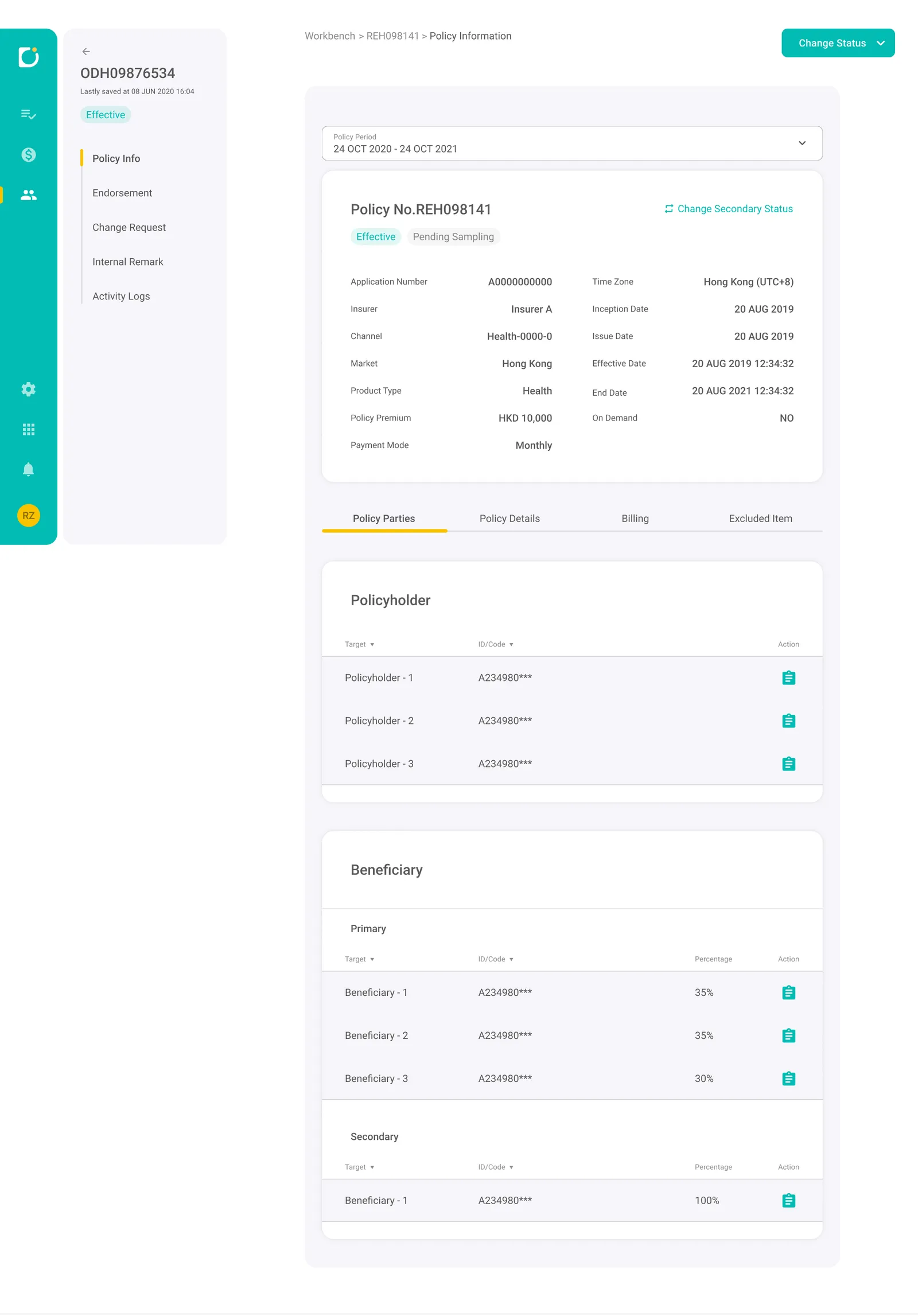
Review first — the state every screen opens inServicing opens in review, and every action is something you reach for deliberately.
Servicing means high-impact operations on a live policy. Whatever state the screen opens in is the one most work gets done in, so the default decides how easy it is to change something by accident.
- Context
- Users need immediate answers to what policy is this, what is its status, what period am I looking at. A summary header carries the policy number, primary and secondary status, key metadata and a Change Status action.
- Actions
- The default is review — readable card sections — with actions pulled out: global at top right, row-level in tables, contextual where they belong. Accidental edits get harder.
- Rhythm
- Every tab follows the same pattern: policy context, section navigation, card blocks, then tables for dense lists. A predictable shape across Policy Parties, Policy Details, Billing and Excluded Item.
- State
- Effective against Pending, Overdue against Paid, renewed relationships. State carries clear labels and badges, exceptions surface their own signal, and status changes live in consistent places.
- Billing
- Billing is designed around what needs attention now — next payment and method up top, then a full schedule with status tags for reconciliation. Excluded Item is an exception workspace with row-level edit and delete.
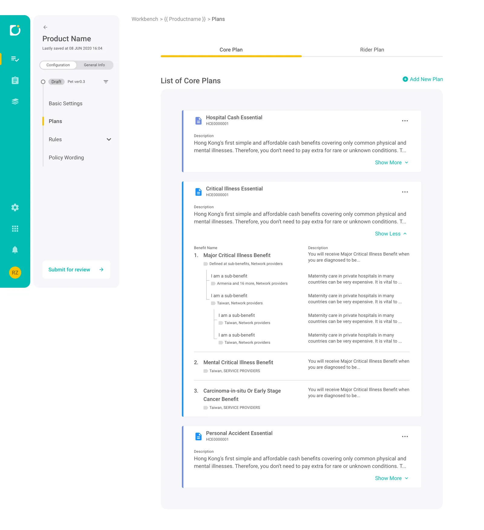
Contract-like content had to become readable without simplifying away detail that is legally load-bearing.
Plan content is dense and nested — main clauses, conditions, riders. None of it can be thinned out, so the only thing left to change is how it is set.
- Hierarchy
- A document-style viewer with real typographic hierarchy and spacing, rather than a form holding legal text.
- Grouping
- Grouping that reflects the clause relationships instead of flattening them into a single run.
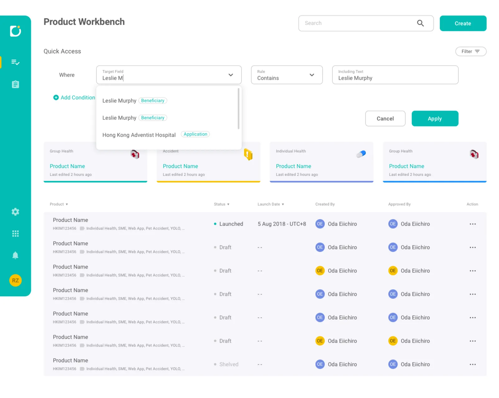
Filtering had to stay reversible — no losing your place, no accidental commits.
Workbench lists need flexible filtering, and a filter is something a user tries several times before it is right. The cost of a wrong one has to stay near zero.
- Panel, not page
- A drop-down from the header, so the list context it is filtering survives the act of filtering.
- Structure
- A Field × Operator × Value structure that scales to multiple conditions, with autocomplete and type labels to prevent mismatches.
- Safe iteration
- Apply and Cancel, so trying a filter is not the same act as committing to one.
Acting
Where a wrong number costs moneyEverything above is what the platform does while nobody is changing anything. What follows is what it does when somebody is — which on this platform is another way of saying where the mistakes get expensive.
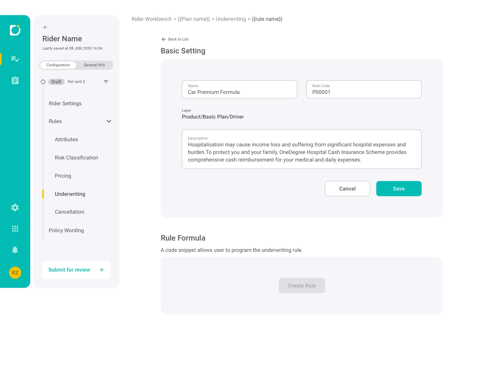
Complex input had to be hard to misconfigure — without anyone relearning the pattern in every module.
Many fields feed calculations and downstream behaviour, so an error here is not a typo — it is a wrong number that reaches a customer.
- Hierarchy
- Long forms structured into consistent sections and blocks; headings, spacing and alignment say what belongs together and what depends on what.
- Reuse
- Dropdowns, toggles, add-another rows, inline help and table actions standardised, so the same interaction behaves the same everywhere.
- States
- Editable against read-only, required against optional, validation and warnings — the difference between a mistake caught and a mistake shipped.
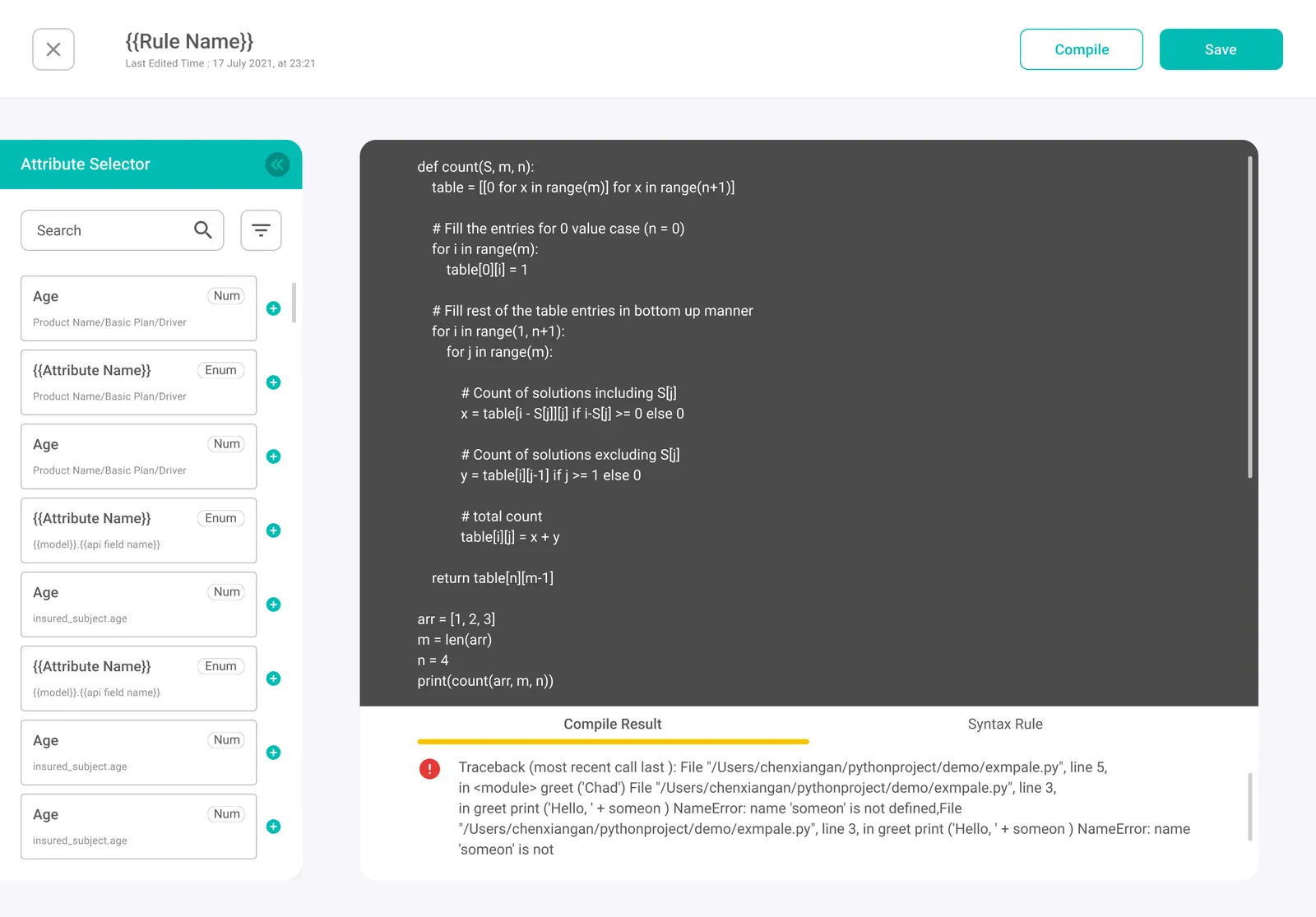
Rule authoring needed its own workspace that still belonged to the platform.
Advanced rules are written, not configured. The workspace had to balance focused writing against fast attribute discovery, and keep errors readable while both are happening.
- Layout
- Left tools and right content, matching the workbench so context switching stays cheap.
- Discovery
- A collapsible attribute selector — expand to search, collapse for focus. Two patterns behind it: hierarchical layer filters for browsing, search with type cues (Num, Enum) for speed, and insert actions to cut copy-paste.
- Feedback
- Compile result and syntax guidance in their own area, so debugging never leaves the page.
- Surface
- A dark editor against lighter UI, which says this is code without a label.
- What these are
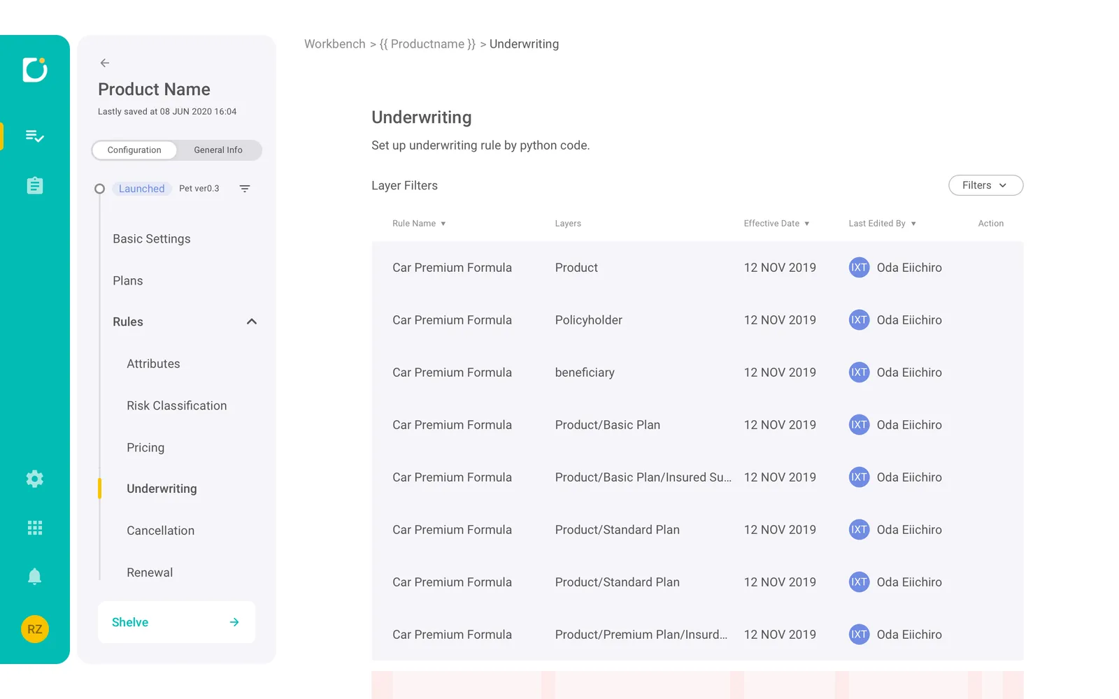
- The underwriting rule list in its three states — nothing yet, a draft, one that has launched — the same list in a denser view, and the Excel-shaped premium table that pricing is authored in.
- A note
- The original case put these five screens under the heading “More product module screens” and said nothing else about them. They are here for the reason they were there: they are part of the module and they were built. Nothing is claimed for them that the source did not claim.
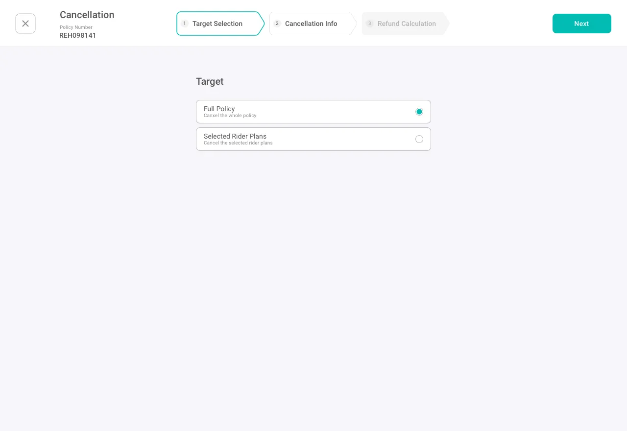
The highest-stakes operation on the platform had to make every decision explicit and reviewable.
A small mistake here cascades — wrong refunds, wrong billing, mismatched documents — and it is usually made under time pressure, halfway through a partial cancellation.
- Steps
- Three steps — target selection, cancellation info, refund calculation — with a persistent progress indicator.
- Disclosure
- Progressive disclosure keeps the default minimal: rider selection appears only for a partial cancellation.
- Attention
- A centred single column with Optional labelling, guiding attention to the fields that matter.
- Verification
- A refund preview with a plan-by-plan breakdown before totals, so the number is checked before it is committed.
Design system
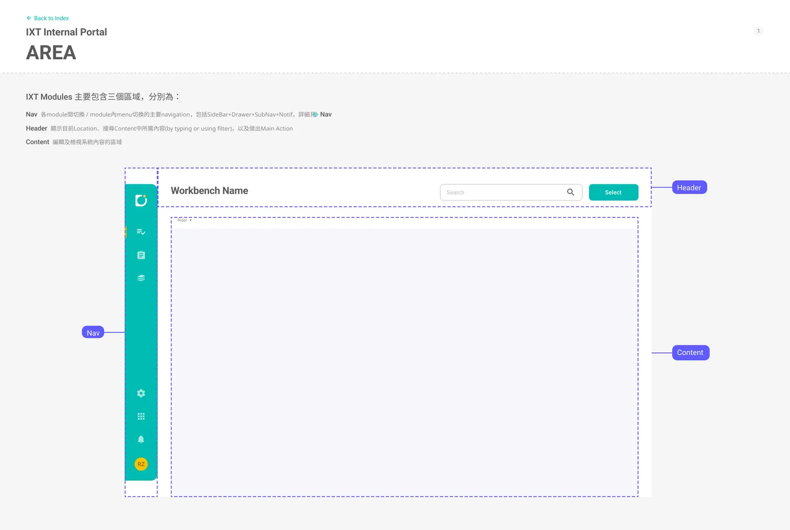
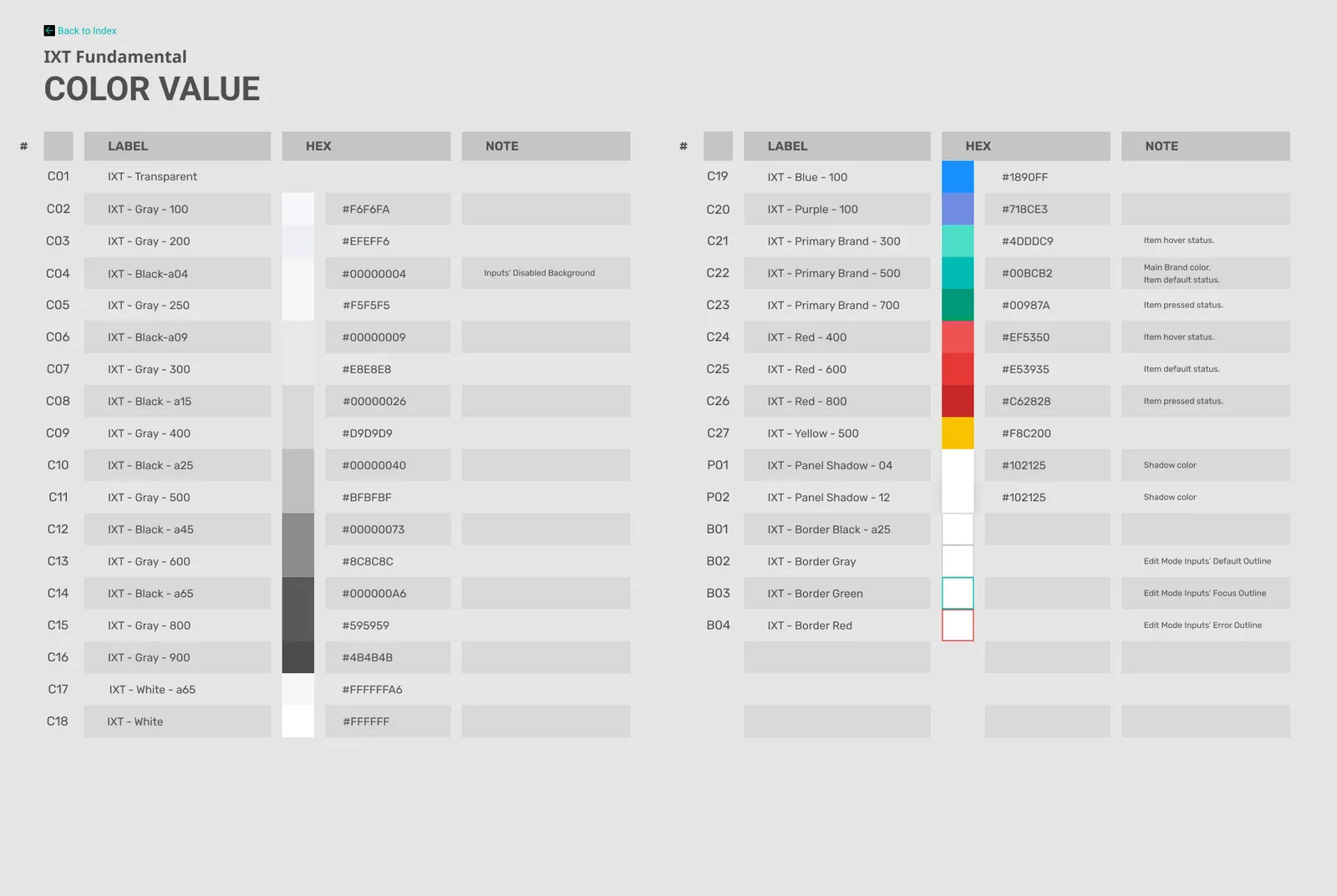
Area → Fundamentals → Components & PatternsAs the platform spread across modules, we needed a shared UI language that could scale without adding rework. I built the visual foundation from the corporate identity, then turned it into rules teams could apply.
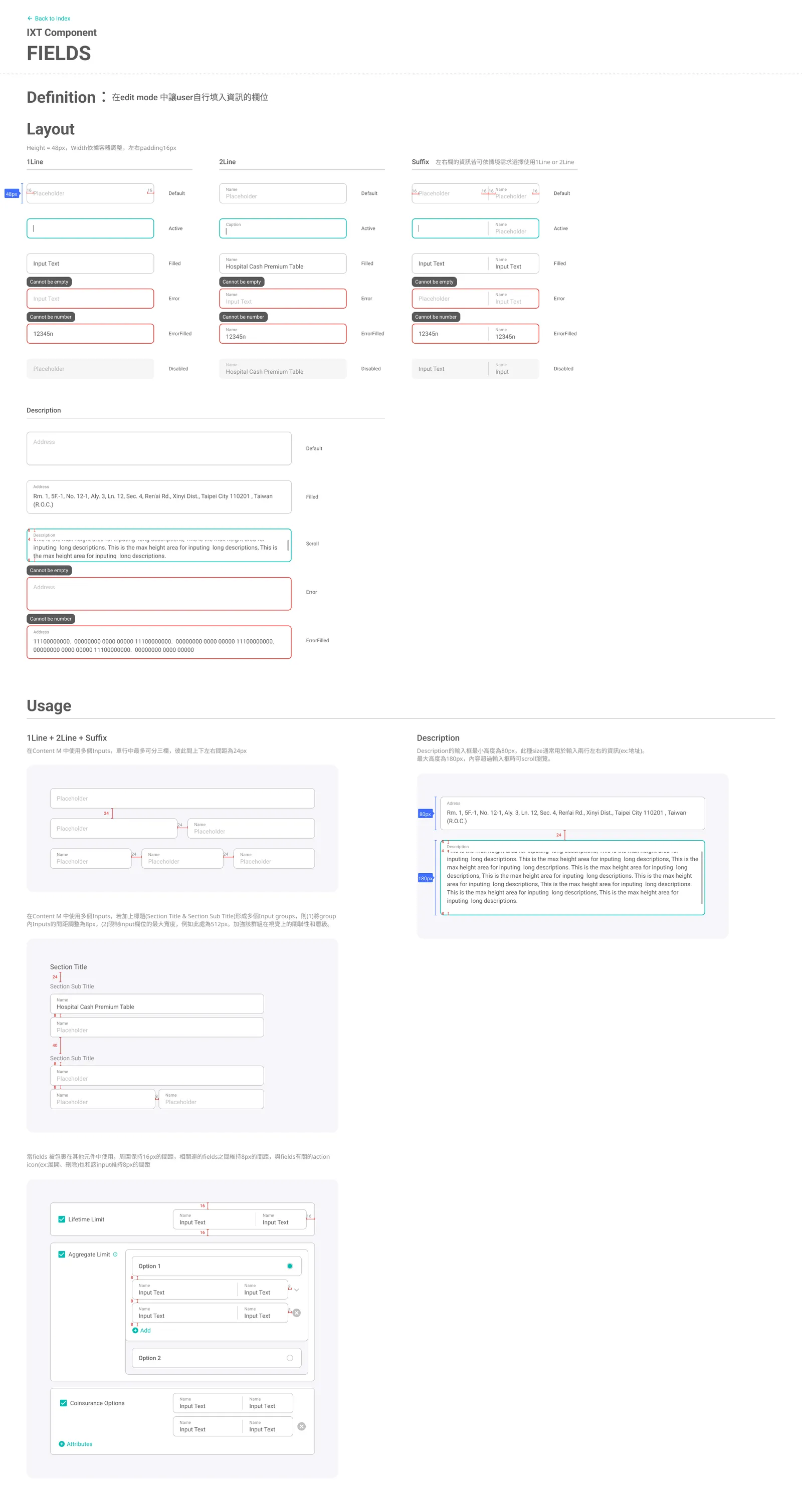
All 21 sheets
Marketing site
Motion, and a page that moves as you read itThe platform has a public face as well as a product one. Two pieces of it: the motion that carries the brand, and a landing page whose sections arrive as you scroll rather than sitting still waiting to be read.
Both are the same argument the product makes, aimed at a different reader. A workbench earns trust by being predictable; a marketing page earns attention first and has a few seconds to do it. The motion is what buys those seconds, and the scroll design is what spends them in an order somebody chose.
Outcome
The platform shipped and kept shipping. What the design work bought was a floor under the complexity — new modules could be built without renegotiating how a form behaves.