How might we craft a distinct and seamless experience that embodies HTC’s brand values?
- Company
- HTC
- Role
- UI Designer
- Platform
- Mobile
- Period
- 2012–2016
Overview
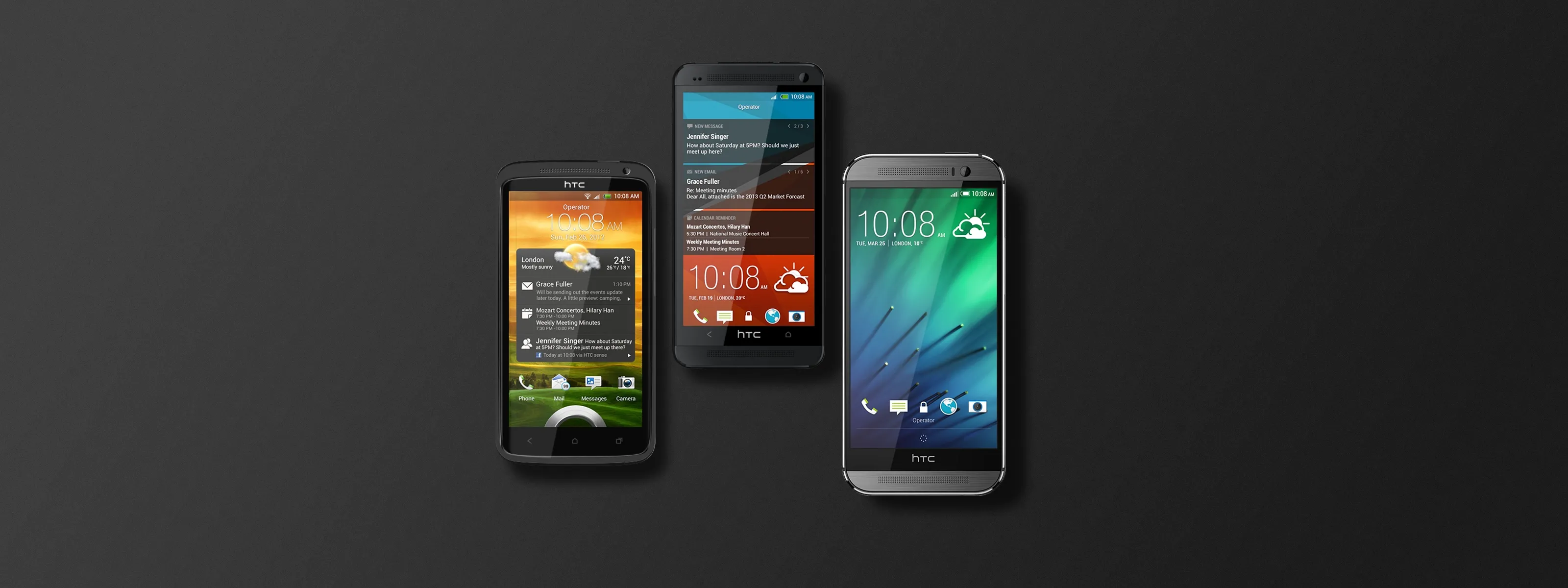
HTC Sense is the flagship system: interface, experience, and everything that gives a generation of phones its character — icons, wallpapers, themes, motion, applications. Across four years the job was to keep making that character recognisably HTC and not merely different each year.
I joined as a visual designer in 2012, on UI and motion, assets, themes and wallpapers. Working alongside the UX designers, I made sure the UI landed as one thing with the experience they had defined — and then followed it into engineering, both to hand their work over and to watch the build against the design guideline.
Motion, before there were tools
Animation as the test, not the polishAt the time there was no convenient way to build a page transition, and nothing to prototype an experience in. So motion was not applied at the end — it was how we found out whether the experience worked at all.
That inverts the usual order and it is the most transferable thing on this page. Designing the animation was the act of deciding what the interface was telling the user: where they had come from, what had just changed, what was now available. An animation that could not be followed was a flow that could not be followed, and it failed at a point where it was still cheap to change.
live.me
A diary nobody has to remember to keepA personal timeline. The phone already records where you went, what you opened and when — live.me turns that into something you can read back, so the diary gets written without anyone having to remember to write it.
My work here was motion: the transitions between screens, and animation used to settle how the app should behave before there was anything to build it with. The same method as the Sense generations above, on a product with no precedent to borrow from.
The other half was the themes for the memories video — the short film the app assembles out of a stretch of your own history. A theme is a treatment prepared for material nobody has seen yet, which is what makes it a design problem rather than an editing one: it has to hold whatever it is handed, and most of what it will be handed is an ordinary week.
Across departments
Where a system design actually gets decidedThe design team worked against schedule pressure with project management and against feasibility with engineering — assessing what could be built, finding the problems early, and settling the ones that had to be settled.
The lesson that stuck is about timing: engage at the earliest stage the project allows. A visual decision raised late is a request; the same decision raised early is a constraint everyone designs around. Most of what a system designer can actually influence is decided before there is anything to look at.
Lock screen
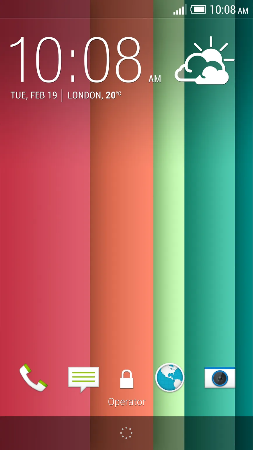
Sense 4+ and Sense 5The lock screen is the gateway: the functions a user can reach before unlocking anything. It is also the first thing anyone sees of a generation, which makes it the densest surface on the system for both use and identity.
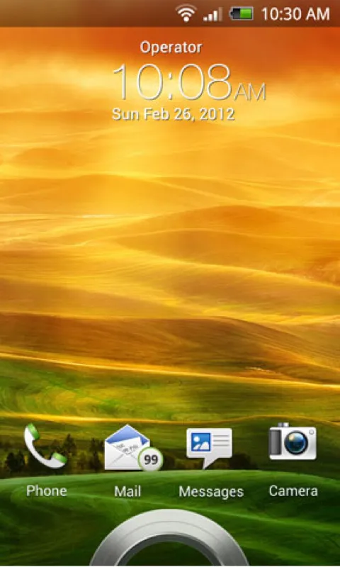
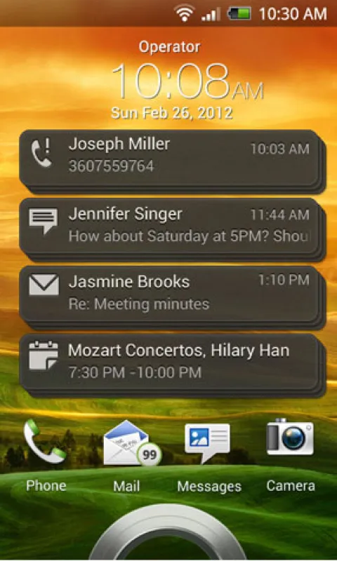
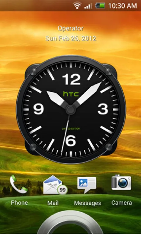
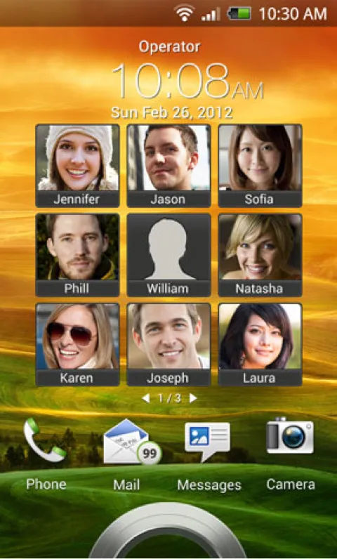
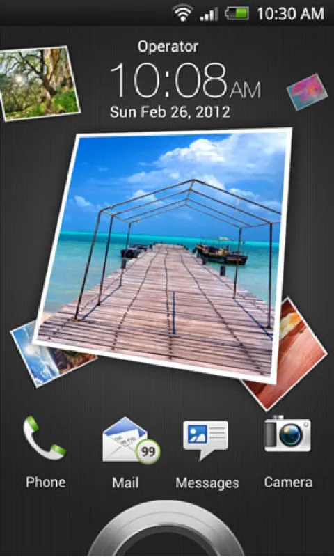
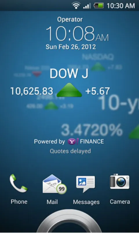
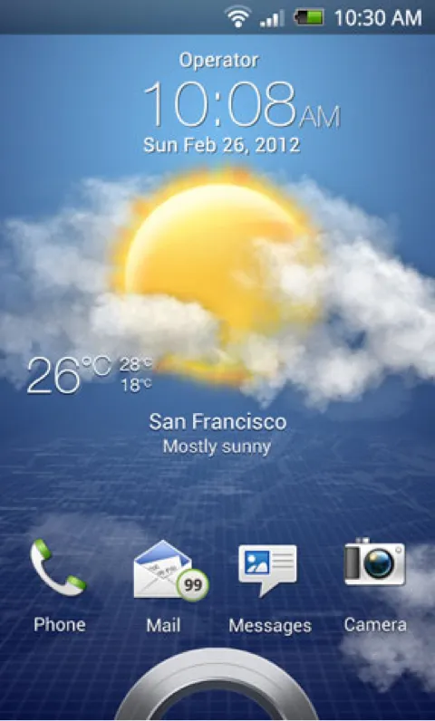
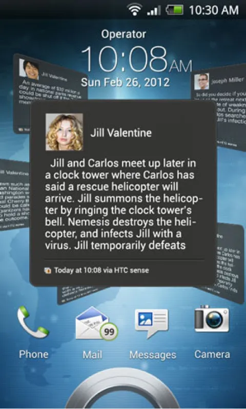
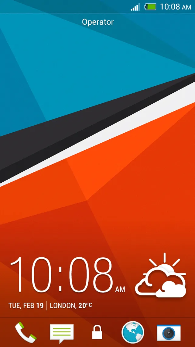
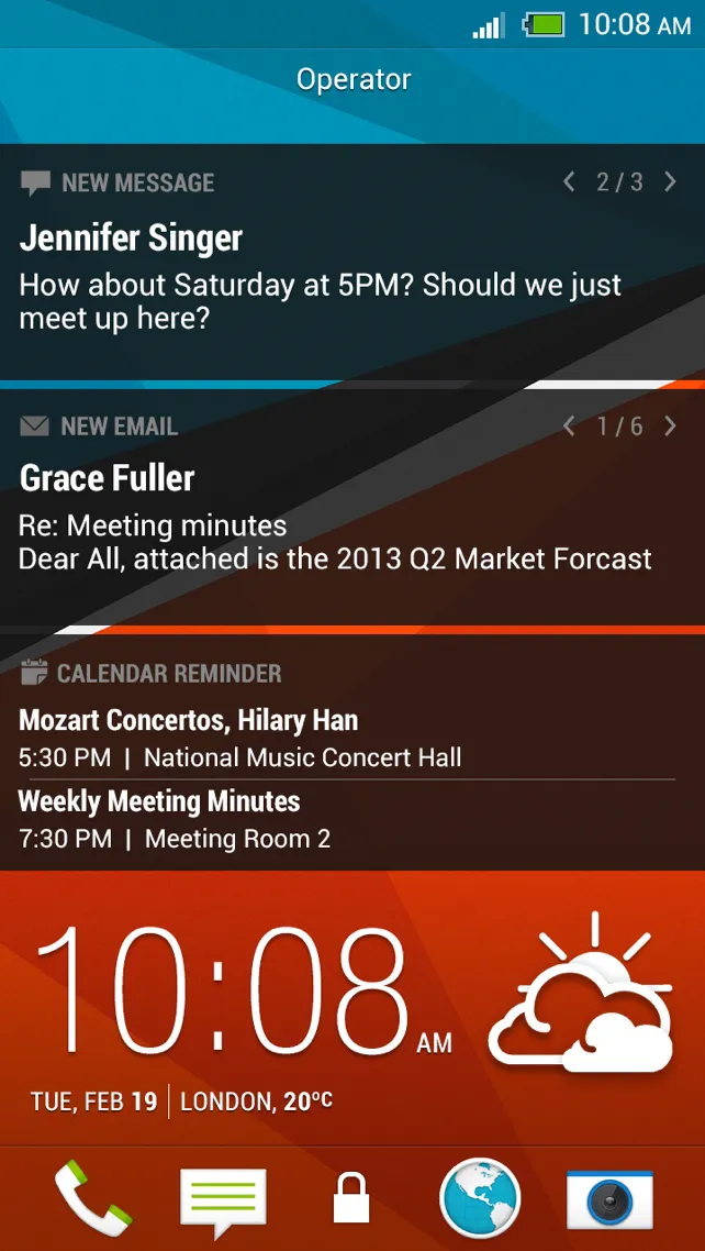
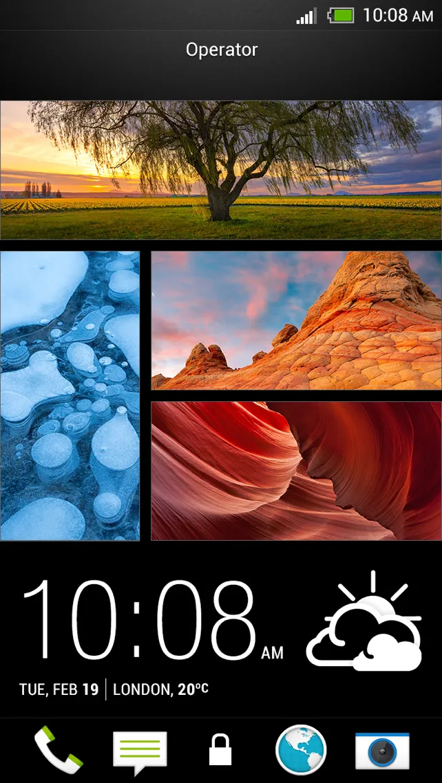
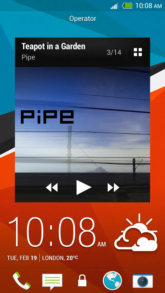
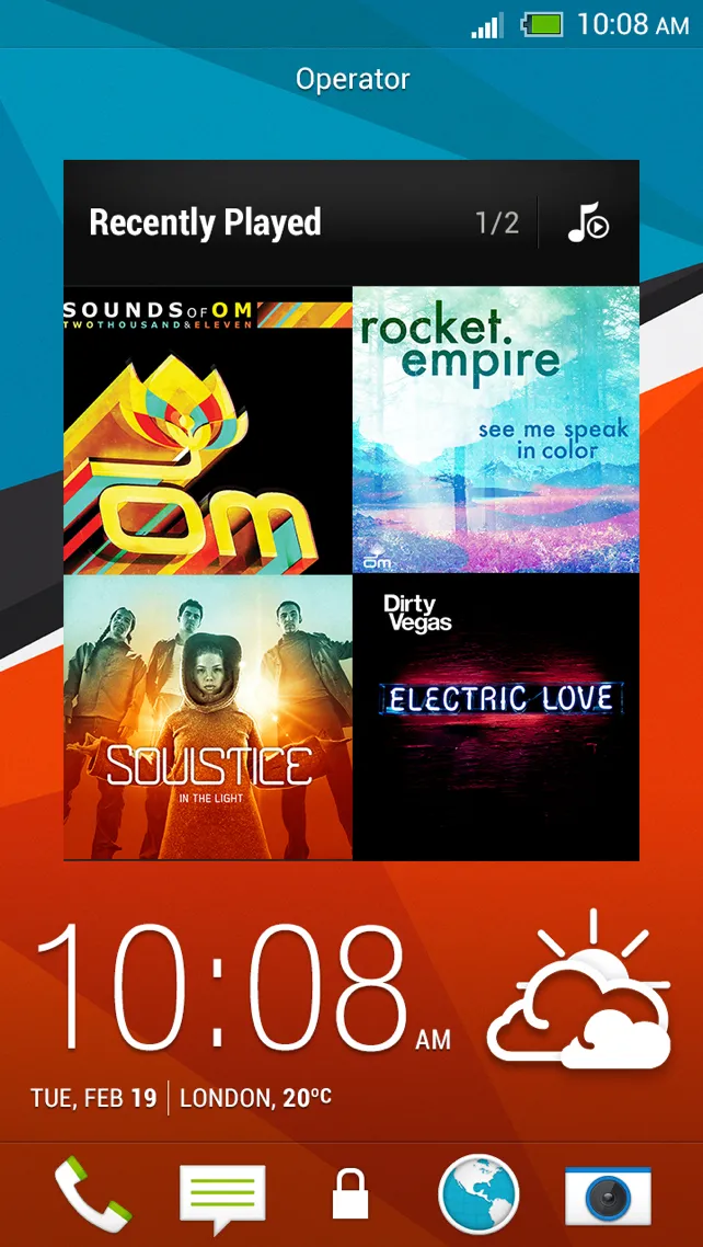
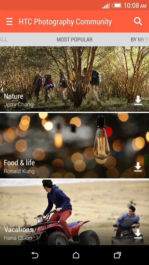
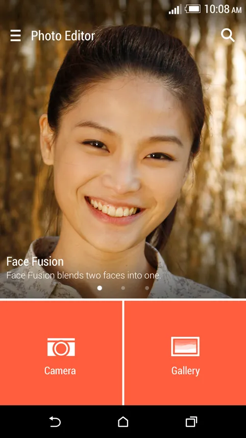
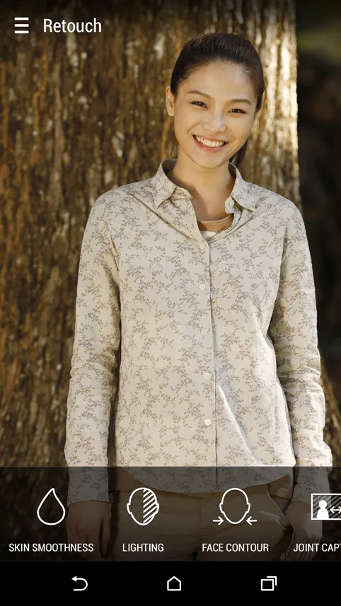
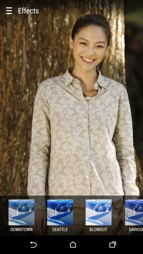
Photo Editor
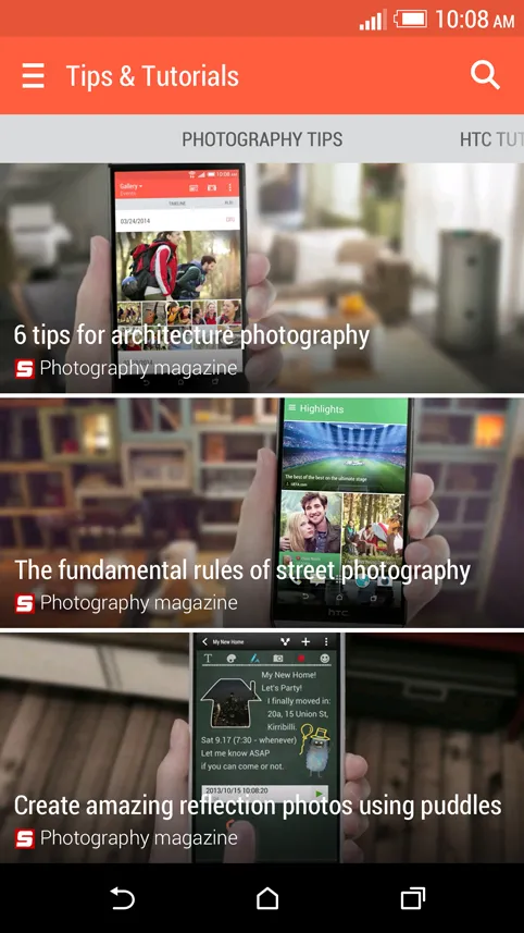
Editing functions, filters, and the community side of it.
Grid and interaction
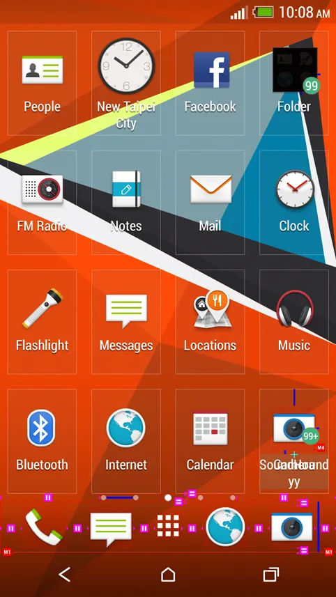
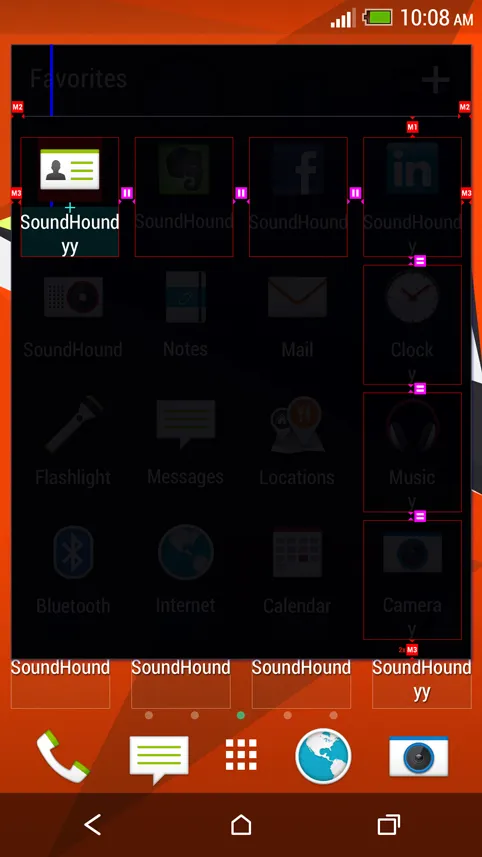
The definition work under everything elseDefining the grid and the margins is what makes a system look tidy rather than each screen look tidy — and defining the interaction is what settles the flow and the motion before either is drawn. A guideline for the home level so the generations after this one had something to be consistent with.
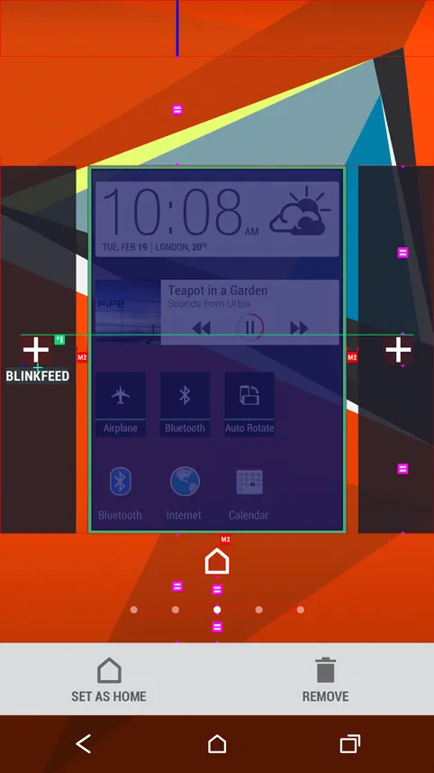
Home and BlinkFeed
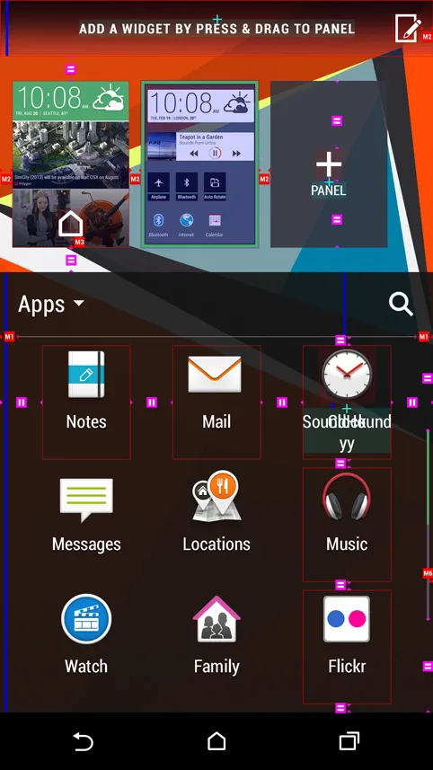
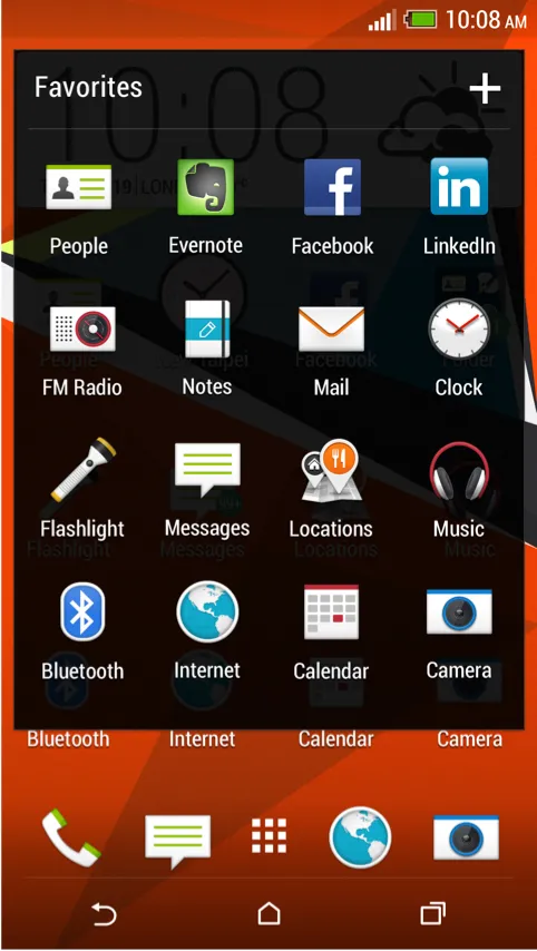
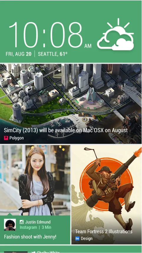
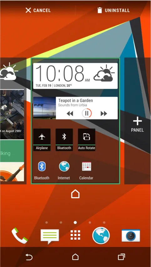
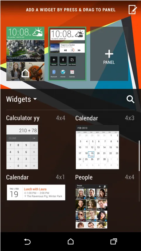
Sense 6Setting the home page, editing panels, rearranging them — the operations that decide whether a launcher feels like yours or like the manufacturer’s.
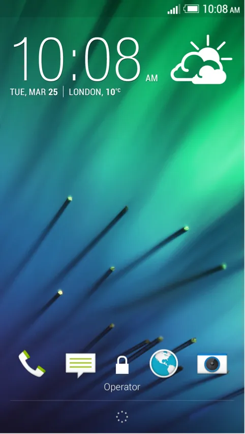
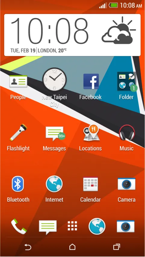
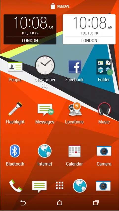
Wallpaper
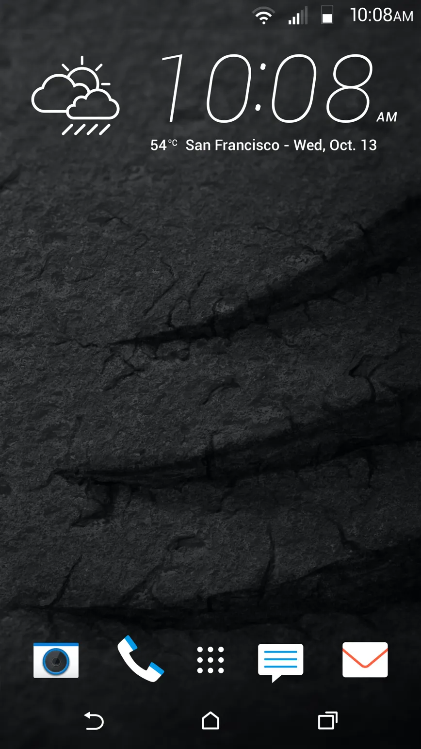
Sense 6 and Sense 8Two generations of wallpaper. On a system this long-running the wallpaper is the one element that changes freely every year, which makes it where a generation gets to say what it is without breaking anything that has to stay stable.